How to Use Personalization in Your App Onboarding
You open a new app and it starts asking. What is your goal. How old are you. How did you hear about us. Seventeen screens later you land on a chart with your name nowhere on it, and a number like 86% you are apparently supposed to find encouraging.
I have been through a lot of these flows lately. Most ask good questions. Almost none do anything with the answers.
That is probably happening in your app too, and not because anybody was lazy. Questions get added one at a time, each for a decent reason, and nobody checks that the answers arrive anywhere.
Which is a shame, because personalised onboarding does retain better. Not because it looks impressive. Because the user feels the app is answering them rather than broadcasting at everyone. And you do not need machine learning for it. You need the answer to come back somewhere they can point at.
The test fits in one sentence. If you deleted the questions tomorrow, would any later screen change?
Most apps fail it. Of eleven onboarding results screens I pulled, three were actually calculated from what the user typed. Twelve apps ask how you heard about them, and not one changes the screen that follows.
So: the test, then the apps that pass it. Then the two I caught showing the same 86% under the same curve, and the question WHOOP asks first that decides its whole flow.
In short
- The test for a personalisation question is whether the answer comes back: if you deleted the questions tomorrow and no later screen changed, you do not have personalisation, you have a longer funnel.
- Of eleven onboarding results screens pulled, only three were computed from the user’s answers, the other eight are stock artwork sitting where a personal result should go, and Me+ and Liven show the same 86% figure under near-identical curves.
- WHOOP goes further than most: its opening goal question routes the sixteen questions that follow, so the answer chooses the onboarding rather than filling a field.
- Twelve apps ask how you heard about them and not one of them changes the next screen, eight are transcribed here word for word, and only four of those eight give the user a way out.
- Nine flows captured from big consumer apps run 14 to 30 screens, median 19, so the decision is not how many questions you ask, it is whether you tell people how many are coming.
What personalization actually means in onboarding
It doesn’t mean a different app for every user. It means the answer comes back somewhere the user can point at. The questions that pass that test in the flows I catalogued are unglamorous. Calm asks “What brings you to Calm? We’ll personalize recommendations based on your goals”, and the goal picks the content it recommends.
Deepstash asks “What are some of your goals? Let’s recommend the best content to get you started” and does the same job. Finch asks “Which daily goal would you like to be more consistent with?” and that goal turns into an actual task inside the app.
MyFitnessPal asks “Which healthy habits are most important to you?” and the habits picked become the metrics it tracks.
What those four share is not sophistication. It is that the answer is not filed for a report, it becomes something on a screen. The tier above that is rarer: the answer changes the flow itself.
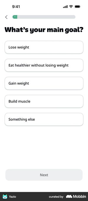
Yazio · the goal question that lets you refuse the goal
Right at the start, with the progress bar almost empty: “What’s your main goal?” over five outlined cards, Lose weight, Eat healthier without losing weight, Gain weight, Build muscle, Something else, with Next greyed out until one is chosen. In a calorie counter the second option is the interesting one, because it lets the user decline the premise of the whole category.
The answer sets a daily number the user then meets on the home screen, so the question pays itself back where they can see it, not in a report somewhere. What ruins it: a route like “Eat healthier without losing weight” that leads to the same weight-loss plan as the other four. An option offered and then ignored is worse than one never offered.
WHOOP · the first question decides which onboarding you get
The opening goal question, “BE HEALTHIER / IMPROVE FITNESS / OPTIMIZE PERFORMANCE”, under a header reading “GOALS STEP 1 / 17” routes the sixteen questions that follow it. It is not collecting a preference, it is choosing which onboarding the user gets.
Branching has to genuinely shorten the path. The answer has to take questions away, not unlock more of them.
Count yours, then. If choosing an option adds screens instead of removing them, the user works that out by about question four, and every question after it looks like a trick.
The number of questions is not the decision
So I counted. Here is every onboarding flow I have a full capture of, biggest first.
How long onboarding actually runs
Screens counted in thirteen third-party captures. Duolingo came up twice at the same length, so it has one bar. The median of the nine big-app captures is 19, meaning half are longer and half are shorter. Long onboarding is the norm at this scale, not the exception.
Two warnings. These are third-party captures, so each number is a floor rather than an exact length. And I found the flows by searching for patterns rather than picking at random, so this is both a small sample and a biased one. Treat 19 as a rough sense of scale, not a target.
Notice what the chart does not show: a cliff. There is no length at which these apps all stop. Spotify at 14 and TikTok at 30 are both perfectly normal.
Whether to ask the questions at all, and what a progress bar is promising when you show one, is a different question from this one. That is micro-commitments in onboarding.
Which is why the decision is not how many questions you ask. It is whether you tell people how many are coming. Calm Sleep puts “1/6” next to the bar, so the user reads a number rather than a filled proportion. WHOOP shows “GOALS STEP 1 / 17” and means it.
Monarch says “Step 5 of 6”. Feeld says “11 of 13”. On the other side, Udemy shows no indicator at all and offers a persistent “Save & exit” instead, swapping a promise about length for a promise about escape.
Monzo · the flow where no honest total exists
Monzo runs one question per screen with no indicator at all, and the questions branch on earlier answers: “Do you have home insurance? Doesn’t matter which type, contents only or buildings too. Your answer helps us tailor what you see next.” Answer that one way and the screens that follow are not the screens you would otherwise have seen.
This is the case the counting argument misses. Once a flow branches, any total it prints is wrong for somebody.
If your flow really branches and it is short, leave the counter off. A number you cannot keep is worse than no number at all.
The long branching flow I do not have a clean answer for, and I am not going to pretend otherwise. Any total you show is wrong for somebody, and showing nothing leaves the user with a working estimate of “this never ends”. Udemy picks a third way and promises escape instead of length. It is the closest thing to a solution I have seen.
Across the flows I looked at, a progress indicator was close to universal. Hiding the length is now the deviation, not the norm. The expensive version is neither: Me+ shows a bar on some steps and drops it on others. Progress that vanishes reads as progress lost, and the reflex is to tap back to check, which is the one interaction a long flow can’t afford.
What to ask (and what not to ask)
Ask about outcomes, not demographics is the usual advice, and it is nearly right. The sharper version: a demographic question is fine when the screen says what it will do with the answer. Lovi asks “How old are you?” and answers the objection in the same breath, “At different ages, your skin needs different skincare treatments.”
Strava asks for a birthday and a gender, and writes down a use for each one:
“We’ll use this for performance analysis, filtering leaderboards, and to keep younger users safe.”
“Your gender will not appear on your profile.”
Monzo asks “Do you have home insurance?” and adds “Your answer helps us tailor what you see next.”
The test is not the category of the question, it is whether the screen can name the payoff.
Ask what they think of themselves, not just what they want
Life Reset asks “How confident are you that you can stick with a daily routine for 7 days? Be honest — there’s no wrong answer”, which is a difficulty setting wearing the clothes of a feelings question.
Tiimo opens with “Are you neurodivergent? Tiimo helps you stay focused and plan your day with ease. Which of these feels most like you?” Both are worth asking only if the next screens differ by the answer. A confidence rating that leads everyone to the same plan is decoration. You asked how hard this would be for them, they told you honestly, and you did the same thing anyway.
Ask how often, then answer in their own units
Headway · the question that answers itself
“Choose your daily goal — You can change it later.” The picker converts the input into the unit the user actually cares about: ten minutes a day is shown back as 25 book summaries a month. The question stops being a preference and becomes a preview.
Keep it to arithmetic the user could do themselves. Because the flattering number is the one they will remember, and on day 30 your app gets measured against a promise it made on screen two.
Speak turns the same question into a promise. Its four options are 3 days Baby steps, 7 days Strong start, 14 days Committed, 30 days Unstoppable, and the button underneath says “I’m committed” rather than Continue.
Duolingo labels the minutes instead: 5 min/day Casual, 10 min/day Regular, 15 min/day Serious, 20 min/day Intense. Same button idea at the end.
Both then bolt a multiplier onto it, and this is where I would be careful. Speak promises you will be 2x more likely to finish the course. Ahead promises 4x. Same claim, different number, and neither screen says where the number came from.
The commitment is only worth collecting if the app reflects it back later, which means the streak the user chose has to be the streak the home screen tracks.
Move the “how did you hear about us” question, or make it refusable
“How did you hear about us?” This is the attribution question, called that because it tells your growth team which channel to give the credit to.
It was the easiest pattern to fill in the whole reference library I built for this. One search returned twelve, across budgeting, fitness, meditation, dating and travel. It is cheap to add, so it is being added everywhere.
Not one of the twelve changes what the user sees on the next screen. Twelve out of twelve. I kept searching for the one that used the answer, and I am still looking.
I realise I sound like somebody with a grudge against a dropdown. I am. It takes a whole screen in somebody’s first two minutes and gives them nothing back.
It is worth knowing. It is not worth that slot. Monarch spends step 5 of a declared 6-step flow on it, directly after step 4, which is the one question that genuinely configures the product (“What brings you to Monarch? Select your financial priorities below and we’ll help you achieve them”).
The user counted six steps toward using the app, and one of them turned out to be the growth team’s report.
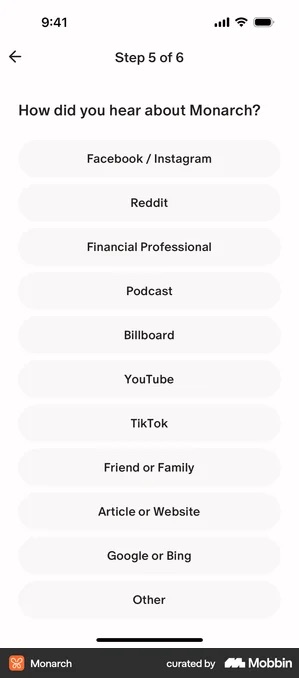
If you keep it where it is, copy Ten Percent Happier and put a plainly worded “Prefer not to answer” under the button instead of a greyed-out skip in a corner. A visible refusal makes the answers you do get worth more. YNAB’s version is the common shape and the costliest: nine channels, single-select, scrollable, early in the flow, with no skip on screen.
Ten Percent Happier · the refusal written out in full words
The attribution question sits at the very start of the flow, the bar showing a single dot at the left, and its options need a scroll: “Browsing the App Store”, “Podcast”, “The Dalai Lama’s Guide to Happiness”, “A friend/family member”, “Other”. Continue stays greyed until something is chosen, and directly beneath it, in full dark type rather than a corner link, sits “Prefer not to answer”.
A visible refusal works because it makes the answers you do get worth more, and it costs one line. It does not fix the placement, and this screen is the clearest evidence that the two are separate problems: the opt-out is exemplary and the question is still the first thing the app asks a stranger.
YNAB · greeted by name, then asked for the growth report
“Hi Sam! How’d you hear about us?” The name has already been collected, and this is what it is spent on. Nine single-select options run past the bottom edge: Podcast, friend family or colleague, YouTube, App store, YNAB’s own social, online search, news article, ChatGPT or other AI tool, Influencer. No skip appears anywhere on the screen.
One option earns its place. “ChatGPT or other AI tool” is the single answer no attribution tool can see on its own, which is exactly the case for asking at all. The rest is the costliest shape of the pattern, a scroll, early, with no way past, spent on a question that changes nothing the user will meet later.
If you are going to greet someone by name, greet them into a screen that does something for them.
Eight of those twelve are transcribed word for word in my notes, and four of the eight give the user a way out. Commons pairs “Select all that apply” with a SKIP. Wanderlog and Paired both show “Skip”. Ten Percent Happier writes the refusal out in full words.
Bloom is the most honest about what the question is for. Its options name the ad channels directly: “Tik Tok Ad”, “Facebook / Instagram Ad”, “Podcast / TV Commercial”. Being open about the purpose does not buy it a place in the flow, though.
Using zero-party data vs. behavioral data
Zero-party data is what users tell you directly, and onboarding answers are the only kind you have before there is any behaviour to read. It goes stale fast. What someone picked in January is a worse guide to March than what they opened last week.
So start with what they said and let what they do overwrite it. Finch’s daily goal and MyFitnessPal’s chosen habits are useful precisely because they land somewhere the app can then watch: a stated goal that is never checked against a completion rate is a preference nobody audits. An app still treating you as your day-one answers six months later feels out of touch, and it is.
Most “personalised” results screens are not personalised
This is the finding I did not expect. I pulled eleven onboarding results screens, the ones that show you a chart or a projection once the questions are done. Three were computed from the user’s answers. The other eight are stock artwork sitting in the position where a personal result would go, and visually they are near-identical to the real thing.
MyFitnessPal is the computed version, and it is not clever. It plots the two numbers just typed in, 70.0 kg now and 75.0 kg by August, and the slider above the chart redraws the line. The answer comes back on the very next screen, and the user can move it.
Then the other eight. Me+ ends its flow with a happiness-score curve marked at 5 days, 14 days and 30 days, and that line is the same line for everyone.
Under the chart, in small type, sits its source: “Recoreded from Me+ user respond”, typo included. I read it three times to be sure it was theirs and not mine.
And the 86% in the paragraph below it is the same figure Liven shows under its own near-identical curve.
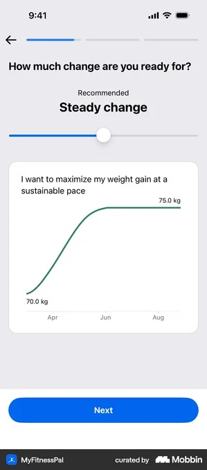
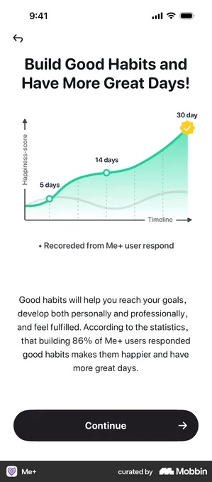
Put them next to each other and the difference is one glance. Separate them by three taps in a real flow, which is where your user meets them, and almost nobody can tell.
One correction before you file Liven under artwork, because I did and it was too quick. Liven also ships a genuinely computed reveal, headed “Based on your answers, your primary irrational pattern is…”. So one app sits on both sides of this line at once, and three out of eleven is a floor rather than a verdict.
Citing it is the middle path, and two apps take it. Breathwrk puts a peer-reviewed study under its curve; Liven names an internal survey and its date, “*Internal survey by Liven Research team, Feb 2025”. If the chart is marketing, say so on the chart. It stops pretending to be a result, and the questions before it stop looking like a setup.
The paywall personalization payoff
The paywall headline is where the answers pay for themselves. A generic one says “Get Full Access to [App Name]”; a personalised one says “Your plan to [stated goal]”.
Life Reset sets that expectation before the questions rather than after, promising “We will use the answers to design a tailor-made life reset program for you”, and Wanderlog does the same with “We like the way you travel! We’ll use your answers to personalize your trips.” A promise made that explicitly is a debt the paywall has to settle.
Hannah Parvaz, founder of the growth agency Aperture, makes the same point in RevenueCat’s State of Subscription Apps 2026, which draws on data from more than 115,000 apps:
“If a paywall appears before context is established, it feels jarring. When onboarding builds momentum first, conversion looks very different.”
Then check how the decline is worded, because that is the other half of the handoff and it is where personalisation gets spent. Feeld gives “Skip” a full-width button directly under the subscribe button: same shape, same width, lower contrast, so the exit is unmissable and still clearly secondary.
Monarch phrases it as a loss instead, “or continue in-app without additional discount”, which is accurate only while the discount really is time-limited. Run the same offer again next session and the user learns the urgency was manufactured, and that lesson spreads to every price you show them afterwards.
What the big apps actually do
The test for onboarding personalisation is simple: does the answer change anything downstream? Three apps that pass it, and one pair that shows exactly what failing looks like.
QUITTR · questions, then proof, then the ask
Personalisation runs first, then a long testimonial, then the plan. By the time the price appears, the user has described their own problem in their own words.
All of which needs the onboarding to actually change what comes after it. People notice when it does not. A warm-up act leading to a generic paywall is worse than asking nothing at all, because you spent their patience and got nowhere with it.
Kit · the tier change triggered by the action that needs it
Single child versus Multi child is shown as a before-and-after pair with an arrow, triggered at the exact moment the user adds a second child.
The comparison appears at the exact moment the user has a reason to need it. Nothing on this screen has to argue, because the parent already did the arguing by tapping Add. More on where this belongs in a flow.
GoodRx · splitting two decisions rather than stacking them
Billing period first, then Individual versus Family, as two separate steps rather than one grid.
Splitting stops the two decisions competing for the same glance, and each one gets a whole screen to be answered on. It costs a tap, and the tap is worth it.
BitePal and Me+ · the questions never reach the reveal
Both run a long personalisation flow and both end it with a chart. BitePal’s is an us-versus-other-apps curve carrying a 76% claim; Me+’s is the happiness score above. Neither is drawn from anything the user typed.
As persuasion the screens are competent, and I would keep them. The problem is where they sit. After the questions, a stock chart is not a reward for answering, it is the receipt showing the answers went nowhere.
The honest check: if you removed the personalisation questions tomorrow, would any later screen change? If the answer is no, you do not have personalisation, you have a longer funnel.
Checklist
- Every question asked is one whose answer visibly changes a later screen
- The flow declares its length honestly, or replaces the count with a real exit, and the indicator never disappears mid-flow
- Any results or projection screen is computed from the answers, or is placed before the questions and framed as an illustration
- The “how did you hear about us” question sits after the user has done the thing the app is for, or it carries a plainly worded “Prefer not to answer”
- Paywall headline references the user’s stated goal or situation
- Personalization is updated over time using behavioral data, not just onboarding answers
- Drop-off rate on each onboarding question is tracked
Got questions? I’ve got answers
How many questions should app onboarding ask?
There is no magic number. Nine onboarding flows I counted from big consumer apps run 14 to 30 screens, median 19, so length on its own is not the problem. Ask only what visibly changes what the user sees next, and tell people how many steps are coming.
What is zero-party data in an app?
Anything the user tells you directly, as opposed to behaviour you observe. It is the only kind you have in the first session, before there is any behaviour to read, which is exactly why onboarding questions are worth asking at all.
Does personalization actually improve paywall conversion?
It does when the answers visibly change the offer, the plan or the copy. The failure is specific and common: BitePal and Me+ both end a long personalisation flow with a chart that is stock artwork, identical for every user. Of eleven results screens I pulled, three were computed from the answers.