What Is a Second Paywall Offer and Why Does Your App Need One?
Somebody just tapped the X on your paywall.
For most indie apps that is the end of it. The sheet closes, the user carries on with their day, and you never get another word in. By day 35, the median freemium app, meaning one you can use for free and pay to unlock more, has turned 2.1% of its installs into paying subscribers. Everybody else walked past, and we let them.
Here is what I think goes wrong. We read that X as a verdict. It usually is not one. It means the offer was wrong for that particular moment, and there are at least seven different reasons somebody says no. Only one of them is “too expensive”.
A second offer is what you say next. So by the end you will have what one has to change to count as an offer at all, nine of them documented off real screens, and the two ways the arithmetic gives you away when the badge and the struck-through price disagree with each other.
In short
- By day 35 the median freemium app has converted 2.1% of its installs into paying subscribers, and the median hard-paywall app 10.7% (RevenueCat, State of Subscription Apps 2026, 115,000+ apps). A dismissal is the normal case, not the exception.
- Second offers work by changing commitment level, trial length, payment structure or framing, not by repeating the first ask. Blinkist asks (“Would a discount help? 40% OFF”), Headway teases with no number at all, Future Pro apologises for the product, Bloom concedes the price out loud.
- The framing and the arithmetic have to agree. Deepstash sells “8 free months” and strikes its own list price anyway; Cal AI shows “80% OFF FOREVER” next to a struck $29.99 and a $19.99 plan. Pillow is the counter-example: −25% off SGD 39,98 really is SGD 29,98, and the footer says what renews.
- Cap exposure and keep it clearly skippable. That cap is my judgement, not a benchmark, no public dataset reports how often a second offer should fire.
The basic idea
A dismissal is rarely a refusal. It is usually a pricing or a timing objection with no way to voice itself, the tap on the X is the only sentence the user gets to say.
Shumel Lais, co-founder of Day30, calls these abandonment discounts: half off the moment somebody taps that X. He reports them taking a big share of total subscriptions across the apps he sees.
His reasoning is simple. Plenty of people who would never start a free trial will risk a few euros on half price.
That is one practitioner’s observation rather than a benchmark, but it points at the right thing: the person leaving your paywall has made a price decision, not a trial decision.
A second paywall offer is a different ask, shown immediately or shortly after the first one is dismissed. It answers a specific objection instead of repeating the first one louder.
What the second offer can look like
Lower-commitment option
If your main paywall led with an annual plan, the second offer shows a monthly one. The point is not that it is cheaper; it is that it is a smaller decision.
Shorter trial
If your main offer was a 14-day trial and that felt like a big commitment, the second offer can be a 3-day trial. Just know what you are trading.
RevenueCat’s State of Subscription Apps 2026, across 115,000+ apps, puts median trial-to-paid, the share of trials that turn into paying subscriptions, at 25.5% for trials of four days or less. For trials of 17 to 32 days it is 42.5%. So longer trials convert about 1.7 times better.
A short trial may buy you more starts. It converts a smaller share of them.
Lifetime deal
Some users don’t like recurring payments, and a one-time lifetime option changes the payment structure rather than the price, a different objection from “too expensive”. Peanut uses exactly this as its post-dismissal offer: a lifetime plan behind a timer. How well lifetime second offers convert is not something any public dataset reports, so treat the size of the win as unknown.
The reason to try it is that it answers a different no.
FocusFlight · a lifetime price behind a one-hour clock
The second offer is a −58% coupon on a lifetime plan, with “Expires In” set over a flip clock reading 59:52. It is filed as the offer after the no, not as the screen anyone meets first.
It answers a different objection from the first paywall. Not too expensive, but not willing to subscribe to anything at all. The clock is the weak part: under an hour reads as invented in a way Peanut’s two-day version does not.
Discount with a real deadline
“Here’s a 30% discount if you start today.” The deadline has to be real, and you cannot show it every time. If users learn it’s always available, it loses its effect.
Worth knowing how rare the clock version of this actually is. The median paywall carrying a countdown timer runs at 0.8%, and no category RevenueCat measured goes above 1.4%. Progress bars sit at 0.1%. Compare that with highlighted pricing at 74.5% and free-trial messaging at 54%.
Most of the apps below say the deadline in words instead.
Pillow runs a clock and still has nothing to hide, which is rarer than the timer itself.
The screen reads “LIMITED-TIME OFFER −25% discount for one year” over SGD 29,98 against a struck SGD 39,98. Check it: 29,98 against 39,98 really is 25%.
Above the button, “Special offer expires in: 23h 59m 58s”. Underneath it, “No, thanks”. And in the small print, the part most screens leave out: “After the first year, the annual cost of the subscription is SGD 39,98 and renews…”.
The timer is the least interesting thing on that screen. The renewal sentence is what makes the discount checkable, and it is the part most second offers leave out.
Plum · a discount with an end date rather than a countdown
The offer is 50% for six months. Where the same app runs it at cancellation, it pairs the cut with a recap of what the subscription has actually been doing. And the limit is a term, not a clock, so the user knows which month full price starts.
A stated term can be checked later and a timer cannot, and six months is long enough to reach a renewal that means something. Let month seven arrive with no warning and the discount has bought you a cancellation with a delay on it.
Different benefit framing
Same product, different angle: if the first paywall led with features, the second leads with the outcome, or with the relationship. Headway and Future Pro both do the whole job in the headline and are quoted in full below, one of them never mentions a number at all.
Vocabulary · the second offer that is not an offer
This is a cancellation screen rather than a post-dismissal one, and it names no price anywhere.
“Don’t lose what you’ve achieved with Premium” sits above “If you cancel, you’ll lose access to:” and a four-item card: backup and sync between devices, unlimited Premium content, streak progress, settings and subscription.
The save button reads “Keep my data safe”. “Proceed with cancellation” sits below it as plain text.
If the user has genuinely built something up, the screen is reporting a fact rather than making an argument. Show it to someone who has built nothing and the same words are a guilt trip, and you lose the review as well as the subscription.
When to show it
Immediately after dismissal
A half-sheet, a modal, or a different screen appears right after the user taps “no thanks”. This is the approach behind most of the screens below, and it works on people who were on the fence.
On the next trigger moment
The second offer appears the next time the user hits a feature gate or reaches the end of their free allowance. By then, they’ve had more time with the app and may be more ready.
Kit · the offer that waits for the trigger
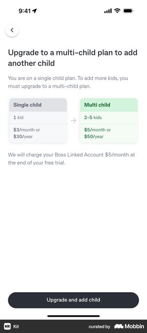
Kit shows single child against multi-child as a before-and-after pair, at the moment a parent adds a second child.
Strictly it is a tier upgrade rather than a post-dismissal offer. But it is the clearest version of this timing in the whole teardown. The ask arrives attached to the action that created the need for it.
The user is not being persuaded here. They are being told the price of the thing they just did. A week earlier, the same comparison is one more decision standing between a parent and the app.
What to avoid
Showing it every time
If the second offer appears every single session, users train themselves to dismiss it and move on. Cap it at 2–3 exposures, then back off. That number is a working rule of mine rather than a published benchmark: the point is that there is a cap at all.
Making it feel like a punishment
“You didn’t subscribe, so here’s a lesser deal” is the wrong frame. The second offer should feel like a favour, not a consolation prize.
Two screens below show the right frame from opposite directions. Bloom agrees with your objection before it counters it. Future Pro takes the blame outright: “while we work to make Future right for you” puts the fault on the product rather than on the user who walked away.
Using dark patterns
The second offer should be clearly skippable. Users who feel trapped leave angry reviews and never come back. A good second offer converts through genuine value, not through confusion, and not through a discount percentage that only works against a price the screen never shows.
Uber Eats · the version that offers nothing, and the version that removes the exit
One Uber Eats cancellation screen asks for a reason and offers nothing in return. A plain-text line reading “Skip survey and cancel now” sits between the progress button and Keep Uber One.
A second version of the same screen ships with Keep Uber One as the only filled control, and that plain-text exit gone entirely.
It works in the first form: asking why and then stepping out of the way costs nothing and produces data a blanket discount would have destroyed. It stops working in the second, where the only obvious control is the one that keeps your money and the way out has to be hunted for.
The returning user version
A specific and underused version of the second offer. You come back to people months later with a trial or a discount, and the good ones acknowledge the gap rather than pretending it did not happen.
The only solid numbers here describe a different group: people who paid and then left.
RevenueCat’s 2026 report finds that within a year 20% of people who cancelled a monthly plan come back, against 9% of weekly and 5% of annual. Shorter commitments are easier to win back.
Nobody publishes the same figure for people who never paid at all. So do not build a forecast on one.
Dan Layfield, founder of Subscription Index, makes the point in that same report that people come back when the problem comes back, not when your win-back, which is the message you send somebody after they have already left, happens to land. Dating, fitness, anything where the need is cyclical: the timing is set by the user’s life, not your campaign calendar.
Checklist
- At least one alternative offer ready for users who dismiss the main paywall
- Second offer uses a different angle (price, duration, billing type, or framing)
- Second offer is capped at 2–3 exposures to avoid training users to dismiss
- Language is framed as a favor, not a fallback
- No dark patterns, second offer is clearly dismissable
- The discount you claim survives a check against the price you strike through
- Reactivation offer considered for returning non-converted users
What the second offer looks like in practice
What happens after a dismissal is its own design problem. Below are seven real second offers, the words that are actually on each screen, and the trade each one makes. Two of them are worth reading with a calculator open. The last three are the whole offer in a single sentence, which is the format most of these take.
Sunlitt · the deadline written out in a sentence
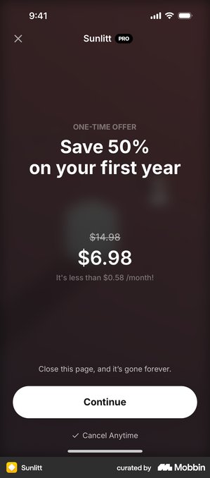
The screen is headed ONE-TIME OFFER over “Save 50% on your first year”, with $14.98 struck through to $6.98 and “It’s less than $0.58 /month!” underneath. The pressure line is one row of small body text above the button: “Close this page, and it’s gone forever.”
Two things in that screen do not quite add up, and I only found them because this article is about checking. $14.98 down to $6.98 is a 53% cut, not the 50% the headline claims, so Sunlitt is underselling its own discount. And $6.98 over twelve months is $0.5817, which is a fraction of a cent more than the “less than $0.58” underneath it.
Neither is a scandal. One is conservative and the other is a rounding. But the badge and the price have to agree, because the person who checks is the person who was already hesitating.
Works when it is true. If the offer genuinely never returns, saying so in words is fair warning, and it is a more honest instrument than a clock, because it makes a claim the user can check.
Backfires when the same screen reappears next session. This is the most checkable claim in your entire app, and users reopen the screen precisely to test it.
Cal AI · where the badge and the arithmetic part company
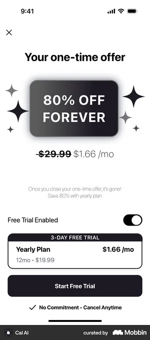
“Your one-time offer”, a dark badge reading 80% OFF FOREVER, $29.99 struck through beside $1.66 /mo, and the line “Once you close your one-time offer, it’s gone!”. The plan card below it is a yearly at 12mo · $19.99 with a 3-day free trial, and the “Free Trial Enabled” toggle is already switched on.
Works because forever is doing real work. 80% off the first term and 80% off every renewal are two different promises, and this screen makes the larger one. Which answers the renewal-shock objection head on, as long as the renewals honour it.
Backfires because the two numbers on the screen do not reconcile. Against the $29.99 it strikes through, $19.99 a year is a 33% cut. The 80% is measured against a price the screen never shows. Whichever figure is the honest one, a user who does that subtraction after paying is a user you have taught to distrust the next offer.
Deepstash · more time, and a cut price anyway
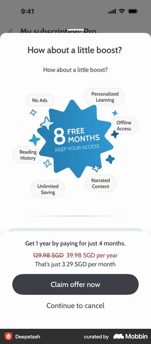
“How about a little boost?” over a badge reading 8 FREE MONTHS · KEEP YOUR ACCESS, then “Get 1 year by paying for just 4 months.”
Works when you would rather sell time than a percentage. Eight free months is a concrete thing a user can picture; 69% off is a number they have to trust.
Backfires as a claim about price integrity, which is what this pattern is usually credited with. The list price does not survive: 129.98 SGD is struck through to 39.98 SGD per year right under the badge. The framing is months, the mechanic is a discount, and both are on the same screen.
Bloom · agreeing with the objection before answering it
The copy concedes the point first: “We know $15 / month can feel a bit expensive… The same features, for just $5 / Month.”
Works when acknowledging the objection makes the second price feel considered rather than arbitrary. Agreeing with the user disarms them better than restating benefits does.
Backfires when the drop is steep enough that the first price now looks invented. At a third of the original, you are close to that line, and you have devalued your own list price retroactively to win one subscriber.
Blinkist · a question rather than an announcement
The screen is two lines: “Would a discount help? 40% OFF”.
Works because the question hands the decision back instead of pushing. And 40% is a number the user can weigh on its own, with no arithmetic against a struck-through price to check.
Backfires the second time. A question you already know the answer to reads as courtesy once and as theatre after that, and you have told the user your list price was negotiable all along.
Headway · the offer with no number on it
“How about a special offer we have for you?” That is the headline. The size of the discount is not in it.
Works as a way of buying one more tap from someone who was already leaving. Curiosity is cheap, and the number then gets a screen of its own where it has room to be explained.
Backfires when what is behind the tap is smaller than the word “special” implied. You have spent the user’s curiosity and handed them a disappointment to remember you by.
Future Pro · apologising instead of punishing
“One last chance offer. While we work to make Future right for you, we’re happy to offer you a membership at a reduced rate.”
Works because it puts the fault on the product. Nothing here says “you didn’t buy”. It says “we’re not there yet”, which is the only framing that makes a lower price read as goodwill rather than as a markdown on something that was overpriced to start with.
Backfires when nothing changes afterwards. It is a promise of future work, and the user renewing at the reduced rate a year later will know whether it happened.
The pattern underneath all seven: a dismissal is information, not a verdict. It usually means the offer was wrong for that moment, not that the user will never pay.
These seven answer seven different reasons for saying no. The price. The renewal. The term. The tone. The arithmetic. The effort of deciding. And the suspicion that the product is not ready yet.
Two of them also show the failure mode, and it is not a design failure. It is an arithmetic one.
When the badge and the struck-through price tell different stories, the second offer is making a promise the pricing cannot back. And the person who bothers to check is exactly the person who was already hesitating.
One last thing worth knowing before you write yours: the same sentences turn up one step further down the funnel, doing a different job.
At cancellation, Headspace asks “Would 50% off help? Stick with Headspace to get 50% off your subscription for the next year”. Oportun offers “Stay with Oportun – free for 3 months! Don’t pause your progress.”
Identical grammar, opposite situation. Those two are trying to keep a customer, not win one.
And a save offer that reads like a dismissal offer tells your paying subscriber you never noticed they were paying.
Got questions? I’ve got answers
What is a second paywall offer?
A different ask shown after a user dismisses the main paywall, either immediately or at the next trigger moment. It changes the commitment level, trial length, payment structure or framing rather than repeating the same offer.
How often should a second offer appear?
Cap it at two or three exposures. Shown every session, users train themselves to dismiss it without reading and it stops working. That cap is a working rule rather than a published benchmark, no public dataset reports an optimal frequency.
Does a lifetime deal make sense as a second offer?
It changes the payment structure rather than the price, which answers a different objection from “too expensive”. Peanut uses a lifetime plan as its post-dismissal offer. No public dataset reports how well lifetime second offers convert, so run it as a hypothesis rather than as a known win.
What should a second offer actually say?
The screens in my paywall teardown do one of four things. They concede the objection, Bloom: “We know $15 / month can feel a bit expensive… The same features, for just $5 / Month.” They ask rather than announce, Blinkist: “Would a discount help? 40% OFF”. They tease with no number at all, Headway: “How about a special offer we have for you?” Or they apologise for the product, Future Pro: “While we work to make Future right for you, we’re happy to offer you a membership at a reduced rate.” What none of them do is repeat the first paywall louder.
How many people actually buy on the first paywall view?
Very few. RevenueCat’s State of Subscription Apps 2026, built on more than 115,000 apps, puts the median download-to-paid rate at day 35 at 2.1% for freemium apps and 10.7% for hard paywalls. Even five weeks after install, the overwhelming majority of users have not paid, so a dismissal is the normal outcome your flow has to be designed around.