What Does a “Normal” Paywall Actually Look Like? (Benchmarks)
You screenshot a paywall you like. Maybe Duolingo, maybe Calm. You put it next to yours and start wondering which of the differences actually matter.
Two plans or three? Does everyone put the price in big type? Is it normal that mine scrolls?
I have spent a lot of evenings doing exactly this, so let me save you some.
The useful thing is that somebody counted. RevenueCat looked at 115,000+ apps and published what paywalls actually do, so “normal” stops being a feeling and becomes a number you can check yourself against.
One note, because I want you to be able to trust these. Where RevenueCat publishes a median I say median, where it publishes a range I give you the range, and I round nothing up to make a point.
Here is the mistake almost everybody makes with a page like this, me included. You read that 74.5% of paywalls highlight one price, so you go and highlight one price. But normal is not automatically good. Some of these patterns are common because they work, and some because everybody copied the same app in 2021. I will say which is which where I can.
What follows: thirteen paywall choices with their real numbers, in two tables you can hold your screen up against, and thirty-odd named apps showing each one shipped.
In short
- Two plans is the norm: 41 to 60% of paywalls across categories, led by Health & Fitness at 60%.
- Most paywalls scroll, between 59 and 76% of them, so the single screen everyone designs for is not the constraint it is assumed to be.
- Pressure tactics are rare. No category tops 1.4% for countdown timers or 0.2% for progress bars, and the apps that do run one, like Peanut and FocusFlight, put it on a discount offer rather than on a first paywall.
The structure
| Structural choice | Range across categories | Highest |
|---|---|---|
| Exactly two plans | 41–60% | Health & Fitness, 60% |
| Scrollable layout | 59–76% | Travel, 76% |
| Annual plan shown | 28–44% | Health & Fitness, 44% |
| Weekly plan shown | 10.5–33% | Photo & Video, 33% |
Most paywalls show two plans
Two-plan paywalls dominate at 41–60% across all categories. Health & Fitness leads at 60%, Gaming is the lowest, and Shopping is the outlier in the other direction: 40% of Shopping paywalls show a single plan. Three or more plans is genuinely the minority position, 6–27% of paywalls, with Travel highest at 27% and Shopping lowest at 6%.
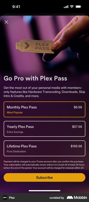
When apps do go past two, they add a different kind of plan rather than another billing period. Plex sells Monthly, Yearly and Lifetime. FotMob splits four ways, into Annual, Monthly, Family Monthly and Family Annual, all carrying the same seven-day trial.
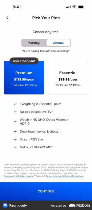
Paramount+ · two plans that differ on what you watch, not on when you pay
A Monthly/Annual segmented control sits above Premium and Essential shown side by side, and a single feature list underneath covers both, with pluses marking what Premium adds. The billing decision and the tier decision are kept apart, so neither one asks the reader to compare four things at once.
All of this rests on the tiers genuinely differing on features, not just on price.
Then watch what the toggle does. Flip it and both cards change at once, so the number the reader had just taken in is gone. Try that on your own paywall and see whether you can still remember the price you were looking at two seconds ago.
GoodRx · two plans, but two separate decisions
Billing period is chosen first, and only then Individual against Family. Both plans read $0.00 with the normal price struck through beside them.
And above the button sits a tick that is not a terms agreement at all: “I confirm I don’t live in Washington state”.
Splitting billing from audience stops the two questions competing for the same glance. Just do not let both steps land before a confirmed price appears. Two decisions with no number attached to them is where people leave.
What moves the number is less how many plans you show than which one the user meets first. Michal Parizek, pricing and growth lead at Mojo, moved the monthly plan behind a separate “see all plans” screen. Yearly got all the visual weight, and read as the only option.
Yearly went from about 60% of plans sold to about 80%, and overall conversion held. His wider point is that layout tests only get big when they change which plan people see first.
Duolingo · the divider that does the work
Monthly sits below a rule labelled NO FREE TRIAL. Nothing is removed and nothing is hidden, but the two annual options above the line read as the real choice and the third plan reads as a footnote. It is a two-plan decision assembled out of three plans, and it costs a divider.
It only holds up because the difference is real. The trial genuinely does not apply to monthly, so the line is reporting a fact rather than inventing one.
Draw the same band for styling and it turns into a dark pattern, meaning a design that works by misleading the person using it. And this is the catchable kind. The user can go and check.
Scrollable paywalls are the standard
59–76% of paywalls scroll. Travel apps lead at 76%, and Photo & Video is the lowest at 59%, still the majority. Education (72%) and Health & Fitness (70%) sit close to Travel. A single static screen is the exception, not the rule.
Sylvain Gauchet, Head of Growth at Reading.com, gives the reason in RevenueCat’s own commentary. People are tired of subscriptions. They do not want to get burned by forgetting to cancel, and they want to understand what they are buying. So most paywalls end up
“scrollable and text-heavy”.
The Atlantic · what the scroll is actually filled with
Two plans, then five paragraphs of renewal, cancellation and refund terms below the button. They are set smaller than the body copy above them, around three quarters of its height, but all five are on the screen rather than folded behind a link.
The screen scrolls because the terms are there, not because the marketing is.
A publisher’s subscribers expect to read this, and a link would feel like hiding. An app audience reads that much legal text as a warning sign. Same screen, opposite reaction.
Annual plans appear most often
Annual plans show up on 28–44% of paywalls across categories, Health & Fitness highest and Gaming lowest. Monthly runs 22–44%, lifetime 5–18%, and weekly varies most of all: Photo & Video shows a weekly plan on 33% of paywalls, Travel on 10.5%. Gaming’s 18% lifetime rate is two to three times every other category.
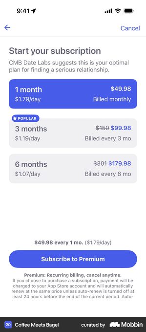
Coffee Meets Bagel · three plans and not an annual one among them
One, three and six months, each showing the total and a per-day figure, with struck-through anchors on the two longer terms and a POPULAR badge on the middle one. Nothing here is annual and nothing is weekly, so it falls outside both of the rows in the table above.
Per-day pricing makes a large total feel small. Fair enough on something people open every day. So how often does anybody actually open your app? Divide by thirty on a weekly-use product and you are not reframing the price, you are hoping nobody does the multiplication.
The UI elements
| Element | By category | Median |
|---|---|---|
| Highlighted pricing | 72.6–77.0% | 74.5% |
| Multiple plan options shown | 54.6–64.2% | 59.2% |
| Feature list | 50.0–61.4% | 57.0% |
| Free trial messaging | 43.6–60.0% | 54.0% |
| Discount badge | 36.2–50.4% | 42.5% |
| Cancel assurance | 25.0–39.5% | 35.9% |
| Testimonials | 5.9–16.9% | 11.3% |
| Countdown timer | 0.0–1.4% | 0.8% |
| Progress bar | 0.0–0.2% | 0.1% |
RevenueCat states the medians for highlighted pricing (74.5%), multi-plan options (59.2%) and free-trial messaging (54.0%) in its own text. The remaining medians are calculated here from the same per-category chart on p. 91, which is why they are more precise than the round numbers usually quoted from this report.
What almost everyone has
Highlighted pricing is close to universal at a 74.5% median, and the spread is unusually tight, no category is below 72.6% or above 77.0%. The advice that travels with that number is “highlight the annual plan”, and it is not what the screens do.
AllTrails tints only the Peak column of its Base/Plus/Peak table, so the eye runs down one column of ticks and the other two read as what you are giving up. Plex gives the coloured outline to the monthly pass. And it labels its three plans Most Popular, Extra Savings and Pure Dedication: a reason per plan rather than a saving per plan.
Multiple plan options shown (59.2% median) and a feature list (57.0%) come next. The feature list varies in kind more than in length. Telegram runs eight named features down one sheet and ends on a single button, “Subscribe for $49.98 / year”, with no trial and no plan to pick.
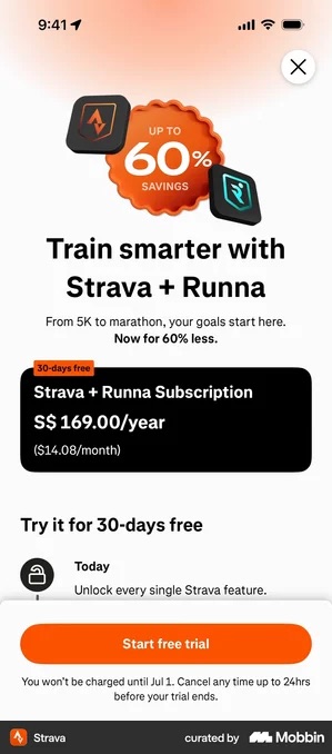
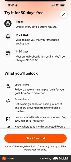
Strava tags each row of its unlock list with the tier it belongs to and skips the table altogether. Tide Guide ships the full ten-row free-versus-pro grid.
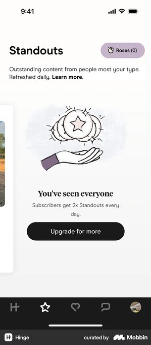
Hinge · when the upgrade is priced in the thing you ran out of
The screen says “You’ve seen everyone”, and the line under it is not a feature list. It is Subscribers get 2x Standouts every day, which is the same unit the user has just exhausted.
Notice what is not here: no tier name, no bulleted comparison, no trial. One number, in the currency of the thing that just ran out, on the screen that announced it.
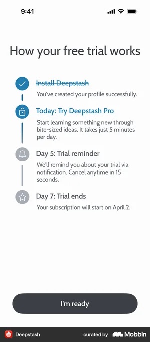
Free trial messaging (54.0% median) has the real category spread, Business shows it on 60.0% of paywalls, Travel on 43.6%, and one shape has taken it over. The dated timeline, three or four steps running from today to the charge date, now turns up on Headspace, Strava, Brilliant, Runna, Buddy, Kitchen Stories and Spark Mail. The duration changes; the structure does not.
“Today: Get instant access · Day 12: Reminder · Day 14: Trial ends — Your paid Plus membership starts on November 4, 2024” · Kitchen Stories
“Free for 90 days — Today: Free trial starts · Day 89: Billing reminder – cancel anytime · Day 91: Plan starts and billing begins” · foodpanda
What roughly four in ten have: a discount badge (42.5% median). Most are a bare percentage sitting on the plan the app wants chosen, Telegram’s −45% on annual, Buddy’s SAVE 57%, Paired’s Save 74%. Two do something harder with the same space. Cal AI badges 80% OFF FOREVER, applying the cut to renewals rather than to the first term, which answers the renewal-shock objection instead of postponing it.
Thrive Market drops the percentage entirely and states the money with its working shown:
“Save up to $384 a year! Based on ordering once every two weeks, and average member savings of $32 an order. Savings may vary.” · Thrive Market
Everyday Rewards · the percentage and the money on the same screen
The heading is “Select your payment frequency”, and the saving is stated twice in two different units. A SAVE 16% pill, and the sentence “By paying annually you pay $14 less”. The same block carries free for the first 30 days and cancel auto-renewal anytime.
A shopper can check the arithmetic without leaving the screen, which a bare percentage never lets them do. Just make the two figures agree. The one they remember is always the bigger one.
What roughly a third have: cancel assurance, “cancel anytime” language (35.9% median). Photo & Video is the notable holdout at 25.0%, about eight points below the next-lowest category.
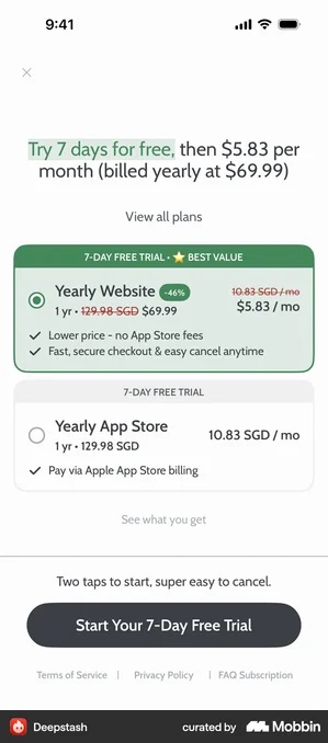
Cancel assurance is the cheapest line on the list to write and the one that varies most in quality. The specific versions are the ones that work. Deepstash promises to cancel “in 15 seconds”. Hypelist, “in just 2 taps”. Headway tells you to cancel in advance to avoid payment, and Bloom offers a full refund if you forget.
A bare “cancel anytime” asks the user to take your word for it; a number tells them how long it takes.
Monarch · the assurance sits inside the timeline, not under the button
“Cancel any time” is written into a step of the trial timeline rather than parked in the small print. The primary button reads “Start 7-day trial and save 30% more”. So the promise and the date it applies to are read in one movement.
Someone checking when they will be charged finds the way out in the same glance, and that is the whole argument for putting it there.
Then check it is not the only place it appears. A reader who never scrolls never reaches the timeline, and for them you did not write the line at all.
What roughly one in ten have: a testimonial, at 11.3% median and 5.9 to 16.9% by category. It is the rarest element in the report that anybody actually uses, which makes the apps leaning on it worth a look.
Moonly stacks three kinds of proof before any price. A stat bar reading 10 million souls, 31,000 reviews and Apple’s Editor’s Choice. Press mastheads from ELLE, GLAMOUR and VOGUE. And a named five-star review with a photograph attached.
QUITTR opens on “Join over 1,000,000 users!”. BitePal skips the compliment and names a customer with a measured result, 67 kg to 62 kg in one month. Orbit turns proof into arithmetic, customers save $300 a year on average, and then asks for a one-off lifetime payment of S$24.98, so the price reads as a subtraction.
Runna · a review count doing a testimonial’s job
The count, 30,000+ reviews, sits alongside the trial timeline rather than in a proof block of its own. So the number a runner is weighing and the dates they will be charged on occupy one screen. No quote, no photograph.
A count has to be big enough to answer “is this real” by itself. A modest number standing alone is worse than no number at all. You have made a specific claim and it does not impress.
What almost nobody has
Countdown timers do not clear 1.4% of paywalls in any category, and in most they sit below 1%: Shopping is at zero. Progress bars top out at 0.2%.
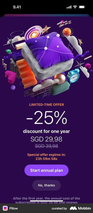
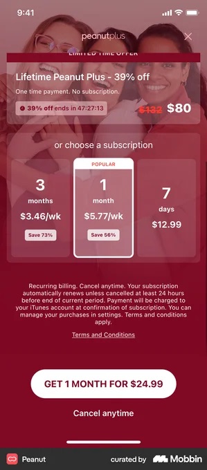
Four turned up across the whole Brewed in Pixels paywall collection, FocusFlight, Placify, Peanut and Pillow, and that collection was built by searching for patterns, so it over-represents them badly. The useful part is where all four put the clock: not on a first paywall, but on a discount offer.
Peanut runs a 39%-off lifetime deal above its subscription list, timed at “39% off ends in 47:27:13” a two-day clock, not a two-minute one. FocusFlight’s is a −58% coupon filed under the second offer, with “Expires In” over a 59:52 flip clock.
Pillow · the one countdown here that says what happens afterwards
A LIMITED-TIME OFFER band sits over −25% for one year. SGD 29,98, with SGD 39,98 struck through beneath it. A clock reads “Special offer expires in: 23h 59m 58s”, and a plain “No, thanks” sits under the button.
Then the footer of the same screen states the renewal: after the first year the annual cost is SGD 39,98.
Every part of the deal can be checked here: a real deadline, the price it is struck from, and the price charged once the year ends. Remove any one of those three and you have the timer everybody else ships, the one that reads as pressure.
So if your paywall has no countdown timer, you are with at least 98.6% of apps in every category. That is the standard, not a gap.
And because they are so rare, a clock on a first paywall reads as a tactic rather than as a deadline. Which is presumably why the apps that do run one save it for the offer after a no.
Text density
Most paywalls are text-heavy. High text density, information-rich, explanation-forward copy, accounts for 45–63% of paywalls across categories. Gaming leads at 63%, 18 points above Shopping at 45%. Photo & Video is the exception at the other end: it uses the most low-density, visual-forward paywalls at 27%, twice Gaming’s 13%.
Yes, I am a designer telling you to put more text on the screen. I know how that sounds. Look at the number again.
It runs counter to the standard advice to keep a paywall minimal. Telegram’s eight-row feature sheet and Tide Guide’s ten-row free-versus-pro grid are what high density looks like in practice. Not clutter. Answers to questions the user would otherwise have to guess at.
The low-density end is where the product is the picture. VSCO runs Yearly and Monthly as text tabs over a full-bleed photograph, which is the Photo & Video pattern showing up in the numbers.
Weverse · the densest end of the scale
The whole subscription notice is rendered on the paywall itself, scrollable, ending in one checkbox and a Start Subscription button. The tick reads:
“I have reviewed all the precautions and agree to the terms and a monthly subscription with recurring Jelly purchases.”
Nothing sits behind a link, and nothing is summarised.
Sometimes the law demands this. Sometimes the terms genuinely hold something the buyer needs, like refund rules that a link would bury.
But a wall of text nobody reads buys you the paperwork and none of the trust. You already know which of those two yours is.
CTA language
The most common call-to-action button text across all apps: “Continue.” “Subscribe” and “Start Free Trial” follow, with “Try Free” close behind. “Cancel Anytime” appears clearly alongside the primary button rather than on it.
“Continue” makes sense behaviourally. It implies the user is already on a journey: they’re not making a new decision, they’re taking the next step. It is also, as Gauchet notes, slightly ambiguous, which is part of why it converts.
One caveat from my own reading, and it is an observation rather than a counter-statistic. I transcribed paywall copy off real screens for the Brewed in Pixels teardown, and the primary buttons were dominated by trial language. Headspace’s “Start my free trial”. Mimo’s “Start my 14-day free trial”. Vocabulary’s “Start 3-day free trial now”. Deepstash’s “I’m ready”.
Bare “Continue” barely showed up; the closest were Vivid’s “Continue and pay” and Rocket Money’s “Agree & Continue”. That sample was hand-picked for trial mechanics, not sampled randomly, so it cannot contradict the benchmark. What it suggests is narrower: once an app leads with a trial, the button usually names the trial.
Uber Eats · the button names the membership, not the payment
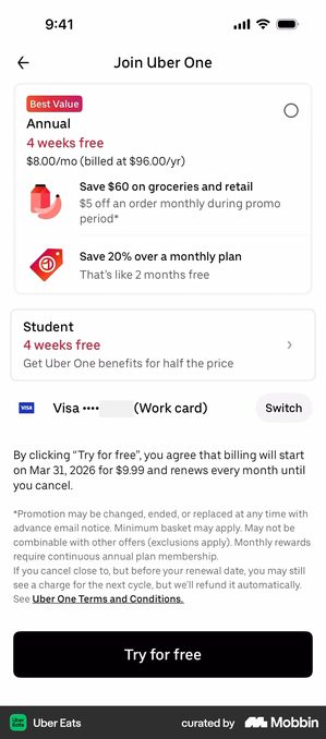
On the membership pitch the primary button reads “Join Uber One”. Not Continue, not Subscribe: it names the thing you are joining. Blue Apron makes the same move in a different aisle with “Subscribe & select meals”, which names the next action rather than the charge.
Worth knowing it does not hold for the whole flow. The plan-selection screen that follows, headed “Join Uber One”, puts “Try for free” on the same black button. The naming move is made once, at the pitch.
All of which needs a membership name the user already knows from outside the app. Uber One has been advertised at them for years. On a product nobody has heard of, your tier name is one more word to decode before they can decide.
The first offer isn’t the last
Even with a hard paywall, the model that converts best, the median app turns 10.7% of downloads into paid subscriptions within 35 days. Nine in ten don’t. For freemium the median is 2.1%.
Silence is not a no.
Marcus Burke, an independent Meta ads advisor, argues that broad ad targeting brings in wildly different levels of intent, so one price point is a contradiction. What works is a ladder of paywalls rather than a single screen:
- a higher-priced first offer for people who arrived ready to buy;
- a multi-plan trial paywall where most conversions land;
- and a discounted follow-up at the end of onboarding for the lowest-intent users.
He judges the whole thing on revenue per new user, not on the conversion rate, the share of viewers who buy, of any one screen.
The second offers I have transcribed off real screens nearly all do one of two things: cut the price, or shrink the commitment. Headspace asks “Would 50% off help?”. Blinkist asks “Would a discount help?” above a 40% badge. Deepstash offers a year for the price of four months.
Bloom names the objection out loud, it acknowledges that $15 a month can feel expensive and offers the same features at $5. What none of the good ones do is repeat the first screen louder.
Sunlitt · a deadline with no clock on it
The second offer reads “ONE-TIME OFFER — Save 50% on your first year. Close this page, and it’s gone forever.” There is no timer anywhere on the screen. The deadline is the dismissal itself.
Only say this if it is true and the offer genuinely never comes back. Show the same screen next session and you have taught the user that saying no is how you get a discount.
Hard paywall vs. freemium: what the data says
| Measure | Median |
|---|---|
| Hard paywall, download-to-paid by day 35 | 10.7% |
| Freemium, download-to-paid by day 35 | 2.1% |
| Freemium conversions happening 6+ weeks after download | 23% |
| Trial-to-paid, trials of 17–32 days | 42.5% |
| Trial-to-paid, trials of 5–9 days | 37.4% |
| Trial-to-paid, trials of 4 days or shorter | 25.5% |
| Share of 3-day trial cancellations landing on day 0 | 55.4% |
| Share of 7-day trial cancellations landing on day 0 | 39.8% |
Before designing the paywall, the bigger decision is when to show it. Hard paywalls convert about 5× better than freemium at download, a 10.7% median versus 2.1% download-to-paid by day 35. The spread matters as much as the median. Hard-paywall apps run from 4.2% to 38.7%, freemium from 0.3% to 8.2%. Which says execution matters more than the model does.
The convergence is usually mis-told. What equalises after a year is not conversion but retention. At twelve months, 28% of freemium subscribers on yearly plans are still there against 27% for hard paywalls, a gap RevenueCat calls noise.
Freemium’s real difference is timing. 23% of its conversions do not happen until six or more weeks after download, so a day-7 report on ad spend will undercount it every time.
The direct design implication: if you use a hard paywall, it’s your first and sometimes only chance to convince, so it needs to be solid. If you use freemium, the paywall a late converter sees in week seven should not be the one they saw in session one, by then they know the product.
Trial length changes everything
If you offer a free trial, duration matters more than most founders realise. Trials of 17–32 days convert at a 42.5% median; trials of 4 days or less convert at 25.5%. RevenueCat frames that as 70% better, about 1.7×, or roughly 17 percentage points at the median.
The 5–9 day bucket sits at 37.4% and the report calls it the sweet spot. You can see the whole span on shipped screens: foodpanda gives 90 days, Strava 30, Headspace and Kitchen Stories 14, Hypelist 3. Despite all of it, short trials are gaining share: trials of four days or less now account for 46.5% of all trials, up from 42.1% the year before.
The most revealing figure is not about length at all. 55.4% of the cancellations on a 3-day trial land on Day 0, the same day the trial started. 84% land on Day 0 or Day 1. On a 7-day trial the Day 0 share is 39.8%.
Read that carefully: it is the share of cancellations, not the share of trial users. Of the people who do cancel, over half never wait to use anything.
That is not a trial-length problem. It is a paywall-moment problem: the screen didn’t convince them, so they hedged, started the trial and immediately switched off the renewal. No trial duration fixes that.
What this means for your paywall
Your paywall doesn’t need to be creative to convert. The baseline that works is scrollable, two plans, the one you want chosen visually highlighted, a feature list, a specific cancel assurance, and a “Continue” or trial-named button. That is the floor, and most of the market is standing on it.
The variation that actually moves conversion comes down to two things. The copy, meaning whether the recommended plan feels like the obvious choice for this particular user. And what happens before the paywall.
Daphne Tideman, who advises subscription apps on pricing and positioning, puts it flatly: what happens before the paywall matters more than the paywall itself. So do not optimise the design before you fix the timing.
From our work · Travel Diaries
The Travel Diaries paywall we designed (August to September 2025) sits close to these benchmarks on purpose. It is a hard paywall using a horizontal scrollable layout that walks through the key features, rather than a single static screen.
We cut the number of plans and made the benefits clearer. We put the trial first, so payment details are entered up front. And we moved sign-up to the end, so nothing blocked the user before they had seen the value.
Nothing about the paywall itself is unusual, and that is the point. The gain came from the order of the flow around it, not from an inventive pricing screen.
Benchmark quick reference
- Scrollable layout, 59–76% of paywalls (standard; Travel highest at 76%)
- Two-plan structure, 41–60% (dominant; Health & Fitness highest at 60%)
- Annual plan shown, 28–44% (Health & Fitness leads at 44%)
- Highlighted pricing, 74.5% median (tight spread, 72.6–77.0%)
- Multiple plan options, 59.2% median
- Feature list, 57.0% median
- Free trial messaging, 54.0% median
- Discount badge, 42.5% median
- Cancel assurance (“cancel anytime”), 35.9% median
- Countdown timer, 0.8% median, and no category above 1.4% (and where one appears, it is on a discount offer)
- Progress bar, 0.1% median, and no category above 0.2%
- High text density, 45–63% of paywalls (Gaming leads at 63%)
- Hard paywall converts about 5× better than freemium by day 35 (10.7% vs. 2.1% median)
- Trials of 17–32 days convert at a 42.5% median vs. 25.5% for trials of 4 days or less
- 55.4% of 3-day trial cancellations land on Day 0
Got questions? I’ve got answers
How many plans should a paywall show?
Two is the norm, appearing on 41 to 60% of paywalls across categories, with Health & Fitness highest at 60%. Three or more plans appear on only 6 to 27%, so it is genuinely the minority position. What moves conversion is less the number of plans than which plan the user meets first.
Should my paywall be scrollable?
Most are: between 59 and 76% depending on category, with Travel highest at 76%. A scrollable layout lets an undecided user explore the value at their own pace instead of feeling blocked by a single static screen.
Should I use a countdown timer on my paywall?
Almost no legitimate app does. In RevenueCat’s 2026 data no category tops 1.4% of paywalls for countdown timers or 0.2% for progress bars; the median category sits below 1%. The few that use one, such as Peanut and FocusFlight, attach it to a discount offer rather than to a first paywall. Because they are so rare, users tend to read them as a pressure tactic rather than a genuine offer.