Post-Paywall Onboarding: Your App Isn’t Done After the Sale
Somebody just paid you. The confetti fires, the number on your dashboard goes up by one, and it genuinely feels great.
Then they open the app and land on… the normal home screen. Same as the free users. Nothing acknowledges what just happened.
I have shipped that screen. It is not laziness, it is that the paywall takes all the attention during a build and the session after it takes none.
But that session is where you lose them. 55.4% of all 3-day trial cancellations happen on day zero, the same day the person signed up. They did not try your app for three days and decide against it. They decided in the first few minutes after paying.
Yes, I am making a drama out of one number. Trust me, this one earns it.
So the paywall is not the finish line. What happens after conversion is where the real work sits.
So you are probably getting this wrong in the ordinary way: you built a paywall and then let the app behave as though nothing happened on the other side of it. I did exactly that, and the number above is what it costs.
What follows: the eleven onboarding paywalls in my teardown file, the one trick ten of them share, and the two different screens you owe two different people. The buyer, and the one who said no.
In short
- Ten of the eleven paywalls I found at the end of an onboarding flow use the same trick: a vertical timeline of three or four dated steps, today, a reminder day, a charge day.
- Several of those timelines count the onboarding itself as step one, so the paywall stops being a new screen and becomes the next step of something already underway.
- Day 0 is where the decision is made. 55.4% of all 3-day trial cancellations and 39.8% of all 7-day cancellations land there, and so do 50.6% of download-to-paid conversions.
- The screen after the paywall is two designs and not one: the session the buyer gets, and the place the person who declined lands. Ten onboarding paywalls were easy to find, an explicit way to decline only filled to six.
- Personalisation is usually stock before the payment, so nothing after it feels tailored either. Of eleven personalised results screens, only three were clearly computed from the user’s own answers.
Why the post-paywall experience matters
The moment someone pays for your app, their expectations change. Before paying, they were curious. After paying, they’re expecting to be impressed. The gap between what they imagined and what they experience in the first session after payment is where most churn is born.
For trial users the window is narrower than it sounds.
RevenueCat’s State of Subscription Apps 2026, across 115,000+ apps, breaks trial cancellations down by the day they land:
- 55.4% of all 3-day trial cancellations happen on Day 0
- 39.8% of all 7-day trial cancellations happen on Day 0
- 84% of 3-day and 64% of 7-day cancellations happen between Day 0 and Day 1
Read that again. Most people who quit a trial quit it on the day they started it. They never came back for day two.
Those are shares of the cancellations, not of everyone who started a trial, but the shape is unambiguous. The decision to leave is mostly made in the install sitting, not at the end of the trial.
What post-paywall onboarding actually means
It’s the experience from the moment someone becomes a paying user (or starts a trial) to the moment they’ve had their first “this was worth it” confirmation.
That moment looks different for every app, and the apps in my onboarding teardown mark it in very different ways. Evernote makes it work the user does, “What are three things on your to-do list today?”, three rows, before the app opens. pliability waits until a session has actually been finished and then names it.
Liven marks the first check-in and uses the moment to state the rule the habit runs on: “Your first check-in is done! Once a day is enough.” Chase UK gives the moment one button and one job, “Tap the button below to activate your card. It only takes a few seconds, so don’t go anywhere.”
Until that moment happens, the user is still undecided. They paid, but they’re not yet convinced.
What to do differently after the paywall
Don’t stop personalizing
Most apps do personalization in onboarding and then go generic once the user is inside. Often it was never real to begin with. Searching my teardown for personalised results screens returned eleven, and only three were clearly computed from the user’s own answers. MyFitnessPal draws the weight curve from the numbers just typed, 70.0 kg now, 75.0 kg by August, and a slider above it redraws the line.
Speak answers with a sentence instead of a chart: “In two months, you’ll be able to communicate while traveling in France”, built from the language and the goal the user gave.
The other eight are stock. Wealthfront shows “$1.3M net worth at 65” before it has asked anything at all. Liven and Me+ ship near-identical happiness curves and both cite the same 86% figure, which is the sharpest evidence in the set that these charts are artwork rather than arithmetic.
That matters here because the premium experience is where the bill comes due: if the reveal before payment was stock, nothing after it will feel more tailored either. Use what they told you in onboarding to shape their first week.
Celebrate the first completion
Whatever your core action is, first session, first task, first booking, treat it as a win, but only once it has actually happened. The distinction matters more than the celebration does, and it is the one thing I would not let slide. pliability fires after a session was completed and names the user.
Liven fires after the first check-in and uses the moment to set the rule:
“Once a day is enough — one log per day is sufficient for your daily routine completion.”
That is a nice thing to be told. It stops you worrying you are doing it wrong.
Binance goes the other way and turns the first post into a points task: “Newbie tasks · Create your first post +5 points”. Which works exactly as long as the points are worth something.
Liven · a celebration that also sets the rule
After the first log: “Your first check-in is done!” over a part-filled ring. Then a second heading, “Once a day is enough”, and under it:
“One log per day is sufficient for your daily routine completion. It will help you build a habit of using this great tool.”
Spending the celebration on the rule tells the user what counts as active, which most teams decide internally and never say out loud. Then make sure your notifications agree with it. An app that says once a day is enough and then pushes three times has contradicted itself in writing, on the one screen the user remembers because it was the nice one.
Send a well-timed push or email
The 24–48 hours after conversion is the highest-leverage window for a message. Not a generic “welcome” email. Something that shows what’s available now that they’re subscribed. Or a reminder of the goal they set in onboarding: “You said you want to lose 10 pounds. Here’s how we’ll start.”
Keep the first session inside the app short and successful
Long onboarding tours inside the app are a mistake after payment. The user wants to use it, not learn about it. One clear path to one clear value moment. Let them explore after they’ve had the win.
pushr ends setup with one sentence and two buttons, “setup complete — let’s get into action by starting your first workout”, with later next to start workout. One action, and a way to not do it today. Evernote’s version of the same screen greys out its Create tasks button until something is typed and keeps Skip in the top right: the button is disabled, the exit is not.
That is the shape to copy, a single action that is easy to take and easy to postpone, rather than a tour that has to be sat through.
Chase UK · one button, one job
An illustration of a card and a phone. The heading “Great, get ready”. One instruction: “Tap the button below to activate your card”. One line managing the wait: “It only takes a few seconds, so don’t go anywhere”. One blue Activate card button.
Nothing else. No menu, no upsell, no tour.
The outcome is a fact rather than an impression. The card either works afterwards or it does not, and there is nothing for the user to interpret. Use the same shape for something nobody can check and it falls apart. A lone button reading Get started looks identical and proves nothing, and the user finds that out one screen later.
Set expectations for the full arc
Especially for habit-based apps, users need to know that results take time.
The apps in my onboarding teardown do this on the way in, not on the way out.
Ten of the eleven paywalls I found at the end of an onboarding flow use the same trick: a vertical timeline of three or four dated steps. Today. A reminder day. A charge day.
Ten out of eleven, across categories that have nothing to do with each other. The wording barely changes.
The detail worth stealing is that several of them count the onboarding itself as step one. Babbel strikes through “Install the app” as done before listing “Today, free trial starts · Mar 26, trial reminder · Mar 27, become member”. Deepstash does it with the profile the user just made: “Install Deepstash ✓ You’ve created your profile successfully.”
The paywall stops being a new screen and becomes the next step of something already underway.
Around them, the same trick carries different jobs:
- Strava puts a specific unlock list under a 30-day version of it.
- Headway runs three dated steps with no price above the fold.
- Kitchen Stories names the exact billing date.
- Nibble makes cancelling in advance step three of the sequence, and Hypelist promises it “in just 2 taps”.
- Bloom answers the objection the timeline just raised, in plain type, with a refund promise.
Mimo does not close the flow at all, the onboarding progress bar is still running along the top of its paywall.
Strava · the anxiety first, then the value
Strava runs a 30-day version of the timeline and puts a specific unlock list underneath it: training plans, coaching, predicted finish times. The order is the whole design. The timeline answers “when am I charged”, the list answers “what do I get”, and the second question is not put to the user until the first one has been settled.
Make the unlock list concrete and tie it to the goal the user gave you earlier. Generic benefits in that slot are wasted. Named features tied to their own answers are not. Watch the length though: push the price off the bottom of the screen and they have to hunt for it, and hunting for a price turns a considered yes into a suspicious no.
All of that happens before the charge. Nothing stops you from repeating the timeline on the other side of the payment, where it becomes a plan rather than a disclosure.
Day zero is the whole game
I have seen the claim that subscription apps average 25–26% day-one retention repeated in a lot of places, including an earlier version of this article. I could not find it in any source I am willing to stand behind, so it is gone.
What the RevenueCat data does say is narrower and more useful: 50.6% of all download-to-paid conversions happen on Day 0, 71.9% in Productivity, and only 28.5% in Education. Trial starts cluster there. So do trial cancellations.
Hannah Parvaz, founder of the growth agency Aperture, draws the conclusion in that same report. Onboarding matters far more than most teams treat it, and a paywall arriving before any context has been built feels jarring.
Her line: “if you want to make money in 2026, start with Day 0”.
The question to ask is: what happens in the first session after someone pays? Walk through it yourself. Time it. Count the decisions. Find the friction.
What the big apps actually do at the handoff
By day 35, the median freemium app, meaning one you can use for free and pay to unlock more, has turned 2.1% of its downloads into paying subscribers. The median hard-paywall app manages 10.7%, on far fewer users.
(RevenueCat, State of Subscription Apps 2026, 115,000+ apps.)
So almost everyone who meets your paywall walks straight past it. Which means the screen after the paywall is really two designs, not one.
One for the person who paid. One for the person who said no. They are not the same person and they should not get the same screen.
For my onboarding teardown I went looking for the paywalls that sit at the end of an onboarding flow, and then for the ways out of them. The first gallery filled to ten without effort. The second, an explicit, readable way to decline, only filled to six. That gap is the finding. Most flows offer a small close cross and hope.
Even inside that short list, the exit is usually parked somewhere nobody will read it. I recorded Copilot Money’s skip sitting in a row of small links, and Tide Guide’s as a pill at the top of the screen, away from the buttons.
Universe is the only one that solves it structurally, “free forever” is listed as a plan alongside the paid ones, so declining is choosing an option rather than escaping the screen. Three of the six treat the decline as a design decision. The other three treat it as a leak.
Universe · the free tier as a plan rather than an escape
The plan list ends on a third card built exactly like the paid ones. The badge reads Free, the price reads “Free forever”, the description names what you actually get, “Build a site all from your device using the GRID and get a univer.se subdomain”, and the button reads Continue. The card above it carries an orange Subscribe at $699.98 a year.
Structuring the decline as a plan means the person who said no has chosen something rather than escaped something. That is a far better state to walk into your app in, and it costs one card.
Feeld · the exit at the same size as the entrance
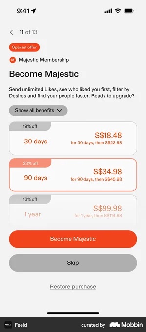
Skip is a full-width grey button sitting directly under the orange Become Majestic. Same shape, same width, lower contrast. The paywall itself is numbered “11 of 13”, so declining is a step in the flow rather than an escape from it.
This needs a free product that is genuinely usable, and a preference for trial takers who meant it. If your free tier is really a demo, a prominent exit into a dead app produces installs that leave on day one, and that hurts your ranking more than a harder paywall would.
Monarch · the decline written as a loss
The way out is phrased as forfeiting something: or continue in-app without additional discount. Saying no is described as giving something up rather than as choosing the free path.
If the discount is real and time-limited, the sentence is simply accurate. Run that discount again next session and the people who declined once learn the urgency was invented, and that lesson spreads to every price you show them afterwards.
timespent takes the opposite route and writes the free tier out as a promise instead of a button: “meaningful free tier · no dark patterns · clean, minimal design”. It holds up for exactly as long as the app is small enough for the developer’s voice to be credible.
pliability · a celebration that reports something that happened
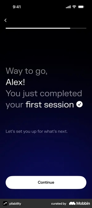
“Way to go, Alex! You just completed your first session ✓ Let’s set you up for what’s next.” Named, and in the past tense. The aha is reported, not forecast.
The whole pattern rests on one constraint: the first session has to be short enough to finish in the install sitting. And it backfires the moment the celebration fires for something trivial, congratulating a user for tapping Next is the cheapest way to make every later celebration worthless.
Revolut Business · the checklist where the first action should be
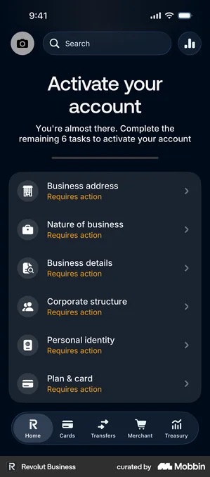
Instead of doing one thing, the user is handed a list: “You’re almost there. Complete the remaining 6 tasks to activate your account”, with all six rows reading Requires action. Deel and Peanut do the same with a completion percentage.
Right when the tasks are genuinely required by law and a list beats discovering the blockers one at a time. Wrong when a checklist is standing in for a first action. A percentage bar is not an aha moment. It turns your product into homework, and homework gets postponed to a tomorrow that does not arrive.
Two of those screens sit inside onboarding rather than after a payment, which is exactly the point. The decision is the same on either side of the gate: report a thing the user did, or hand them a list of things they have not done yet. Paying does not change which of those feels like progress.
And a dismissal is information, not a verdict. It usually means the offer was wrong for that moment, not that the user will never pay.
Checklist
- First session after payment has one clear, short path to a value moment
- Personalization from onboarding is real (computed from their answers, not stock artwork) and carries into the premium experience
- First completion is acknowledged only after it has actually happened, and named
- Push/email sent within 24–48 hours of conversion referencing user’s stated goal
- Long-arc expectation is set for habit-based apps (“your 30-day plan”)
- Day 0 and Day 1 behaviour after payment is measured, not assumed
- The person who declined lands somewhere usable, via an exit they can actually see
Got questions? I’ve got answers
What is post-paywall onboarding?
Everything the user sees after they pay or dismiss the paywall, up to their first real use of the product. It is two designs, not one: the session the buyer gets, and the screen the person who declined lands on. RevenueCat’s State of Subscription Apps 2026 puts 55.4% of all 3-day trial cancellations and 39.8% of all 7-day trial cancellations on Day 0, so the first session is where the subscription is actually decided.
What should happen immediately after someone subscribes?
Deliver the thing the paywall promised, then let the user do something real and say so. pliability’s screen reports a session that actually happened, “Way to go, Alex! You just completed your first session” rather than congratulating a tap, and Liven uses the same moment to set the rule the habit runs on: “Once a day is enough.” Revolut Business does the opposite: it opens on a home screen listing six remaining tasks before the account works, which turns the product into homework.
What should happen when someone dismisses the paywall?
Let them decline in a way they can see, and land them somewhere usable. Feeld puts a full-width grey Skip directly under the subscribe button, same shape, same width, lower contrast; Universe skips the button entirely and lists “free forever” as a plan alongside the paid ones. That is the minority choice: in my onboarding teardown the gallery of end-of-onboarding paywalls filled to ten, and the gallery of readable ways out only filled to six. Most offer a small close cross.