The Emotional Triggers Behind Paywalls That Actually Convert
You are one tap away from closing a paywall. Then you notice a line at the bottom: “Offer ends in 09:58.”
And you pause. Just for half a second.
That half second is what this article is about.
Every paywall that works is doing something to how you feel. Nobody argues with that part. The arguing starts with the tidy list of psychology rules that gets passed around with it:
- Loss aversion. Losing €10 is supposed to hurt more than finding €10 feels nice.
- Anchoring. The first price you see changes how every price after it feels.
- Scarcity. Things feel more valuable when there are not many left.
- Social proof. If other people bought it, it is probably fine.
You will see these quoted like laws of physics. Fixed numbers you can dial in.
They are not. Several of them are still being argued about by the researchers who found them in the first place. And here is the part nobody mentions: none of them were measured on a paywall. They come from laboratory experiments, often with students and gambling chips.
I am not telling you to ignore psychology. I am telling you that “studies show” is doing a lot of lifting in most articles about this, mine included until I checked.
So this one is built the other way round. Every example below is a line I read off a real paywall, with the app named. Where there is industry data I cite it and say what it actually counts. Where something is my opinion, I say so.
In short
- The tidy list of behavioural-psychology laws is shakier than it looks: the 2.25 loss-aversion coefficient comes from laboratory gambles, and whether losses generally loom larger has been argued back and forth in the Journal of Consumer Psychology since 2018.
- Countdown timers are rare rather than standard: across 115,000+ apps RevenueCat counts them on no more than 1.4% of paywalls in any category, and testimonials on 5.9% to 16.9%.
- The screens worth copying make every number checkable: Pillow strikes SGD 39,98 to SGD 29,98, exactly the 25% it advertises, while Cal AI’s badge promising 80% off sits above a cut of 33% against the price on the screen.
- Nine second-offer and save lines are on file and almost all lead with a discount: only Oportun’s names the thing the user would be walking away from.
- Reassurance is the trigger nobody counts: Deepstash puts cancelling at fifteen seconds and Hypelist at two taps, and those are promises the cancellation flow has to keep.
Urgency
Pillow, a sleep app, runs the textbook version. Above the plans:
LIMITED-TIME OFFER — −25% discount for one year · Special offer expires in: 23h 59m 58s

Here is the part that surprised me. A countdown is not a common paywall element: it is a rare one. In RevenueCat’s State of Subscription Apps 2026, measured across 115,000+ apps, countdown timers appear on no more than 1.4% of paywalls in any category, and on 0.0% in Shopping.
Progress bars top out at 0.2%. If you are adding a timer because you assume everyone has one, they do not.
Peanut · the deadline whose arithmetic closes
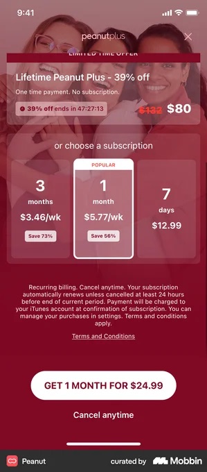
Peanut is the other countdown in my file and the more instructive one, because every number on the screen reconciles against another number on the same screen. The offer reads “Lifetime Peanut Plus – 39% off” with “One time payment. No subscription.” under it, $132 struck through to $80, and $52 off $132 is 39.4%.
Below that, three subscription cards quote a weekly rate: 3 months at $3.46/wk badged “Save 73%”, 1 month badged POPULAR at $5.77/wk and “Save 56%”, 7 days at $12.99. Both percentages are measured against that $12.99, which is printed beside them. The button, “GET 1 MONTH FOR $24.99”, is $5.77 × 4.33.
The clock is at least a live one. Two Mobbin captures of this paywall read 47:27:34 and 47:27:13, twenty-one seconds apart. That is not proof it never restarts, no screenshot can show that, but it does tell you the timer is running rather than being a static graphic.
The cheap version of urgency drops the clock and keeps the finality. Sunlitt’s second offer reads:
ONE-TIME OFFER — Save 50% on your first year. Close this page, and it’s gone forever.
That is a deadline made of one action rather than a number counting down. It costs nothing to build, and it is honest exactly as long as closing the page really does end the offer.
The ethical line
A deadline is fair when the thing on the other side of it is real and stated. Pillow states it: the small print names the renewal price. A single screenshot cannot tell you whether a timer resets, so nobody here is being accused of anything.
What you can check on your own app is whether the price genuinely changes when the clock hits zero, or when the page is closed. If it does not, you have written a lie into your interface, and the reviews are where it shows up.
Loss aversion
The claim usually attached to this heading is that losses hurt about twice as much as the same size of gain feels good.
That number is real in the sense that it has a source. A loss-aversion coefficient of about 2.25, estimated by Tversky and Kahneman in their 1992 cumulative prospect theory paper, from laboratory gambles.
It is also contested, and openly. Gal and Rucker argued in the Journal of Consumer Psychology in 2018 that the evidence does not support a general tendency for losses to loom larger.
Mrkva and colleagues replied in the same journal in 2020: loss aversion has conditions attached, but it is not dead. That argument is still running.
That argument is still open, it was conducted over gambles rather than subscriptions, and it is not the basis on which I would design a paywall.
What the screens actually do
Loss framing is real as a design practice, and the clearest instances I transcribed sit at cancellation rather than on the first paywall. Oportun’s save offer reads:
Stay with Oportun – free for 3 months! Don’t pause your progress.
That is the shape worth copying. Name the specific thing the user built, not “premium features”.
And it is why the structural advice holds even without the psychology. If onboarding lets somebody set a goal, save a preference or log one entry before the ask, the sentence writes itself. If they have built nothing, there is nothing to name.
It is also worth counting how rare that shape is. My copy bank holds nine second-offer and save lines, and every one of them leads with a price move:
“Would 50% off help? Stick with Headspace to get 50% off your subscription for the next year.” — Headspace
“Would a discount help? 40% OFF” — Blinkist
“How about a little boost? Get 1 year by paying for just 4 months.” — Deepstash
“We know $15 / month can feel a bit expensive… The same features, for just $5 / Month.”— Bloom
“One last chance offer. While we work to make Future right for you, we’re happy to offer you a membership at a reduced rate.” — Future Pro
Oportun’s is the only one that also names what the person would be walking away from. If loss framing were the dependable lever the psychology implies, you would expect to see more of it at the exact moment someone is about to lose something. What you mostly see is a discount.
Vocabulary · loss framing with no offer attached to it
This one is missing from the nine lines above for a simple reason. It has no price in it to transcribe.
“Don’t lose what you’ve achieved with Premium” sits over “If you cancel, you’ll lose access to:” and a four-item card: backup and sync between devices, unlimited Premium content, streak progress, settings and subscription.
The save button reads “Keep my data safe”, with “Proceed with cancellation” as plain text beneath it.
If the user really has built up those four things, the card is a statement of fact rather than an argument. Now picture someone two weeks in, no streak, nothing synced. They read the same list as a guilt trip, and they leave a review on the way out.
Social proof
Here is what proof actually says on real paywalls, transcribed:
“Join over 1,000,000 users! Become porn free and regain control over your life.” · QUITTR
“Join a community of 30+ million learners” · Nibble
“150+ million runners, walkers, and other active people on Strava are excited to move with you.” · Strava
“See why over 1 million members trust us” · Thrive Market
Notice what none of them do. The advice you usually read is that a precise count, “3,247,891 users” feels more real than a round one. Not one paywall in my file does that. They all round, and they all round up, with an “over” or a plus sign doing the work.
Where precision does show up is the review count, because a review count is a number somebody else is holding. Moonly shows “31,000 REVIEWS”, Runna “30,000+ reviews”, QUITTR “4.8 · Based on 140K+ users”.
Which makes sense. A rounded user count is a claim. An exact review count is a citation.
One caveat on the citation half of that. TIDE ships at least two versions of the same proof block.
Both round the user count identically: “30,000,000+ · Trusted Choice of Users”. But one pair of laurels reads “130K RATING” and “3M+ Downloads”, and the other reads “165K+ · 5 STARS” and “4.9 · 18K RATING”. Somebody is going to notice.
I am not going to guess which is current, and the two captures sell different plans, so this may simply be two moments in time. It is still the useful lesson: an exact number reads as a citation only while there is one of it.
The other failure mode is the quote that says nothing. Copilot Money puts a five-star review on its paywall reading “Simply the best — This is by far the best budgeting/financial app I have ever used”. Set that beside BitePal’s, further down this page: a named person, a flag, a photo, 67 kg to 62 kg in one month.
Same slot, same cost to build, and only one of them tells the reader something they could not have guessed was there.
The second thing worth knowing is how uncommon this is. In the same RevenueCat report, testimonials are the rarest element it counts on a paywall: 16.9% of Shopping paywalls at the top, 5.9% of Photo & Video at the bottom.
Set that against highlighted pricing at a 74.5% median. Proof is the element most of your competitors have skipped.
That is my argument for using it, and it is a judgement about where the room is, not a measured lift.
Reassurance, the trigger nobody counts
The word “trigger” makes people reach for pressure. On the screens I transcribed, the most repeated wording on any paywall is not pressure at all: it is the sentence saying nothing bad happens today. RevenueCat counts cancel assurance on 25.0–39.5% of paywalls depending on category: commoner than a testimonial, rarer than a discount badge.
It does two separate jobs, and they are worded very differently. The first is stating what is charged today:
“You won’t be charged anything today” — Vocabulary
“No payment now, just full access to the Premium experience” — Headway
“No charges yet. Cancel anytime on the App Store.” — Mimo
“You won’t be charged until Jul 1. Cancel any time up to 24hrs before your trial ends.” · Strava
Headway · the reassurance placed first, not last
The line “No payment now, just full access to the Premium experience” is not a footnote under the button. It is the first row of the trial timeline, so the answer to “what happens if I tap this” arrives before the price does.
Only if nothing else on the screen contradicts it. No card field, no billed-today line further down. Ask for payment details on the very next screen and the whole timeline stops being believed.
The second is making cancelling sound survivable. The good ones quantify the effort instead of promising it is easy:
“Cancel anytime in 15 seconds” — Deepstash
“Cancel anytime before, in just 2 taps” — Hypelist
“Forget to cancel? No problem. Get a full refund, no questions asked.” — Bloom
“RISK-FREE: Cancel within 30 days for a full refund” · Thrive Market
Deepstash’s fifteen seconds and Hypelist’s two taps answer the question the reader is actually asking. Not am I allowed to cancel, but how much of my evening will this take.
Bloom goes one further and absorbs the mistake people are most afraid of making. None of these needs a designer. They need somebody to write the sentence.
The catch is that they are promises, and the same rule applies here as everywhere else on the page: fifteen seconds has to be fifteen seconds. If your cancellation flow is four screens and a survey, do not print a number.
Wolt Delivery · the consent tick that records rather than gates
The saved card and the line stating the charge will be €0 sit inline with the plan, above a full paragraph of renewal terms and an agreement box. The box arrives empty, and the trial button is already live before it is ticked.
As reassurance it is good: the zero sits on the same line as the card, which is where a user looks for a total. As consent it is weak. A box that gates nothing records an agreement rather than creating one.
Anchoring
The usual framing is: show the expensive plan first so the cheap one feels reasonable. What Duolingo does is more interesting. It removes the comparison entirely and prices the upgrade as a difference.
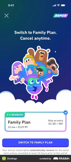
That is the honest version of the move: the small number is true, and the big number is still on screen. The dishonest version shows the $2.00 and hides the $119.99.
The struck anchor, and its arithmetic
The other common form is a struck-through price, and the only test worth applying is whether it reconciles against a number on the same screen. Three worked examples:
- Pillow strikes SGD 39,98 down to SGD 29,98, exactly the −25% it advertises.
- Coffee Meets Bagel lists 1 month at $49.98 with no anchor at all, 3 months badged POPULAR at $150 struck to $99.98, and 6 months at $301 struck to $179.98, with a per-day figure under each. The $150 is not invented: three months at its own monthly rate is $149.94. The anchor is the app’s own price for the same period, which is the version a reader can check with the screen still open.
- Cal AI is where it gets slippery. A badge reading “80% OFF FOREVER” sits directly above a struck-through $29.99, while the plan actually being sold is 12 mo · $19.99. That is a 33% cut against the price on the screen; the 80% is measured against a number the reader never sees.
Thrive Market · an anchor that shows its assumptions
No struck price and no percentage. The claim is “Save up to $384 a year!”, and the sentence under it states what it rests on:
“Based on ordering once every two weeks, and average member savings of $32 an order. Savings may vary.”
Now run it. Once every two weeks is 26 orders. 26 at $32 is $832. The $384 would be twelve orders, which is monthly, not fortnightly.
So the working is on the screen, which is more than almost anybody else does, and it still does not reach the figure above it. The headline is the smaller number, so nobody is being oversold. But if you are going to show your arithmetic, somebody will follow it, and it has to land where you said.
The reader can disagree with the assumption instead of with you. A monthly shopper halves the figure themselves and still trusts it. That stops working when the assumed behaviour is nothing like a real customer’s, because then the small print is doing the job the headline should have done.
The decoy
A middle plan priced so the target looks obvious is a framing move, not a trick, as long as the middle plan is genuinely purchasable. Spotify’s Duo sits between Individual and Family and is a real product two people actually buy.
Duolingo builds the same effect out of a label rather than a price. Its plan chooser puts the two twelve-month plans under a rule reading “7 DAY FREE TRIAL”: Family at $9.99/MO (12 mo · $119.99), and Individual, badged MOST POPULAR, at $7.99/MO (12 mo · $95.99).
Monthly goes under a second rule reading “NO FREE TRIAL”, at $13.99/MO.
The button underneath says “START MY FREE WEEK”. Monthly is not hidden, it is labelled, and the label is a claim you could test by trying to buy it.
Peanut does the same job with a number rather than a rule. Its 7-day plan at $12.99 a week is what makes $5.77 a week look sane, and it is the figure both savings badges are measured against.
Worth knowing before you build one: three-plan layouts are the minority. RevenueCat puts two-plan paywalls at 41–60% across most categories and three-plan layouts at 6–27%.
The “aha moment” timing
This is not a visual trigger, it is a sequencing decision: show the paywall after the user has felt the product work once.
Which is an argument for not waiting around for that feeling to arrive by itself. Marcus Burke makes the case for scripting one into the first session instead, with the traffic numbers behind it.
I had previously cited a mental-health app said to have earned about $23 per download by adding a 45-second breathing exercise before the paywall. I have not been able to source that figure to anything I can check, so it is gone.
Exclusivity
Exclusivity is credible when it is a fact about who is eligible, not an adjective. Vivid’s offer says so plainly:
…and secure the price — Exclusive offer for current Standard clients only
The manufactured version is scarcity invented for a product that cannot run out. QUITTR’s lifetime offer carries “9 spots remaining” and “Once you close the offer, it’s gone!” on a digital subscription where there are no spots. It may well convert. It is also the kind of sentence a reader can disprove by closing the screen and opening it again.
GoodRx · eligibility as a checkable fact
The tick above the button is not a terms agreement. It reads “I confirm I don’t live in Washington state”, a geographic restriction written as one sentence a reader can settle about themselves in a second. The plans beside it both show $0.00 against a struck-through price.
The restriction is real, and the alternative is refunding customers who were never eligible. The danger is the tick becoming a reflex. A box everyone checks without reading is no longer a confirmation, just a record that one was offered.
When it backfires: when the “exclusive” features are things that should obviously be free, basic functionality, removing ads. That one is judgement, not data.
Combining triggers honestly
BitePal is the cleanest stack I have on file. Named results with numbers, a rating and a user count, then the ask:
Sophie · 67 kg → 62 kg in 1 month — “I’ve tried so many calorie counters, but BitePal is actually different.” · 4.7 average rating · 1M users worldwide · Start my 3-day free trial · No payment now. Easy to cancel.
Proof, then the price, then the reassurance about what happens today, three of the six triggers on this page in one screen, and no timer and no invented scarcity anywhere on it. The testimonials rotate in a carousel, so the named result is one of several.
What the data says about these elements
RevenueCat’s State of Subscription Apps 2026 counts paywall elements across 115,000+ apps, by category. Highlighted pricing is the only near-universal one: a 74.5% median, and a tight 72.6–77.0% spread. Feature lists sit around 57%, free-trial messaging at a 54.0% median. Discount badges run 36.2–50.4% depending on category. Cancel assurance runs 25.0–39.5%. Testimonials, as above, 5.9–16.9%. Countdown timers and progress bars are effectively absent.
Read that as a map of what is table stakes and what is still empty. My reading, and it is a reading, not a finding, is that proof is the element with the most room left in it, because it is the one most apps are not doing.
Orbit · proof as arithmetic
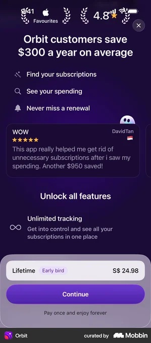
Orbit’s headline is “Orbit customers save $300 a year on average”, with a named five-star review under it. The price it leads to is a one-off: Lifetime, S$ 24.98, “Pay once and enjoy forever”. Set against $300 a year, that reads as a calculation rather than a cost.
Worth correcting a thing I used to say about this screen: the saving is not shown instead of a rating. Apple’s Favourites laurel and a 4.8 sit above the headline. The saving is the loudest element, not the only one.
All of it rests on the figure being honest. Where an average hides the fact that most users save nothing, Thrive Market’s version is the better model: “Save up to $384 a year! Based on ordering once every two weeks, and average member savings of $32 an order. Savings may vary.” The basis is printed next to the claim.
BitePal · a named person with a measured result
A named customer with a specific outcome, Sophie, 67 kg to 62 kg in one month, with a flag and a photo, rather than a generic compliment about the app. The laurels underneath carry 4.7 average rating and 1M users worldwide.
Specificity is what makes it credible. Present an exceptional result as a typical one and you have both a conversion problem and a refund problem.
Moonly · four kinds of proof, stacked
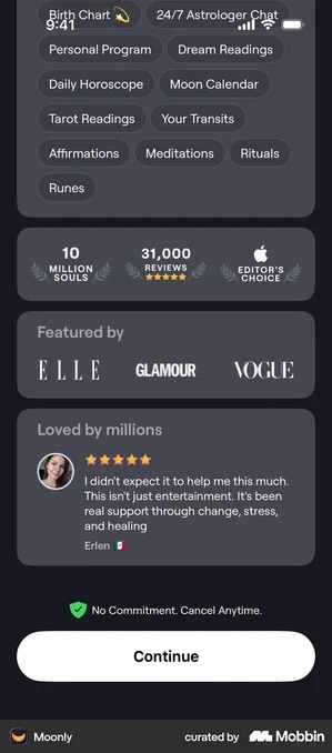
Moonly runs a stat bar, 10 million souls, 31,000 reviews, Apple’s Editor’s Choice, then a “Featured by” row of ELLE, GLAMOUR and VOGUE, then a named review with a photo, then “No Commitment. Cancel Anytime.” and a Continue button with no price on the screen at all.
I had the order backwards previously and it is worth stating correctly, because the order is the interesting part: the numbers come first and the press logos second. This needs the reader to recognise the mastheads and the coverage to be real. Decorative logos get spotted faster than most teams expect.
Cal AI · the discount that removes an objection, and the one that does not add up
“80% OFF FOREVER” rather than 80% off the first term. Applying a discount permanently does kill the renewal-shock objection, and it is a genuinely bigger promise than the standard intro offer.
The arithmetic on the screen does not support the badge, though. The struck price is $29.99 and the plan sold is 12 mo · $19.99, a 33% cut against the number shown. If “forever” or “80%” turns out not to be true at renewal, you have bought a cancellation and a bad review with the same sentence.
The thread running through the ones I would actually copy is simple. Every claim on the screen is one the reader could go and check.
A struck price that is really the old price. A marginal figure you can verify against the other plan. A review count somebody else is holding. A saving with its basis printed underneath.
That is not a coincidence. It is why they survive contact with a sceptical reader.
Design checklist
- Every persuasive number on the screen is one the reader could check
- A struck-through price is the price you actually charge otherwise, and a percentage off is measured against a number that is on the screen
- Any deadline is real, the price genuinely changes when it expires, and the renewal price is stated
- Loss framing names the specific thing the user built, not “premium features”
- Proof is on the paywall at all, most of your competitors’ are not, and counts are rounded and honest while review counts are exact
- Cancelling is described in a unit the reader can picture, seconds, taps, a refund window, and the description is true
- The paywall arrives after a scripted first win, not before it
- No invented scarcity on a product that cannot run out
Got questions? I’ve got answers
Do emotional triggers actually work on app paywalls?
The design practice is real and observable; the psychology usually cited to justify it is shakier than the discourse admits. Loss aversion is the clearest case: the often-quoted figure that losses hurt about twice as much as equivalent gains comes from Tversky and Kahneman’s 1992 paper, estimated from laboratory gambles, and Gal and Rucker argued in 2018 that the evidence does not support it as a general tendency, with Mrkva and colleagues replying in 2020. So this article works from what real paywalls do, transcribed from the screens, rather than from lab results.
Should you use a precise number like 3,247,891 users instead of a round one?
No, and this is the opposite of the usual advice. Across the paywalls I transcribed, not one uses a precise user count. They all round up: QUITTR says join over 1,000,000 users, and Strava, Nibble and Thrive Market do the same. The only place precision appears is review counts, where the number comes from the store and the reader knows it. A hand-precise user count reads as invented, because it usually is.
How common are urgency and discount badges on real paywalls?
Rarer than the design discourse suggests. In RevenueCat’s State of Subscription Apps 2026, across 115,000+ apps, highlighted pricing is the only near-universal element at a 74.5% median with a tight 72.6 to 77.0% spread. Feature lists sit around 57% and free-trial messaging at a 54.0% median. Testimonials are the rarest element counted, at 5.9 to 16.9% depending on category. Countdown timers top out at 1.4% and progress bars at 0.2% in every category measured, so those are ceilings rather than typical rates.
What makes social proof credible rather than decorative?
Specificity, and showing your working. A named person with a measured result beats a generic compliment: BitePal uses a named customer who went from 67 kg to 62 kg in a month, with a photo. Where the claim is a saving, the credible version explains how it is calculated, as Thrive Market does with save up to $384 a year, based on ordering once every two weeks and average member savings of $32 an order. It backfires when an exceptional result is presented as typical, which is a refund problem as well as a conversion one.
What is the cheapest thing you can add to a paywall?
The sentence that says what happens today. It is the most repeated wording in my whole copy bank, and it takes a writer rather than a designer. Vocabulary prints you won’t be charged anything today; Mimo says no charges yet, cancel anytime on the App Store; Strava names the date, you won’t be charged until Jul 1. The cancel-assurance versions that work quantify the effort instead of promising it is easy: Deepstash says cancel anytime in 15 seconds, Hypelist says cancel anytime before, in just 2 taps, and Bloom offers a full refund if you forget. RevenueCat counts cancel assurance on 25.0 to 39.5% of paywalls by category, so most of the field says something and very few say a number.
Where does loss framing actually belong?
At cancellation rather than on the first paywall. The clearest instances sit in save screens, where the user has genuinely accumulated something: Oportun’s reads stay with Oportun, free for 3 months, don’t pause your progress. That is the shape worth copying, because it names the specific thing the person built rather than referring vaguely to premium features. On a first paywall the user has built nothing yet, so the same sentence describes a loss that has not happened.