Why One Paywall Screen Isn’t Enough
You built the paywall. You spent a week on it, you got the copy right, you argued with yourself about the colour of the button. Somebody opens it, looks at it for about two seconds, taps the X, and is gone.
Most indie apps accept that. One screen, one answer, done. The apps that actually make money treat the X as the middle of the conversation rather than the end of it. They have a second screen ready, and sometimes a third.
Here is where it usually goes wrong. “Multi-screen paywall” means two completely different things, and the advice for one is bad advice for the other. Build the wrong one and you have not designed a funnel. You have designed a nag, and people spot a nag much faster than founders expect.
I will separate the two first. Then the rest of this article is three screens, around twenty named apps you can steal the moves from, and one test for telling a real second offer apart from asking the same question again in a different font.
In short
- “Multi-screen paywall” means two different things: one paywall broken into steps, and a sequence of separate offers across the journey. This article is about the second, and RevenueCat’s 2026 report does not measure the first at all.
- Two plans is the default shape rather than three: 41 to 60% of paywalls show two, and 74.5% highlight one price over the others.
- The second screen is not an annual upsell. Every second offer documented here either cuts the price and says why, or leaves the price alone and extends the term.
- Mojo moved the share of yearly plans from about 60% to 80% by putting monthly behind a second screen, with overall conversion holding. That is one self-reported result on one named app, not a benchmark.
- Every second-offer screen in my teardown ships a visible exit, and countdown timers are far rarer than the internet implies, at a 0.8% median and never above 1.4% in any category.
The two things people mean by “multi-screen paywall”
The first meaning is one paywall broken into steps: features, then trial terms, then price. Sylvain Gauchet, Head of Growth at Reading.com, names that as the emerging pattern in RevenueCat’s State of Subscription Apps 2026. Most paywalls are now long, scrollable and full of text, and his fix is to
“break down all that information into several chunks”.
Take that as a description rather than a benchmark. The report measures the scrolling, but it does not measure multi-step paywalls at all, so there is nothing yet to hold yourself against.
The second meaning is a sequence of separate offers spread across the journey. A first ask, a different offer after a dismissal, sometimes a third one later. That is this article, because that is the one you can open a real app and look at.
Screen 1: The main paywall
The three screens, and the objection each one answers
This is the whole article in one picture. If you cannot name the objection a screen answers, that screen is a nag.
“I’m not sure yet”
Your main offer, after the user has seen something work. Two plans, one highlighted, one visible X.
“It’s too expensive”
Shown on the dismissal. Either cut the price and say why, or leave the price and extend the term. Not an annual upsell.
“Not right now”
Let them in. Pick them up later with an upgrade prompt or a re-engagement notification, at a moment that gives them a reason.
You are not asking three times for the same thing. You are answering three different reasons for saying no.
This is your primary offer. It shows after the user has experienced value, completed onboarding, created something, or reached their first aha moment, the point where the app finally proves it was worth downloading.
Two plans is the default shape, not three. Across RevenueCat’s 2026 sample of 115,000+ apps, 41–60% of paywalls show two plans, with Health & Fitness highest at 60%; three-plan layouts run 6–27%, highest in Travel. Annual dominates the presentation, appearing on 28–44% of paywalls, and 74.5% of paywalls highlight one price over the others.
That contradicts the usual advice to push the cheapest, shortest plan because it feels like a lower commitment. In my own paywall teardown, the annual card is normally the pre-selected one and the saving sits on it as a badge. Weekly-first is a real strategy, but it is a choice you make against the grain, not the default.
What is worth copying from the large apps is not the plan count. It is what the list asks you to decide.
Spotify splits on what you get, not on how often you pay: Individual, Duo, Family. And it keeps its limited-time “$0 for 4 months” promotion on a screen of its own instead of dropping it into the plan list. So an offer is never mistaken for a plan.
FotMob goes the other way with Annual, Monthly, Family Monthly and Family Annual, all carrying the same seven-day trial, which asks the user to compute rather than to choose. Panera Bread spends the same space on trust instead: the next four billing dates with amounts, and the line “your card won’t be charged until 9/26.”
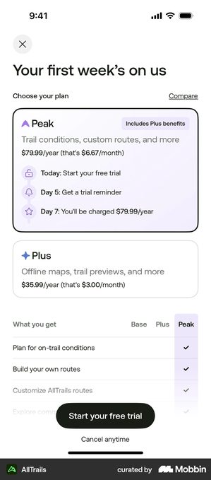
AllTrails · a first screen that is a table, not a list
Base, Plus and Peak run as a true checkmark matrix, one column per tier, so a hiker compares by reading down a column instead of across three cards.
The matrix is the second half of the screen, not the pitch. Above it sit “Your first week’s on us”, a Peak card with a dated trial timeline, and a Plus card. The table is what answers the question the offer raises.
A matrix answers one question at a glance: what am I giving up. That is the right question when you are moving somebody up a tier. It is not the right question when they have never paid you anything.
Then the phone gets involved. Three columns of ticks stop being readable, and the user picks the middle one. Not because it is the best plan. Because it ends the decision.
Mojo · the extra screen is the plan architecture
Michal Parizek, Pricing and Growth Lead at Mojo, describes their biggest paywall layout change as moving monthly onto a separate screen:
“We’ve essentially hidden the monthly plan under a separate screen, so the yearly plan looked like the only plan… shifting the share of yearly plans from, I believe, from the like 60 to 80%.”
Overall conversion held.
Treat that as one self-reported result on one named app, not a benchmark. And answer one question honestly first. Is monthly the only plan some of your users can actually afford? If it is, you have not simplified the screen. You have moved their option behind a tap and hoped they do not look.
How many people convert on the first screen? RevenueCat’s medians are 10.7% of downloads paying by day 35 for hard-paywall apps, the ones you cannot use at all without subscribing. For freemium apps, where the app works for free and you pay to unlock more, it is 2.1%.
Read those carefully. They are shares of downloads, not of paywall views, and the report never publishes a first-view conversion rate. So treat any single number you see quoted for that as marketing.
What the shape of the data does support is the design conclusion: the first screen is the start of the job, not the whole of it.
Two things belong here whatever shape you choose. One plan visually highlighted, which three quarters of paywalls do, so not highlighting is the unusual choice. And a visible close button, every second-offer screen in my teardown ships one.
Screen 2: The offer after a dismissal
The user tapped the X. They said no. Most indie apps accept that and move on, and that is the cheapest revenue left lying on the floor.
What the second screen actually is, in the apps that run one, is usually not an annual upsell. It is a different price or a different term.
The evidence that it works, and the side effect it has on your trial-start number, are in the second paywall offer, which is about this one screen on its own. Here it is the middle of a sequence, so what follows is the two moves worth knowing and where each one sits.
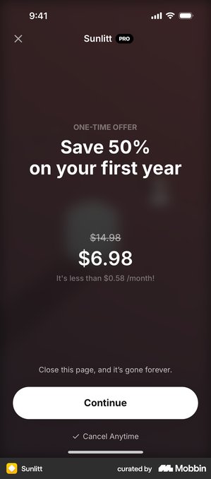
That small line under the price is the part worth stealing, and it is not only for second offers. Parizek reports the same move at Mojo lifting trial starts by 30% in parts of Latin America, with no impact on trial-to-paid, which is the share of free trials that turn into paying subscriptions.
Coffee Meets Bagel runs 1, 3 and 6 months with the total and a per-day figure side by side.
Headspace does it on its first screen in a single line:
“First 14 days free, then $69.99 ($5.83/month).”
In all three the real total stays on screen. That is the whole difference between a reframe and a trick.
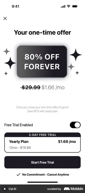
Cal AI · a second offer that changes the renewal, not the first term
The badge reads 80% OFF FOREVER, and the word doing the work is the last one: the cut applies to renewals rather than to the first period. The trial toggle sits between the offer banner and the plan, so flipping it reads as part of the discount.
If the discount really is permanent and renewals honour it, this answers renewal shock, the moment a cheap first year turns into a full-price second one, instead of just postponing it. If forever turns out to mean the first year, it is the same screen with a refund queue attached.
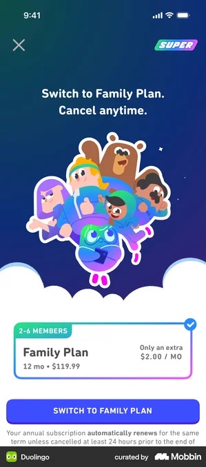
Duolingo · pricing the gap instead of the plan
The family upgrade is priced at the difference rather than the total, “only $2.00 more” so the decision on screen is two dollars, not a second subscription.
And the total stays right next to it. Two dollars is the difference, not the price, and this screen never lets you forget which is which.
Screen 3: the offer that waits
First, the two shapes. Every offer after a dismissal, whether it is your second screen or your third, does one of two things: cut the price and say why, or leave the price alone and extend the term. Here is each one, and then the versions that wait for a reason rather than firing on the X.
Bloom does the first. It drops from $15 to $5, and it explains the drop instead of just showing it:
“We know $15 a month can feel a bit expensive.”
The risk is what that does to the $15. Say it out loud once and the first price starts to look like a number you made up.
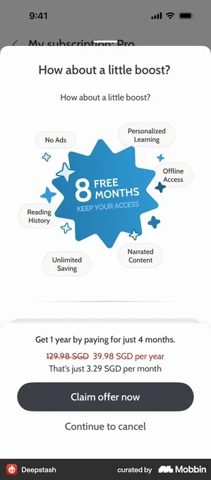
A longer term protects your price and costs you margin per month instead. Which is the better trade if your worry is what a discount teaches people about your list price.
Before you build a discount ladder, read this number. Vahe Baghdasaryan, founder and CEO of Tangent, notes in the same RevenueCat report that hobby-tier apps often see 65–99% of new subscribers arrive through intro offers, while top-performing apps rely on them for only 0–10%. Heavy discounting is a signature of the apps that are not working.
Only 9.3% of apps use promotional offers at all, and where they are used the median intro discount is -50.1%.
Oportun · a final offer that gives time rather than money
The save reads “Stay with Oportun – free for 3 months! Don’t pause your progress.” The subscription price never moves. What changes is when it starts, and the sentence names what the user would be interrupting.
The sentence is doing the work here, not the discount. “Don’t pause your progress” lands only where there is progress to pause. So open your own app and ask what somebody actually loses by stopping for three months. If the honest answer is nothing, three free months is just a discount that took longer to say.
It also does not have to be a third sheet at the same moment.
Marcus Burke, an independent Meta ads advisor, describes the sequence as a pricing ladder spread across the journey:
- a high-price ask, often without a trial, for people who arrived ready to buy;
- a paywall with three plans on it and a trial, where most conversions land;
- and a 50–70% off offer at the end of onboarding that then sits on the home screen for the first week or so, picking up the lowest-intent users.
He would not call three a rule.
Kit · the upgrade that waits for its reason
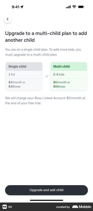
Kit’s tiers are not billing periods but households, “Single child plan / Multi-child plan (2–5 kids)” shown as a before-and-after pair, and the screen is triggered at the moment a parent adds a second child.
That is the cleanest version of a later offer. It arrives because the user has just done the thing that requires it, and there is very little to argue with: the screen is not asking, it is answering, and it waited until there was something to answer.
Why this works psychologically
My reading rather than a measured finding, and the board at the top of this article is the short version: each screen answers a different reason for saying no.
The one worth dwelling on is the third. “I don’t want to pay right now” is not a refusal, it is a timing problem, and the right answer is to let them in and pick them up later with an upgrade prompt or a re-engagement notification. Treat it as a no and you lose somebody who was going to pay you eventually.
What to avoid
Don’t hide the close button. On any screen, ever. I have not found a single shipped second-offer screen without a visible exit. Sunlitt keeps the X. Deepstash keeps “Continue to cancel” in plain text. Character AI keeps a permanent “Skip for now”, and Hypelist keeps a “No thanks”.
Apple will reject you for hiding it, which is reason enough on its own. The better reason is that a trapped user does not leave quietly. They leave one star.
Yes, I am aware I am being dramatic about one small button. Go and read the one-star reviews on any app that hid it, then come back and tell me I am wrong.
How common these moves actually are
Median share of paywalls carrying each one, across RevenueCat’s 2026 sample of more than 115,000 apps. The two things the internet talks about most are the two almost nobody ships.
Read the last two rows again. A timer is not the industry standard somebody told you it was, and no category in the report goes above 1.4%, so in every one of them at least 98.6% of paywalls do without one.
Don’t use fake timers. If your “limited time offer” resets every time the user opens the app, they will notice.
Sunlitt’s plain sentence does the same job without a clock, and it survives exactly as long as the screen genuinely does not come back next session. If it does, you have taught users to wait.
Don’t show the same screen twice. If Screen 2 is identical to Screen 1, it is nagging rather than strategy.
Say what happens when the trial ends, in the words a user would use. Hypelist writes the auto-renewal into the timeline itself rather than leaving it to the small print: “Love it? You’ll be upgraded automatically. Cancel anytime before in just 2 taps.” Fine, as long as the two-tap claim is true. Not fine if “upgraded automatically” is the only place the screen admits billing is about to start.
Don’t block the app indefinitely. After the user dismisses every paywall screen, they should be able to use the app, even in a limited free mode. An infinite paywall loop is the version of this pattern that gets apps into trouble with reviewers and with users alike.
Measuring the flow
Track each screen independently, then refuse to judge them independently.
Conversion at each step, separately. A blended number hides which screen is doing the work, and hides the moment a discount screen starts cannibalising the full-price one.
Revenue per new user for the sequence as a whole. This is Marcus Burke’s test, and it is the right one: a ladder that lifts total conversion while lowering revenue per new user has cost you money.
What the last-screen group does at first renewal. Your dashboard will call it a cohort, which just means the group of users who all arrived around the same time. A group that all came in on a discount and then all leave at renewal is not a win.
Vahe Baghdasaryan’s split is the long-run version of the same warning: hobby-tier apps get 65 to 99% of subscribers through intro offers, top performers 0 to 10%.
Trial starts, with an asterisk. If you add an abandonment discount, some conversions now arrive by a route that never touches a trial event. Shumel Lais’s point is that trial start stops being a clean stand-in for anything the moment you ship one.
What the big apps actually do
Scrollable is now the default, not the exception: between 59 and 76% of paywalls scroll, with Travel highest at 76% and Photo & Video lowest at 59%. A single static screen is the unusual choice.
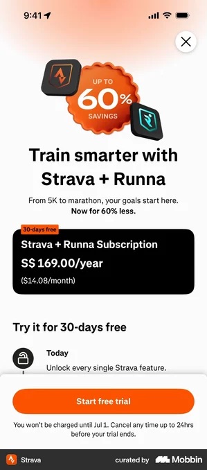
The most interesting multi-step pattern in current practice is the dated trial timeline. Ten apps in my teardown run a version of it: Headspace, Strava, Brilliant, Runna, Buddy, Kitchen Stories, Headway, Spark Mail, 5 Minute Journal and Deepstash. And it works by being more honest, not less.
foodpanda · the longest timeline in the set, and the same three steps
“Free for 90 days — Today: Free trial starts · Day 89: Billing reminder – cancel anytime · Day 91: Plan starts and billing begins”. Ninety days against Headspace’s fourteen and Hypelist’s three, and the structure does not change at all: start, reminder, charge.
The reminder is placed against the charge, not against the start. So even a three-month gap still ends with the warning the user was promised.
Which puts a lot of weight on one notification. Ninety days is long enough to forget the app exists. If that reminder does not go out, the timeline was a promise with your name on it that you did not keep.
One caveat before you copy the shape. A timeline sells a relationship, so it does very little for a utility, where somebody wants one job done now. Alice Muir’s account of watching this fail on real client apps is worth reading before you build one.
Which makes the question not whether the layout is good, but what your paywall is promising.
Tide Guide · the utility that sells with a table instead
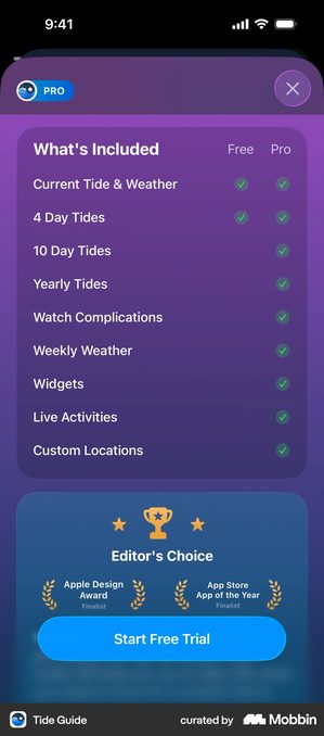
No timeline anywhere. A nine-row free-versus-pro grid under the heading “What’s Included”, two plans labelled Monthly and Yearly, and a “SAVE 17%” pill with “1 Week Free” beneath it on the Yearly card.
The screen answers one question: what do I get that I do not already have. The first two rows are ticked in both columns, which is the part most grids skip, because telling someone what they already have is what makes the rest of the column credible.
A tide app is bought for a job, not a routine. A dated sequence about your relationship with it would be answering a question nobody asked.
The limit here is the phone. Grow the grid past what fits on one screen and nine rows of ticks are doing the work of four.
Headspace · Today, in 12 days, in 14 days
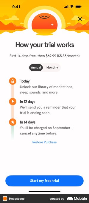
A three-step sequence with the actual charge date written out, and “cancel anytime” emphasised on the final step. The Annual/Monthly toggle sits directly under the price line and above the timeline.
A dated timeline is a promise with a date on it. Headspace puts the reminder two days before the charge, which gives somebody who has changed their mind a window wide enough to use.
Strava · thirty days, written out
“Today: Unlock every single Strava feature · In 28 days: We’ll remind you that your free trial is ending soon · In 30 days: Your annual subscription begins!” The same paywall states the deadline as well as the charge: “You won’t be charged until Jul 1. Cancel any time up to 24hrs before your trial ends.”
Naming the cancellation deadline, and not only the charge date, is the rarer half of this. It is also the half that stops a refund request before anybody writes it.
Because the 24 hour rule applies whether you mention it or not. The only thing you control is whether the user learns about it from your screen or from their bank statement.
Deepstash · putting a number on cancelling
Inside the same timeline pattern, Deepstash says you can “cancel anytime in 15 seconds” and ticks off the install step you have already completed.
Putting a number on the effort beats promising the right. “Two taps” is something a user can check. “Cancel anytime” is not.
Which makes it a claim with a stopwatch attached. If cancelling your app takes five screens, that line is not a trust signal. It is a complaint you wrote yourself and handed to the user.
Bloom · a fourth step after the charge
Bloom extends the timeline past the charge date with “Forget to cancel? No problem. Get a full refund, no questions asked.” The annual price is restated in the same breath: $59.99 a year, “that’s only $1.15/week.”
That removes the last objection to starting a trial. If there are conditions on the refund, put them on the screen. Every condition you leave off is a complaint somebody is already writing.
QUITTR · personalise, prove, then ask
Personalisation questions come first, then a long testimonial carrying a 4.8 rating from 140K, then the plan. The ask arrives after the user has described their own problem in their own words.
By the time the price appears, the user has described their own problem in their own words, and the testimonial has answered it. The screen is the third beat of an argument, not the opening of one.
Notice what none of these do: they do not spread one screen’s worth of content across four screens. Each step in the sequence answers a question the previous step raised.
Paywall figures are from RevenueCat’s State of Subscription Apps 2026, across 115,000+ apps. Practitioner quotes are from that report and from Botsi’s Price Power Playbook. Screens are from my own paywall teardown; each capture is credited and linked above.
Multi-screen paywall checklist
- Screen 1 presents main plans with one highlighted
- Screen 2 (on dismiss) makes a different offer: a lower price with a reason, or a longer term
- Screen 3 (optional) sits later in the journey rather than stacked on the same moment
- Every screen has a clearly visible close/dismiss button
- Each screen makes a different offer (not the same paywall repeated)
- No fake timers or deceptive urgency, countdowns appear on 0.8% of paywalls at the median anyway
- User can access the app after dismissing all screens
- Each screen’s conversion rate is tracked independently, and the sequence is judged on revenue per new user
Got questions? I’ve got answers
How many screens should a paywall flow have?
Two or three. The main paywall, an are-you-sure step that reframes rather than simply discounts, and at most one final offer. Past that you are training people to dismiss, and the dismissal habit carries over to every other prompt in your app.
Does a second offer cheapen the product?
It does when the second screen is only a lower price with nothing said about it. Bloom cuts from $15 to $5, but it admits the objection in words first. That is the difference between a reframe and a discount.
Deepstash is the cautionary case. Its offer is dressed as eight free months, and underneath it the list price is struck from 129.98 SGD to 39.98 SGD. The months are the wrapping. The price cut is the offer.
What should I measure on a multi-screen paywall?
Conversion at each step separately, revenue per new user for the sequence as a whole, and then what happens to the people who converted on the last screen. A discount-driven cohort that churns at first renewal is not a win, and a single blended conversion number will hide that completely.