Should Sign-Up Come Before or After the Paywall?
Somewhere in your onboarding there is a screen asking for an email and a password. You have probably moved it at least once, because every article says something different and none of them show you a real flow.
It is one of the highest-friction things you can ask of anybody. Type an email, invent a password, go and dig out a verification mail. All before the app has done a single thing for them.
So I got tired of the advice and counted instead. Thirty captured onboarding flows, one question: where does the account go?
And here is the thing I had wrong, in print, on this page, for months. I used to write the rule as “first screen or after the paywall, never in between”. Ten apps put sign-up exactly in the middle, deliberately, and several of them do it well. If you moved yours out of the middle because an article told you to, nobody had checked.
There are three patterns, not two. I will call the sign-up screen a gate, because that is what it does: nothing happens behind it until the user makes an account.
What follows is all three patterns with the apps that run each one, the exact wording that makes the middle one work, and the single thing that makes it fail. On the data, I will be honest: there is none, and I will show you where I looked for it.
In short
- Three patterns, not two: gate at the door, gate at the save point, or no gate at all.
- In the captured flows the gate lands early. Strava, Notion, Headspace and Pinterest all take the account within the first few screens, before the personalisation questions.
- “Never put sign-up in the middle” is not what the flows show. Ten apps put it exactly there, most of them framed as saving progress. What separates the good versions is whether there is anything real to protect yet, and whether the decline is honoured.
- No captured flow in the library defers the account until after payment. That does not make it wrong, it is what we shipped on Travel Diaries, but it is the rare way to build it, and it costs you an anonymous session: somewhere to keep everything the user makes before they have an account.
- There is no published benchmark for sign-up placement. RevenueCat’s 2026 report does not measure it. Anyone quoting you a percentage made it up.
The energy model, and where it stops helping
Here is how I think about it, and this is a model rather than a measurement. Treat the user’s willingness to engage as a battery: they download the app fully charged, and every action you ask for drains it.
Sign-up drains a lot, because it is pure friction with no immediate reward, and when it goes wrong, a password rule or a verification email that never arrives, the session ends there.
The model is useful right up until it hardens into the rule I used to write. So here is what the flows actually show instead.
The three patterns, and who runs each one
From thirty captured onboarding flows. Pick one deliberately. Most apps land on one by accident.
Gate at the door
The account is the first thing. Nothing happens until it exists.
Strava, Notion, Headspace, Pinterest, Evernote, Eventbrite, Revolut.
Use it when the account is the product, or the user already knows what they downloaded.
Gate at the save point
Questions first. The account arrives framed as protecting what the user just built.
Duolingo, Calm, Cal AI, Transit, Finimize, BitePal, Ahead, Recime, Vocabulary, QUITTR.
Use it when the onboarding actually produced something worth saving.
No gate at all
Guest mode, a skip, or an account made silently and claimed later.
Klarna, Walmart, Target, Best Buy, Etsy, On, 7-Eleven, Bolt Food, Copilot, Nibble.
Use it when the first job can finish without knowing who the user is.
The three are not interchangeable, and the third one in particular travels badly. There is a reason for that, and it is in the Pattern 3 section below.
Pattern 1 · Gate at the door
The account is the first thing. Nothing happens until it exists. This is the majority pattern in the captured flows, and the biggest apps in the library all run it. Strava takes the account before the sport questions. Notion, Headspace and Pinterest all take it within the first few screens, before any personalisation.
Inside the pattern the interesting variation is who the screen is built for. SoundCloud puts Create an account above Log in, and gives it the heavier styling, so the screen is built for somebody who has never been there. Raycast inverts it and puts Log in first, which is the right call once your install base is bigger than your weekly new-user count.
Evernote · create and log in given the same weight
Under the small line above the headline, “WELCOME TO EVERNOTE!”, and the headline “Work. School. Life. Remember everything”, two dark filled buttons take the social routes, Continue with Google and Continue with Apple. Below an or divider sit two outlined buttons of identical width, Create account and Log in, side by side.
Refusing to steer only makes sense if you genuinely do not know your mix of new and returning arrivals. So do you? That number is in your analytics and it takes about a minute to find.
If most of the people hitting it are one kind, treating both the same throws away a free improvement to the bigger group. SoundCloud and Raycast spend that knowledge on the layout. Evernote leaves it in a dashboard.
Revolut is the variant worth stealing: a swipeable set of product cards runs above the buttons, so the gate is still first in the flow but not first in the eye.
The rest of the gallery gives up on the wording. Waking Up asks with “Welcome to Waking Up. Create an account to get started.” Suno with “Create a free Suno account to begin”. Both accurate. Both worth nothing to the person reading them.
Zocdoc is the one screen in the ten that answers the question the user is actually asking: “Sign up — It’s free, secure and easy. We will help you keep track of your health by managing your appointments.” One sentence, and the account has a purpose.
Eventbrite · an exit built for the one job a returning user has
Four ways in, all outlined pills of the same size and weight: Continue with email address, Continue with Apple, Continue with Facebook, Continue with Google. Under them a single underlined text link, Find my tickets, and a close cross in the top corner.
Naming the errand is smart. Somebody holding a ticket does not want an account. They want the ticket.
The trouble is everything above that link. Four options at identical weight recommend nothing, so the screen hands the user a fifth decision before they have finished making the first.
And one to be careful with. MyFitnessPal dresses the gate as the first question: the headline is “Welcome! Let’s customize MyFitnessPal for your goals” and the primary Continue button is, in fact, the account step. That works when the customisation it promises is genuinely what happens next.
When the next screen is more account setup, users who tapped Continue expecting a question and got a password field start reading every later framing as marketing, which is expensive across a twenty-screen flow.
Best for
Apps where the account is the product (social, collaborative, anything syncing across devices), apps with enough brand recognition that the ask is not presumptuous, and paid acquisition where the user already knows what they downloaded.
Pattern 2 · Gate at the save point
This is the position I used to tell people never to use. The questions come first, and the account arrives framed as protecting what the user just built. Ten apps in the library do it: Duolingo, Calm, Cal AI, Transit, Finimize, BitePal, Ahead, Recime, Vocabulary and QUITTR. It is not a mistake. It is a pattern with a failure mode.
Most of them use loss framing, and you can see the whole spectrum in the wording:
“Sign up to save progress” · Ahead
“Create an account to save your progress” · Calm
“Now let’s create account — Save your progress & reach your goals” · BitePal
“Save your favourites, stats & settings · WHAT’S A TRANSIT ACCOUNT?” · Transit
“Keep your data safe — Create an account so you never lose favorites, collections, and settings when you reinstall or switch devices” · Vocabulary
Transit and Vocabulary are doing more work than Calm is. They name the specific things an account saves instead of using the word progress, and Transit adds a link explaining what a Transit account even is. Naming beats abstracting: favourites, stats and settings are easier to want than “your data”.
Two of the ten skip loss framing altogether, and they are the interesting ones. Finimize uses the name it already collected, “Sam, finish your setup”, so the account reads as an unfinished task rather than a new demand. QUITTR trades loss for crowd: “Become a QUITTR — Join over 1,000,000 users!”, with Skip For Now underneath.
Both work for the same reason the loss lines work when they work, they point at something that has already happened.
The failure mode is the sentence being untrue. Save your progress after two taps invites the obvious reply, what progress?, and the loss framing curdles into a sales line. A first-run Transit user with no favourites is being sold the preservation of nothing.
Recime · the bar is full before the account is asked for
The progress bar across the top is complete, and only then does the screen read “Create an account”, with “Already have an account? Log in” beneath it. Three outlined buttons offer Apple, Google and Other options, and Skip sits under them as plain centred text with no button around it.
A full bar is an argument in itself. It says the questions are done and this is the last thing. Unless the bar was already full two screens ago. A finished bar that keeps producing screens is the same broken promise as a count that grows.
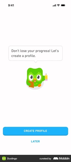
Duolingo is the exception in the whole library: it asks what you want to learn, gives you a first lesson, and only then wants a profile. The decline is offered in the same breath. Cal AI does the same thing in the user’s own words, “Save your progress · Would you like to sign in later? Skip”.
That is the version of this pattern that works, and the whole thing turns on the decline being remembered. A LATER that reappears on the next open is not a decline, it is a nag.
Best for
Apps where the onboarding produces something. If the user answered ten questions, built a plan, generated a story or customised a character, the ask has a subject. If your onboarding is three taps, this pattern has nothing to protect and you are better off at the door.
Pattern 3 · No gate at all
The option the old version of this article did not mention. Guest mode, a skip, or an account created silently and claimed later.
And here is the reason it travels badly. Eight of the ten examples in the library are commerce apps: Klarna, Walmart, Target, Best Buy, Etsy, On, 7-Eleven and Bolt Food. In all of them, a purchase can complete without anybody knowing who you are. Read the category before you borrow the pattern.
Microsoft Copilot · guest mode outside commerce
Three pale pill buttons sit under the line “Hi, I’m Copilot, your AI companion”: Continue with Microsoft, Continue with Apple, Continue with Google. Below them, Continue as a guest in plain centred bold text with no button drawn around it, then Privacy, Terms of use and FAQ.
A chat assistant, like a checkout, can do its first job without knowing who you are. The answer is useful whether it gets saved or not, and the screen is honest about that: the guest route is in plain bold text, not hidden in a corner.
The best of them argue instead of blocking. Best Buy lists five ticked account perks and then offers Continue as guest anyway, unhidden. Walmart compresses the same case into one sentence, “Sign in to track orders and earn Walmart Cash, check in for faster pickup and get personalized shopping recommendations”, with Continue as guest under it.
Klarna is the most generous version in the gallery, because it names the state the user is actually in rather than the benefits they are missing: “In a hurry? No problem, you can register later.” All three accept that they might lose the argument. That is a checkout convention, and it does not transfer to an app that stores personal state from minute one.
Target · the guest exit placed as far from the decision as the layout allows
Two buttons sit at the foot of the screen, a red filled Welcome! Sign in and a white Create account under it. Continue as guest is not with them. It sits alone in the top right corner, plain dark text on the teal background, most of a screen away from the pair.
You could defend the position. Maybe Target has measured that guests are worth less, and would still rather have them than nothing.
The honesty is what bothers me here. The option exists, so this is not really a gate. And putting it in the opposite corner only teaches whoever finds it that somebody chose to put it there.
Etsy · one button for both the new user and the returning one
An email field arrives pre-filled and the primary dark button under it reads “Sign in or create account”. One control, no branch. Three outlined social buttons follow an or divider, and Continue as guest sits beneath them as plain centred text.
One control, no branch, and the whole SoundCloud versus Raycast argument disappears. The email field decides which flow you are in, which is a thing your back end already knows and the user should never have had to.
The one that does transfer is Nibble.
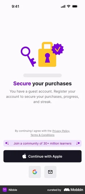
Nobody is ever blocked, and the later ask is about protecting something concrete. The trade is real though: if the user changes device before registering, everything is gone, and you have to explain the loss of a state you never asked them to protect. That is the price of the pattern, not a bug in it.
Whichever pattern you land on, word the exit deliberately. The skips transcribed across the library run from the bare, Bolt Food’s Skip, through Finimize’s Skip this step and Numo’s Skip onboarding, to Udemy’s Save & exit.
Udemy’s is the only one of the four that tells the user nothing is being thrown away, which is the fear that makes people tap the gate instead of the exit.
What about “after the paywall”?
It is a genuine fourth option and it is the one I have shipped. It is also, in thirty captured flows, one that nobody in the library does. Not one of the three patterns is “ask after payment”.
The captured flows lean the other way, and Spark Mail is the clearest example. The account already exists by the time the paywall appears, and the paywall counts it as step one of the trial.
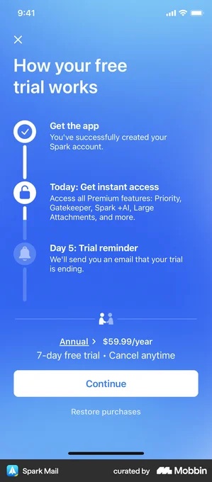
Deepstash and Vocabulary do the same trick on their own trial timelines, Vocabulary strikes through Install the app as step one, Deepstash uses the profile you just created. If you are going to charge for the gate, at least spend it twice.
Asking after payment has one real advantage, the user reaches the paywall with nothing spent, and one real cost: you need anonymous sessions. Everything created during onboarding has to persist on the device and attach to an account later. That is engineering work, and it is why the pattern is rare.
What about the data?
There isn’t any. RevenueCat’s State of Subscription Apps 2026, which covers more than 115,000 apps, reports nothing on sign-up placement, not a conversion delta, not a drop-off rate, nothing. Neither does my own teardown library, which records design decisions and their stated logic, not outcomes.
An earlier version of this article told you that moving sign-up out of the middle of the funnel improves paywall conversion. I could not source that, so it is gone.
So if somebody quotes you a percentage for what a sign-up gate costs, ask them which dataset. There is no public one. And yes, I know that asking makes me the difficult person in the thread. Ask anyway.
What you can do is test it on your own traffic. Run one placement, then the other, for long enough to clear a weekly cycle, and compare trial starts and Day 1 retention, meaning how many people come back the next day. Not trial starts on their own, which a softer gate will always win.
From our work · Travel Diaries
Travel Diaries is the clearest version of this decision we have made. Before the redesign, users had to subscribe before seeing any value at all, and only about 10% converted.
In the redesign, August to September 2025, we turned the order around. The aha moment here is previewing journal covers: the point where the app finally proves what it is for.
What the order became
Onboarding questions
The aha moment
Previewing journal covers.
The paywall
Payment details
The trial starts here.
Sign-up
Last.
Sign-up after payment reads as saving something you already own. Sign-up before value reads as a toll. That is a judgement about this app and this audience, not a rule I would hand anyone else without looking at their flow first.
Placement checklist
- Pick a pattern deliberately: at the door, at the save point, or no gate, not by accident
- If at the door: give a reason on the screen, decide whether sign-up or log-in gets the heavier styling, and keep the form short. No password complexity walls, no fields you will not use
- If at the save point: check there is genuinely something to save, and name what the account protects, favourites, stats, settings, instead of the word “progress”. “Save your progress” after two taps is a sales line
- If you offer a decline, honour it. A “Later” that reappears next session is a nag
- Word the exit. “Save & exit” says nothing is lost; “Skip” says nothing at all
- If after the paywall: anonymous session persists everything built during onboarding
- If the account is already made by the time the paywall loads, put it on the trial timeline as a completed step
- Test both on your own traffic. There is no benchmark for this
Got questions? I’ve got answers
Should sign-up come before or after the paywall?
In thirty captured onboarding flows there are three patterns, and none of them is “after payment”. The account either opens the flow (Strava, Notion, Headspace and Pinterest all take it within the first few screens), arrives mid-flow once there is progress to protect (Duolingo, Calm, Transit), or is never required at all (Best Buy, Nibble). Asking after the paywall is a real option and it is what we shipped on Travel Diaries, but it is the rare way to build it, and it costs you an anonymous-session build.
Is putting sign-up in the middle of onboarding a mistake?
Not on its own. Ten apps in the teardown put it exactly there, most of them framed as saving progress. What separates the good versions is whether anything real exists to protect by that point, and whether the decline is honoured. Duolingo asks only after a lesson is finished and offers LATER directly under the button, in the same size type as the button’s own label.
What is the alternative to a sign-up gate?
A guest account. In the captured flows it is mostly a commerce convention, Klarna, Walmart, Target, Best Buy, Etsy, where a purchase completes without an identity. The version that transfers to a subscription app is Nibble’s: the app creates the account silently at first launch, so nobody is ever blocked, and later asks the user to attach an identity to something that already holds their purchases, progress and streak.