Dark Patterns vs. Ethical Persuasion: Where’s the Line?
Every app uses persuasion. Push notifications, upgrade prompts, free trial reminders. These all nudge users toward specific actions. That’s not a problem. The problem starts when persuasion crosses into manipulation.
Understanding the difference matters for two reasons: dark patterns cost you the retention you converted for, and both stores publish rules that some of them break. The legal exposure is real but narrower than it is usually described, and the section below sets out what actually applies.
In short
- Neither store publishes any rule about paywall close buttons, not their timing, not their size, not a delay before they appear. Apple’s only close-button rule is about ads.
- The FTC’s click to cancel rule is not in force: the Eighth Circuit vacated it in full in July 2025, and ROSCA is the statute that still applies.
- Countdown timers appear on no more than 1.4% of paywalls and progress bars on no more than 0.2%, so a timer reads as suspicious rather than compelling.
- I went looking for the consent box that arrives pre-ticked, across a whole paywall teardown, and did not find one: the screens that look pre-ticked are the frame straight after the user tapped.
- The test is simple: would a user who fully understood what they were agreeing to still make the same choice?
What are dark patterns?
Dark patterns are design choices that trick users into doing things they didn’t intend to do. They exploit confusion, friction, and psychology to benefit the company at the expense of the user.
Here are the most common ones in apps:
Roach motel subscriptions
Signing up takes one tap. Cancelling means a survey, a save offer and three confirmations. The FTC sued Amazon over its Prime enrolment and cancellation flow, and Amazon settled in September 2025 for $2.5 billion, $1.5 billion in customer redress and a $1 billion civil penalty.
Two senior executives were named personally and are bound by the injunction. The money judgment was entered against Amazon alone, and the order records that the defendants neither admit nor deny the allegations.
The case was brought under ROSCA, not under any dark-patterns statute.
On iOS, though, most of that friction is not yours to design. An App Store subscription can only be cancelled in Settings, so the real decision is how quickly your screen admits it.
Peanut does it in one sentence: “Upgrade, downgrade, cancel and resubscribe are all managed in the App Store”. Then it spends the rest of the screen on three buttons: share feedback, check the FAQ, go to the App Store.
It does not pretend to own the cancellation, and it does not hide the door. Putting the feedback route beside the exit is how it still learns why.
Other apps in the same gallery say the identical true sentence and then leave the user to find Settings alone, or open a help-centre article instead. Same truth, very different cost to the person reading it.
Forced continuity
The trial ends, the charge lands, and nothing warned you. The counter-move is cheap, and two apps in the teardown ship it. Strava discloses the deadline rather than only the right, “cancel any time up to 24hrs before” so the user knows the actual window and not just the charge date.
Bloom goes further and removes the consequence of forgetting: “forget to cancel? No problem. Get a full refund.” That is the strongest version I have found, because it answers the specific fear a trial timeline creates. Both only work if the promise survives contact with the flow. A refund that needs an email chain and a stated reason produces support tickets that cost more than the cancellations it prevented.
foodpanda · the reminder is a dated row, not a promise
The pandapro trial screen heads its plan block “Free for 90 days”, then lists three dated rows:
- “Today · Free trial starts”
- “Day 89 · Billing reminder – cancel anytime”
- “Day 91 · Plan starts and billing begins”
Beneath them sits “S$ 5.99 every 1 month(s) after trial ends”, and a total at the foot repeats it: “Free for 90 days, then S$ 5.99 for 1 mo.”
Once the trial is running, a card inside the app reads “89 days left in your free trial”.
The reminder is dated against the charge, not against the signup. So the user is told in advance when the warning lands and what it will cost.
And the counter keeps that answer inside the app for three months, instead of asking them to remember it.
All of it collapses the moment that promised reminder is the only thing between the user and the charge, and it does not get sent.
A warning you advertised and then failed to deliver is worse than never offering one. The user stopped keeping their own note.
Hidden costs
The price shown at signup is not the price charged.
The fix is to say what is charged today. It is the cheapest way to earn trust on a paywall, and the one most often skipped.
Headway makes it the first row of its trial timeline instead of a footnote: “No payment now, just full access”. So the answer to “what happens if I tap this” arrives before the price does.
Panera Bread names the date, “Your card(s) won’t be charged until 9/26”, and then lists the next four billing dates and amounts underneath it. Both go dark at the same seam: promise no payment now, then ask for a card on the next screen, and nothing else on that timeline is believed again.
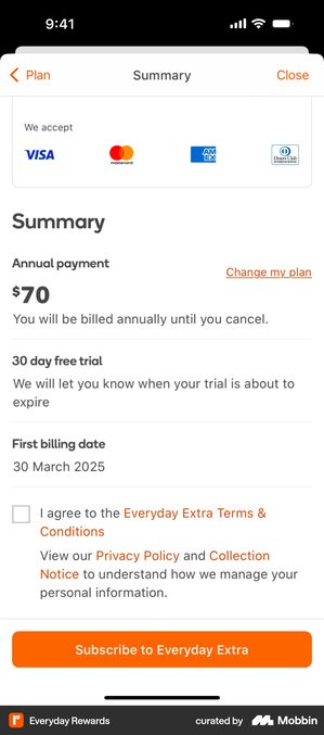
Everyday Rewards · the whole charge itemised before the tap
The Everyday Extra summary sheet answers four questions in three labelled rows above the button:
- “Annual payment”, $70, with “You will be billed annually until you cancel.”
- “30 day free trial”, with “We will let you know when your trial is about to expire”
- “First billing date”, with “30 March 2025”
An agreement tick for the “Everyday Extra Terms & Conditions” sits under them, then an orange “Subscribe to Everyday Extra”.
Nothing here has to be worked out. Amount, cadence, trial length and the date of the first charge are set out as labelled rows, not buried in one sentence of small print.
That is a harder thing to build than a “no payment now” line. It is also a much harder thing to argue with later.
One row lets it down. The trial-expiry promise gives no date and no way to check it, which makes it the only line a reader cannot verify. It is also the line the whole summary gets judged by if that reminder never arrives.
Misdirection
The “cancel” button is small and grey; the “keep subscription” button is large and coloured. Reading the button pairs across the cancellation flows in my retention teardown, though, the sharper imbalance is in the words rather than the styling. The stay buttons name the product: Stay with DashPass, Keep Uber One, Keep benefits, Keep my Premium plan.
The exit buttons name the paperwork: Continue with cancellation, Continue to cancel, Submit and Cancel, Proceed with cancellation. One side speaks the language of what you have, the other the language of process, and it recurs too consistently across the set to be accidental.
That by itself is not manipulation.
DoorDash pairs Stay with DashPass with Submit and Cancel. The exit does exactly what its label says it will.
talabat pairs Cancel free trial with Keep benefits, and argues above the buttons rather than through them. Two named losses, plus the reminder that “you still have 30 day to enjoy your pro benefits for free”.
The line gets crossed when a loud, affectionate stay button is paired with a vague exit, not when it is paired with a plain one.
Colour is the other half of it, and the same red does two different jobs across the set.
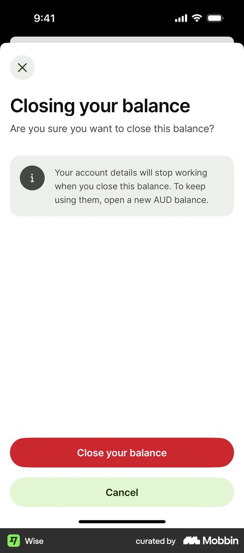
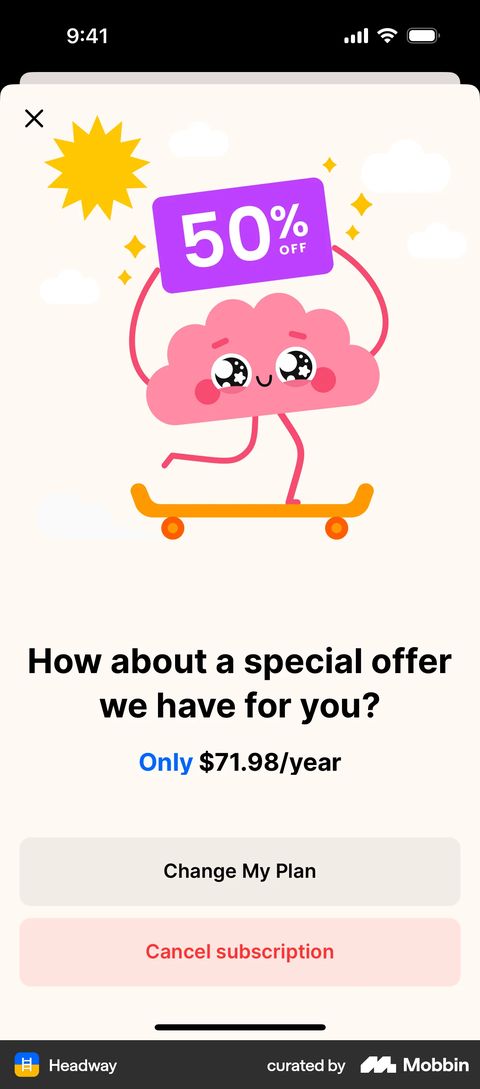
Wise and Headway · the same red, doing two different jobs
Wise’s screen is headed “Closing your balance” and asks “Are you sure you want to close this balance?” A grey box states the consequence:
“Your account details will stop working when you close this balance. To keep using them, open a new AUD balance.”
Underneath, “Close your balance” is a filled dark-red pill and “Cancel” a filled pale-green one. Both full width, both the same size.
Headway’s cancellation offer, “How about a special offer we have for you? Only $71.98/year”, ends in two pills of the same width: “Change My Plan” in neutral grey, and “Cancel subscription” in pale pink with the label set in red.
Wise is closing an account, which is irreversible and legally consequential, so red is a warning and it is earned. Headway is ending a subscription that can be restarted with one tap, and there is nothing dangerous about it.
Neither screen hides the exit and neither shrinks it. So the whole argument is in the colour.
Red spent on a reversible action is discouragement wearing the costume of a warning. And it leaves you nothing to signal with when something really is permanent.
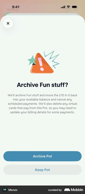
Monzo · the destructive button takes the fill, and it is still fair
“Archive Fun stuff?” sits above a paragraph that spends four clauses on the consequences:
- the pot is archived
- the £10 in it moves back to the available balance
- scheduled payments are cancelled
- virtual cards paying from the pot are deleted, “so you may need to update your billing details for some payments.”
Then two buttons. “Archive Pot” as the solid blue primary, “Keep Pot” as a pale grey secondary beneath it.
This is the arrangement the misdirection rule warns about: the destructive action loud, the safe one quiet.
And it is not manipulation, because the paragraph above has already told the user everything the tap costs. Which button carries the fill is a weak test on its own.
What decides it is whether the words above the buttons would let a careful reader predict what happens next. Shorten that paragraph for tidiness and the whole defence goes with it.
Opal · a streak used as a lock on a setting
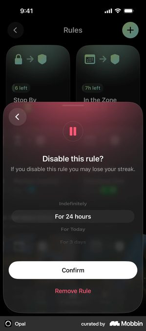
Turning off a focus rule in Opal raises a sheet reading “Disable this rule? If you disable this rule you may lose your streak.” Below it, a wheel of durations with “For 24 hours” selected, then a white filled “Confirm” and “Remove Rule” in red text underneath.
The buttons here are fine. The lever is the sentence, and it attaches a loss to an ordinary settings change rather than to a lapse in the behaviour the streak measures. It is defensible where disabling the rule genuinely does break what the streak counts, which for a screen-time app is arguable.
It stops being defensible the moment the warning is there to make the setting expensive to reach. Users read that difference correctly.
That is how a motivational mechanic becomes the thing they quote in a review.
Trick questions
“Would you like to not unsubscribe from our notifications?” Confusing language designed to get the wrong click. The honest version restates the action inside the button so it cannot be mis-tapped: CAVA’s confirmation reads “ARE YOU SURE? You’ll lose all of your meals and customizations in your bag”, and the two options are YES, CLEAR MY BAG and NEVERMIND rather than Yes and No.
It costs nothing, and a button that repeats the consequence is very hard to accuse of trickery.
Fake urgency
A countdown timer on the paywall that resets every time the user opens the app. The “limited time offer” that’s been running for six months.
Worth noting how rare these actually are. Across every category RevenueCat measured, countdown timers appear on no more than 1.4% of paywalls. Progress bars on no more than 0.2%.
That is from RevenueCat’s State of Subscription Apps 2026, across 115,000+ apps. The report writes both figures with a less-than-or-equal sign, so those are category ceilings, not medians.
These tactics are far less common in real apps than the design discourse suggests, which means when users see them, they read as suspicious rather than compelling.
Why dark patterns kill your app long-term
Short-term, dark patterns might boost conversion. Long-term, they destroy everything that matters:
Reviews tank. Users who feel tricked leave 1-star reviews, and for an indie listing a handful of those is enough to matter.
Churn spikes. Churn is just the share of people who leave, and the ones who convert through manipulation are the first to go. They weren’t convinced. They were confused. When they figure out what happened, they leave.
Refunds are the number that tells you. Refunds are processed by the store, not by you, so you learn about them afterwards. Across the categories RevenueCat measured, median refund rates cluster between 3% and 4% of paid subscriptions in the first billing period. Productivity is highest at 4.7%, Travel lowest at 2.5%. Outlier apps reach 9 to 18%.
The report does not say what causes the outliers. It does give you the number to watch.
Is any of this actually illegal?
Partly. It is worth being precise here, because a lot of what circulates about this is out of date or points at the wrong law.
The EU. Article 25 of the Digital Services Act bars providers of online platforms from designing interfaces “in a way that deceives or manipulates the recipients of their service”. Making cancellation harder than signup is named in the same article, but as something the Commission may issue guidelines on, not as a listed prohibition.
It also binds online platforms, and micro and small enterprises are exempt, so a solo app with no public content feed is very likely outside it. The Digital Fairness Act, which is the instrument people usually mean, has been announced and is not law.
Germany. Since 1 July 2022, § 312k of the German Civil Code has required a cancellation button that is always available. It applies to any trader selling a rolling contract to consumers via a website.
The law even names the labels: Verträge hier kündigen on the button, leading to a confirmation page with jetzt kündigen.
That is a specific label and placement duty, not a general “make it as easy as signup” principle. If you do not provide it, the consumer can cancel at any time without notice.
The US. The FTC’s “click to cancel” rule is not in force. The Eighth Circuit vacated it in full in July 2025, and nothing has been re-proposed in final form since. What still applies is ROSCA, which requires clear disclosure before billing, express informed consent, and “simple mechanisms for a consumer to stop recurring charges”. That is the statute Amazon settled under, and it is enough on its own.
What the stores actually publish
Apple’s App Review Guideline 3.1.2(a) covers apps that “attempt to trick users into purchasing a subscription under false pretenses or engage in bait-and-switch and scam practices”.
Guideline 3.1.1 adds a second requirement: a trial has to identify its duration and any charges that follow.
Google’s subscriptions policy requires “an easy-to-use, online method to cancel the subscription” inside the app. It then lists two things as violations:
- “multiple screens in the purchase flow that lead users into accidentally clicking the subscribe button”
- annual plans that show their price mainly as a monthly cost
What neither platform publishes is a rule about paywall close buttons, not their timing, not their size, not a delay before they appear. Apple’s only close-button rule is about ads. If you have read that Apple rejects apps for hiding the close button on a paywall, it is not in the guidelines. Design it well because a hidden close button costs you the install, not because someone will catch you.
Ethical alternatives that work just as well
You do not need any of this to convert. The two strongest moves in the teardown are both disclosures.
Instead of forced continuity, let them pick the day
Tell them the trial is ending, and let them choose when you tell them. Anmol Tiwari of Duolingo, in a minisode summarised in RevenueCat’s State of Subscription Apps 2026, describes testing a step that lets users pick which day they get the expiry reminder.
The extra friction signalled transparency. It built trust that no charge would arrive as a surprise, and it gave people time to experience real value before deciding.
The same write-up puts the general case more bluntly. Showing a timeline of exactly what happens during the trial, when the charge lands and how refunds work, drove more conversions for Duolingo than selling harder did.
Instead of burying the terms, pick a length and mean it
There is no neutral amount of small print, and both extremes are defensible. GO Club covers its offer in one sentence, “Recurring Billing. Cancel anytime.” with Terms and Privacy as links beside it. Weverse renders the entire notice on the screen itself, scrollable, ending in a single checkbox and Start Subscription: nothing hidden behind a link, and nothing summarised either.
The failure mode sits between them, where the volume of text signals seriousness and the content is a wall nobody reads. That is compliance for show, it buys you the paperwork and none of the trust, and GO Club’s single line does more with one sentence.
The Atlantic · the middle position, with every clause on the screen
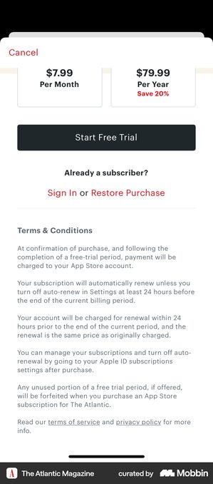
Below “Start Free Trial” and the sign-in row sits a heading, “Terms & Conditions”, and five paragraphs. They are set smaller than the body copy above them, around three quarters of its height, but all five are on the screen rather than folded behind a link.
They cover when payment is taken, when the renewal charge lands, and where to manage it. Two clauses are set out in full on the screen:
- “Your subscription will automatically renew unless you turn off auto-renew in Settings at least 24 hours before the end of the current billing period”
- “Any unused portion of a free trial period, if offered, will be forfeited when you purchase an App Store subscription for The Atlantic.”
Only “terms of service” and “privacy policy” are left as links.
It complicates the idea that the middle is where the failure lives. The Atlantic sits squarely in the middle and does not fail, and the variable it got right is not word count. It is that every clause is on the screen at a size you can still read, instead of one summarising sentence and a link to the rest.
It works where the buyer is a publication’s subscriber and expects to read terms.
An app audience reads that much legal text as a warning sign. And shrink those five paragraphs any further and it falls apart immediately, because shrinking is what actually turns a disclosure into a wall.
The retention test
Here’s a simple way to check if your approach is ethical: would a user who fully understood what they were agreeing to still make the same choice?
If yes, it’s persuasion. If no, it’s manipulation.
Users who choose to pay because they experienced value and understand the terms are the users who stay. Users who pay because they were confused or couldn’t find the cancel button are the users who leave bad reviews and request refunds.
Where real apps sit on the line
The line is easiest to see in the small print. That is where the trade between conversion and defensibility gets made explicitly.
So I went looking for the classic villain of this genre: the consent box that is ticked for you before you arrive. I went through the consent gallery in my own paywall teardown, then opened the actual captures.
I did not find one. What I found instead is that the screens which look pre-ticked are the frame straight after the user tapped, which is a good reminder that a screenshot is not a default state.
Here are five decisions from real paywalls, and what the screens actually show.
Centr · the box you have to tick, and the button that waits for you
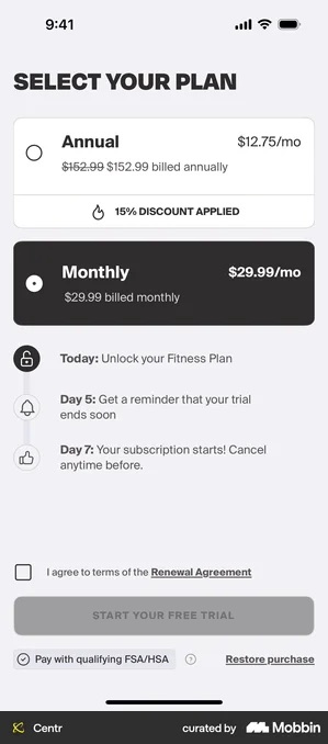
“I agree to terms of the Renewal Agreement” arrives empty, and Start Your Free Trial is greyed out underneath it until you tick. The very next frame of the same capture shows the box ticked and the button live, which is what the tick is there to do.
This is the strictest version of the pattern in the whole set, and it costs conversion deliberately. The risk it carries is the opposite of a dark pattern: a dead button with no visible explanation is something users abandon rather than solve. Everything around it is handled well, a dated timeline above spells out today, the day-5 reminder and the day-7 charge, with “Cancel anytime before.”
Wolt Delivery · the same box, gating nothing
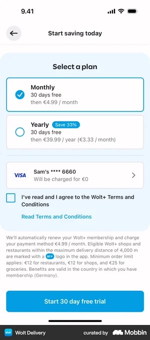
Wolt’s box also arrives empty, “I’ve read and I agree to the Wolt+ Terms and Conditions” above a full paragraph of renewal terms and the saved card, which shows it will be charged €0. But Start 30 day free trial already carries its full blue fill before anything is ticked.
So the tick records rather than gates. That is not manipulation; it is a weaker version of the same idea, and it is the more common one. The real weakness is the paragraph underneath: if nobody reads it, the tick becomes a reflex and stops functioning as a confirmation at all.
Duolingo · the divider that does the work
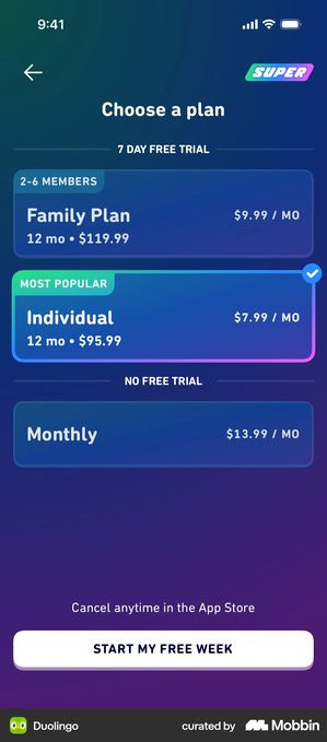
Monthly sits below a divider labelled NO FREE TRIAL, which makes the annual plans look like the only sensible options.
The band is the app’s own statement that the trial does not apply to that plan, and used that way it is a disclosure doing the work of a decoy. It becomes a dark pattern the moment the band is just a design choice rather than a real difference.
Sunlitt · “close this page, and it's gone forever”
Stated in plain words rather than dressed up as a countdown clock.
Honest if true. If the same screen reappears next session, you have taught your users that your deadlines are fiction, and every future deadline is worth less.
Headspace · the exit is a button, not a link
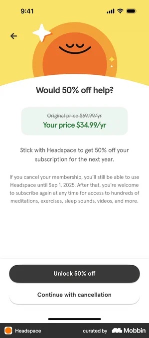
Under the heading “Would 50% off help?”, the save offer Unlock 50% off takes the dark fill.
Continue with cancellation sits directly beneath it, outlined, at the same width and the same type size.
This is not equal weight, and it is not pretending to be: the fill is doing work.
Two things make it defensible. The exit is a full-size control in the same stack, not a grey link in a corner. And the body volunteers the date access actually ends:
“you’ll still be able to use Headspace until Sep 1, 2025.”
Naming the end date is the part most flows skip. It is also cheaper than the discount.
None of these five needs a countdown clock to do its work. Worth remembering when one is proposed to you: the 1.4% ceiling above means you are with at least 98.6% of paywalls without one, not behind them.
Design ethics checklist
- Cancel is as easy as subscribe (same number of steps)
- All pricing is transparent and visible before purchase
- Countdown timers reflect real deadlines
- Users get clear trial-ending notifications
- Confusing language has been removed
- All buttons are clearly labeled and visible
- You’d be comfortable explaining every design choice to a user
Got questions? I’ve got answers
What counts as a dark pattern on an app paywall?
Anything that gets the outcome by making the alternative hard to see or hard to reach: a consent box ticked before you arrive, a close button you have to wait for, a countdown that resets on reload. Worth checking before you copy one from a screenshot: on the consent screens I opened, the ticks that look pre-set are the frame straight after the user tapped. Centr’s box arrives empty and holds the trial button inactive until it is ticked; Wolt’s arrives empty too, but its trial button is live either way.
Are dark patterns actually illegal?
Some of them are, but less sweepingly than the discourse suggests. The FTC’s click-to-cancel rule was vacated in July 2025 and is not in force; ROSCA still requires clear pre-billing disclosure and a simple way to stop recurring charges, and it is what Amazon settled under for $2.5 billion in September 2025. The EU’s Digital Services Act bars manipulative interface design by online platforms, and Germany has required a specific cancellation button on websites since July 2022. For most indie apps the commercial cost arrives first, as refunds and one-star reviews, well before anyone sends a letter.
What works as well without the manipulation?
Stating the commitment plainly and giving the exit a real button. Headspace fills its save offer and puts “Continue with cancellation” directly beneath it as an outlined button of the same width, rather than demoting the exit to a link. Bloom removes the consequence of forgetting altogether, promising a full refund if you forget to cancel before the trial ends. Duolingo labels a divider NO FREE TRIAL, which is a disclosure doing the work of a decoy rather than a plan being hidden.