What Big Apps Show When You Try to Cancel
Someone opens your app, goes into Settings, and taps Cancel subscription.
What do they see next?
For most apps the honest answer is: whatever got built in twenty minutes near the end of the project. I have done this too. You design the paywall for weeks and the cancellation screen on a Friday.
Which is strange when you think about who is standing in front of it. This person already paid you. They already used the app. And they have already decided it is not worth the money.
That is a harder room than any first-time visitor. They know exactly what they are giving up, and they are doing it anyway.
So I went back through the cancellation flows in my teardown file to see what apps with real scale actually put on that screen. Two things surprised me.
The big ones mostly do not lead with a discount. And almost none of them use the answer the user just gave them, thirty seconds earlier, about why they are leaving.
In short
- The cancellation save is the screen shown at the moment a user starts to cancel, before the cancellation completes.
- It is not a win-back campaign, meaning an email or a push that chases somebody after they have gone. This reaches somebody with their hand on the door.
- There are five moves available, not four: a discount, more time, a pause, a reminder, or nothing.
- Across the nine save offers in my teardown, discounts ran from 25% to 100% off, and four of the nine landed on exactly half price.
- The pause is the most common move that is not a discount: Hinge, Tinder, happn, Hims, Hers and Bloom all offer one, and each names exactly what pausing preserves. Only one app in the set, Blue Apron, picks its offer from the reason the user gave.
The five things a save screen can offer
Every save screen in the set was doing one of five things. Only two of them cost you money.
| The move | What you give up | Seen on |
|---|---|---|
| A discount | Margin, permanently. They now know the real price. | Most of the nine. Four landed on exactly half price. |
| More time | Nothing, if they were going to leave anyway. | Oportun, three months free |
| A pause | Nothing. The subscription is paused, not priced down. | Hinge, Tinder, happn, Hims, Hers, Bloom |
| A reminder | Nothing, but only works if you actually send it. | Rare in the set |
| Nothing at all | Nothing. Let them go cleanly and ask why. | Peanut |
1. A discount
Headspace asks “Would 50% off help?” and answers it with the arithmetic: the old price struck through, the new one in green underneath. Blinkist asks “Would a discount help?” and then shows 40% OFF at enormous scale. Plum offers 50% off Premium for the next six months.
Future Pro calls it a “one last chance offer” at a reduced rate. This is the most common approach and the most expensive one.
The good versions ask rather than announce. A question invites an answer; a banner announces that your price was never real.
Bloom · agree with the objection before answering it
Most discount screens restate the benefits. Bloom’s concedes the point first:
“We know $15 / month can feel a bit expensive, so we wanted to offer you a chance to continue learning & investing for a much lower price. The same features, for just $5 / Month.”
It names the old price, agrees it is high, and states plainly that nothing is being taken away.
Agreeing with the objection disarms it far better than restating benefits. The trap is a discounted price you cannot honour long term. A save at a third of the price turns one cancellation into a low-margin customer who renews once and leaves anyway.
Sunlitt and Pillow · scarcity pointed at the exit
Sunlitt heads the screen “ONE-TIME OFFER, Save 50% on your first year” and adds “Close this page, and it’s gone forever.”
Pillow does the same job with a live countdown, running down from 23h 59m 58s next to a 25% cut.
Both turn a considered decision into a timed one.
This is the most checkable claim in any cancellation flow, and users check it.
If the offer comes back next month, or the countdown resets when the screen is reopened, you have taught a paying customer that your urgency is fiction. At the exact moment they were deciding whether to trust you.
2. More time instead of less money
Oportun offers three months free: “Stay with Oportun – free for 3 months! Don’t pause your progress.” The headline price never moves, which protects what the product is worth while still giving the user something real.
Deepstash looks like this move and is not. Its screen reads “8 FREE MONTHS” and “Get 1 year by paying for just 4 months” but underneath, 129.98 SGD is struck through and replaced with 39.98 SGD. The months are the wrapping. The price cut is the offer.
And the two do not quite line up. Paying for four months out of twelve would be 33% of the price. 39.98 against 129.98 is 31%. The money is slightly better than the months promise, which is the right direction to be wrong in, but it does mean the headline and the prices are describing two different offers.
That is worth knowing before you copy it, because a struck price teaches the user what your list price is really worth, and free months do not.
3. A pause
This is the one most indie apps never build, and it is the cheapest of the five. You stop the billing without ending the relationship. The user keeps what they made, you keep the account, and nobody has to be talked out of anything.
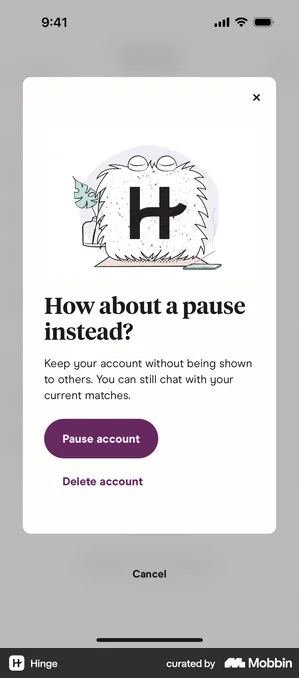
happn and Tinder · the same sheet, almost the same words
happn: “You have the option of pausing your profile without having to delete it. All the information you added to your profile, as well as your conversations, will be saved.” Tinder: “Pausing hides your profile from others, but won’t delete it entirely. This way you won’t have to start from scratch if you return!”
Three apps in one category making the same argument, and none of them mentions money. The pitch is not stay. It is you will not have to rebuild this.
Hims · a pause with a date on it
“Would you like to pause your subscription? Pausing your subscription will ensure you are able to receive future refills on your prescription.”
Then four fixed lengths, each carrying its own consequence: “Yes, pause for 180 days. Next order to ship July 4, 2025.” Hers runs the compressed version: “Take a break, snooze your next order.”
The user is not agreeing to a vague delay. They are picking a date, and naming the resume date removes the fear of forgetting.
The failure mode is a longest option that is too short. Offer thirty days to somebody who needs six months and you have spent your one save attempt moving the cancellation to next month.
Bloom · three things preserved, one of them counted
“Don’t want to invest right now? Pause your subscription until you’re ready to start again!” Underneath sit three lines: you can use Bloom for free, you can keep your stocks, and, the one doing the work: “You can keep your 1668 Oinks.”
That number is the user’s own. A generic list of preserved features is an argument; a count of what this person accumulated is evidence. It costs you one query.
Pause works when the user has built something they would have to rebuild, a profile, a history, a library, a plan. It fails when there is nothing to preserve, and it fails badly, because a second refusal is more final than the first would have been.
4. A reminder
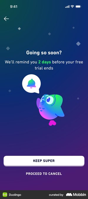
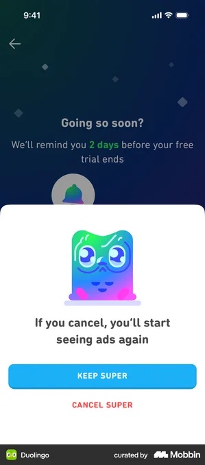
“Going so soon? We’ll remind you 2 days before your free trial ends”, then Keep Super or Proceed to Cancel. No money changes hands. And it lands because a good share of cancellations are people avoiding a charge they have not budgeted for, not people rejecting the product.
5. Nothing at all
Uber Eats asks why you are leaving and makes no offer on that screen. What it does instead is give the exit its own line, in plain text, in the middle of the stack: “Skip survey and cancel now”.
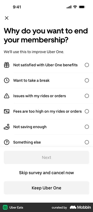
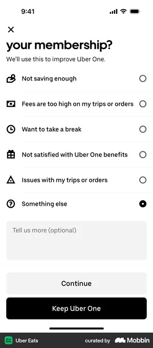
Those two are the same screen in the same app, and they disagree about the two things that matter. Which control gets the fill, and whether the plain-text exit exists at all.
Uber Eats is clearly still testing this. Which is a fair signal that you should test yours rather than copy either one.
Making no offer does not mean making no argument. Two apps outside food delivery show the other things that screen can be spent on.
Hims · argue with your own timeline instead of your price
Instead of a discount, Hims counts how long the person has been subscribed and answers with the treatment’s own schedule:
“Hey Alex – You’ve only had skincare treatment for 1 month. Want to give it some more time? You should expect to see results from your treatment after approximately three months of daily use, with more obvious results typically occurring after six months to one year. Want to stick with it for a bit longer?”
The two answers are plain cards of the same size: “Ok, I’ll stick with the treatment” and “I’d still like to cancel”.
This costs nothing, and it is the one save argument a discount cannot make, because it speaks to the user who has not yet had the result rather than the one who cannot afford it. You need a genuine, known time to value, and you need to be able to state it.
Invent the number to buy yourself a month and it will catch up with you. It is checkable. A stated three months that turns into another prompt at month four reads as a stall.
Peanut · nothing to offer, and nothing to hide either
Peanut cannot process an App Store cancellation, so its Manage subscription screen says so in one sentence, “Upgrade, downgrade, cancel and resubscribe are all managed in the App Store”, and spends the rest of the screen on three outlined buttons of identical weight: “SHARE FEEDBACK”, “CHECK OUR FAQ”, “GO TO APP STORE”. No offer, no survey, no interception.
This is the honest floor, and most indie apps are in exactly this position. Putting the feedback route beside the exit at the same weight is how you still learn why when you cannot make an offer at all. Dress one of the three up to absorb the tap and you have lost the honesty that made it work.
Give the feedback button a fill and leave the App Store route outlined and you have built an obstacle out of three identical controls, which is the version users notice.
What a save offer actually looks like, measured
- Nine save offers, all found in cancellation flows in my own teardown.
- Discounts ranged from 25% off to 100% off. The median was 50%.
- Four of the nine landed on exactly half price: Headspace, Headway, Plum and Sunlitt.
- The two largest concessions were Oportun’s three free months and Deepstash’s eight, though Deepstash strikes its list price too, so only Oportun’s is purely a term extension.
- These are the offers in one library, gathered by searching for a pattern. They are not a census of the App Store.
Why the discount is the expensive option
A discount at cancellation is applied to everyone who reaches that screen. That includes the users who opened the flow to check something, the ones who were undecided, and the ones who would have stayed if nothing had happened at all. You are paying all of them to do what a portion of them were already going to do.
There is a second cost that shows up later. If the same discount appears every time someone starts to cancel, users learn the rule. Cancelling becomes the way to get a lower price, and you have created a recurring negotiation with your own subscribers.
Use the answer the user just gave you
Nearly every flow in the set asks why you are leaving, and then ignores what you said.
This is the biggest miss in the whole category. The reason list is right there, one screen earlier, and the options are not interchangeable. “Too expensive” is answered by a discount. “I don’t use it enough” is answered by a pause, and a discount makes it worse: you have offered to charge someone less for something they already told you they do not use.
“I reached my goal” has no offer that fits, and the honest response is to let them go well.
One app in the set does this.
Blue Apron · the only app in the set that reads the answer
The pause is not offered to everyone. It appears inline, underneath the reason just ticked, and only for the reasons a pause actually solves, moving, travelling, a life change. Tick “I’m moving” and the screen answers “That is exciting. Did you know you can pause your subscription?” Cancel my subscription stays available below it.
The trap is doing this cosmetically. Conditional logic that is not really conditional is worse than an unconditional offer, because it pretends to have listened. If every reason triggers the same suggestion, remove the branching and save yourself the work.
Worth noticing too: most reason lists only let the user complain.
Yazio, Panera, Patreon, Duolingo, Photoroom · options worth stealing
A few lists leave room for the product to have worked. Yazio offers “I’ve reached my goal.” Panera Bread offers “Canceling for now, I’ll be back.” Patreon offers “I only became a member to receive a specific benefit and now I’ve got it.” Duolingo offers “I wanted to try Super temporarily.”
A few others leave room for the awkward truth. Duolingo has “I subscribed by accident”; SiriusXM has “I didn’t intend to subscribe after my trial ended”; Photoroom has both “The free tools are enough for my needs” and “I prefer not to say.”
None of these cost anything to add, and together they change what your cancellation data means. You can finally separate the people who failed from the people who finished, and both from the people who never meant to subscribe.
Loss framing, and when it is fair
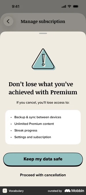
The four items are checkable and specific. Weaker versions gesture at what you had. This one lists it.
DailyArt states a fact: “If you cancel your subscription, you will lose access to your favorites and see ads again.”
talabat is blunter, and adds the sting that actually stops people: “You will lose access to the pro benefits. You will not be able to apply for another trial.”
CAVA applies the same move to a shopping bag rather than a subscription: “You’ll lose all of your meals and customizations in your bag”, with “YES, CLEAR MY BAG” against “NEVERMIND”.
The honest test is simple. If you removed the emotional language and just listed the facts, would the user still hesitate? If yes, the framing is fair. If no, you are manufacturing a feeling rather than describing a loss.
Bloom runs the inverse and it is worth stealing: “Forget to cancel? No problem. Get a full refund, no questions asked.” Removing the loss is also a move.
Give the exit equal weight
Headspace is the one to copy here, and the detail has nothing to do with the discount. The offer screen reads:
“Would 50% off help? If you cancel your membership, you’ll still be able to use Headspace until Sep 1, 2025.”
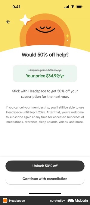
The body volunteers what happens if you say no, including the exact date your access runs to. Then the two controls: “Unlock 50% off” filled, and “Continue with cancellation” directly beneath it as an outlined button. Not a grey link, not hidden in a corner, not a smaller font.
Blinkist shows the other way round. “Claim my discount” is a filled green button and “Continue to cancel” is a text link, which tells you which of the two they consider the real choice.
Burying the cancel path buys you very little. The user who wanted to cancel still cancels, they just do it through the App Store instead, where you get no signal and no chance to ask why. And in several jurisdictions the regulatory direction on this is only going one way.
The naming imbalance
Read the two buttons on any of these screens and you will find the same split. The stay button names the product. The leave button names the process.
“Keep Uber One”. “Stay with DashPass”. “Keep my Premium plan”. Against “Continue with cancellation”, “Submit and Cancel”, “Proceed with cancellation”. One side sounds like a thing you own, the other like paperwork.
It is a small piece of persuasion and it is not dishonest, because both buttons still say plainly what they do. But it is deliberate, it is nearly universal, and if you have never thought about which of your two buttons gets the product name, that is the cheapest change on this page.
What they see after they cancel
The save screen is not the end of the flow. The subscription is gone, the app is still installed, and access usually runs for weeks. That window is the cheapest win-back you will ever get, meaning the cheapest chance to get somebody back after they have gone. And if you bill through the App Store, most of it is not yours to design.
Headway, SiriusXM, Feeld, DailyArt, GoPro Quik, Insight Timer · one screen, six apps
All six produce an identical post-cancellation screen, because it is Apple’s and not theirs: the confirmation sentence, the end date, and a full-price Renew button. “You have cancelled your subscription. Your subscription ends on 4 March. Renew: $6.98/month.” The app supplies its name, its icon and its price. Nothing else.
So do not assume this screen is doing win-back work for you. It shows full price with no offer, no context and no reason. It is a receipt, and it converts like one. Spend the effort earlier in the flow, or later in a channel you actually own.
Panera Bread, Oportun and Strava · three ways to own the moment
Panera is the most aggressive: “WE DON’T HAVE TO SAY GOODBYE… You can still enjoy subscription benefits until 08/27”, then every membership benefit re-listed under “I’d like to Resubscribe”. Oportun is the highest-trust: it confirms, says plainly what stops working and when, links “What happens after you cancel?”, and offers Resume subscription with no discount attached.
Strava is the quietest: two facts and one button, sitting in the normal Membership screen so the door stays visible every time the user comes back.
All three exist only because those apps own their billing or built a second surface inside the app. That is the prerequisite. Oportun’s is the version to copy, as long as the link genuinely answers the question, because a question posed in the user’s voice and answered with a marketing page is worse than not asking it.
What this means for your app
If you have no save screen at all, adding one is worth more than optimising any part of your first paywall, because the users hitting it have already demonstrated they will pay.
Start with the cheapest version. Ask the reason, and put at least one option in the list that lets the product have worked. Give the exit equal weight. Measure what happens before you offer anything.
Then build the pause before you build the discount. It costs nothing, it answers a reason a discount cannot, and it is the one move in this list that leaves you with the relationship intact.
Save screen checklist
- Ask the reason first, and include an option that lets the product have worked
- Match the offer to the reason: discount for price, pause for “not using it”, nothing for “I finished”
- Build the pause before the discount: it costs nothing and keeps the account
- Give the cancel path equal visual weight to the stay path, and say what the user keeps until
- Cap how often any offer appears, so it does not become a rule users learn
- If you use loss framing, name one specific thing that is genuinely lost
- Measure the screen with no offer first, so you know what the discount is actually buying
Got questions? I’ve got answers
What is a cancellation save screen?
It is the screen an app shows at the moment a user starts cancelling a subscription, before the cancellation completes. It is the last paywall in the lifecycle and the one most apps design least. It is not the same as a win-back campaign, which reaches a user after they have already gone.
Should a cancellation screen offer a discount?
Not necessarily, and several of the largest apps do not. Uber Eats makes no offer on its cancellation screen at all. Duolingo offers a reminder rather than money. Hinge and Tinder offer a pause. A discount is the most expensive option because it is applied to everyone who reaches the screen, including the people who would have stayed anyway.
Does offering a discount at cancellation train users to cancel?
It can. If the same discount appears every time a user starts to cancel, they learn that cancelling is how you get a cheaper price. Apps that avoid this either vary what they offer, cap how often it appears, or lead with value rather than money.
Should you offer a pause instead of a discount when someone cancels?
Often, yes. A pause stops the billing without ending the relationship, so it costs you nothing and the user keeps what they built. Hinge, Tinder and happn intercept the delete with a pause sheet that names exactly what is preserved. It works when the user has accumulated something they would have to rebuild, and it fails when there is nothing to preserve. It is also the right answer to the reason a discount cannot fix: someone who says they do not use the app enough is not asking to pay less for it.
What should an app show after someone cancels?
The window after the cancellation is the cheapest win-back you will get, but on iOS most of it is not yours to design. Headway, SiriusXM, Feeld, DailyArt, GoPro Quik and Insight Timer all show the same post-cancellation screen, because it is Apple’s: a confirmation sentence, the end date and a full-price Renew button with no offer attached. Apps that own their billing can do better. Panera Bread re-lists every benefit under a resubscribe button, Strava leaves two facts and one button in the Membership screen, and Oportun states what stops working and links to an answer to “What happens after you cancel?”.
What is the difference between a second paywall offer and a cancellation save?
A second offer appears after a user dismisses the paywall without ever paying. A cancellation save appears after they have paid and are leaving. The user has completely different information in each case: the first has not tried the product, the second has and decided it is not worth the price.