The Aha Moment in Apps: What It Is and How to Find Yours
Somebody downloaded your app this morning. By tonight they have either understood why it exists, or deleted it. Not much in between.
That moment has a name. The Aha Moment: where a user first gets, really gets, why your product exists. Where a stranger turns into a user.
Get it right and retention gets easier on its own. Miss it, and every push notification you send is working against somebody who never had a reason to come back.
Here is where I see it go wrong. Teams build a results screen to deliver this moment, a chart that appears once the questions are done, and then compute it from nothing. It looks exactly like the real thing. That is the problem.
The window is also narrower than most launch plans assume. Across 115,000+ apps, RevenueCat reports that 55% of all 3-day trial cancellations happen on Day 0. The report draws its own conclusion: the battle for the subscriber is won or lost in the first session.
Trial starts cluster in the same place. People who do not try immediately rarely try at all: 89.9% of Business trial starts land on Day 0, 82.1% in Health & Fitness, 81.5% in Gaming, 78% in Productivity.
So: the eleven personalised results screens I pulled apart, the three that are actually computed from what the user typed, and the two patterns apps use to stage the moment on purpose.
In short
- Of eleven personalised results screens I pulled, only three are computed from what the user typed: the other eight are artwork sitting in the same position.
- Liven and Me+ both print the identical 86% figure against different user bases, which is the sharpest evidence that these reveals are template artwork rather than measurement.
- The Aha Moment is a sequence, not a single event: the setup that gets the user ready, the moment itself, and the repetition that turns it into a habit.
- The activation metric is the number that stands in for the moment, and it has to be an observable event rather than a state, found by comparing what retained users did against what churned users did.
- Averages hide the answer. Download-to-paid runs 2.9% on the App Store against 2.6% on Google Play, trial-to-paid is level at about 32.5% on both, and Google Play is ahead on the first weekly renewal, 47.7% against 41.4%.
What the Aha Moment actually is
It’s not a “wow” moment of visual delight. It’s not an impressive demo. It’s the moment of personal recognition: “oh, this solves MY problem.”
In a language app it is the first sentence you understand without looking anything up; in a budget tracker, the first time you see where the money actually went. Note what those have in common: the user did something and the product answered. Nobody explained anything to them.
The Aha Moment is always experiential, never explanatory. You can’t tell someone their Aha Moment. They have to live it.
The Aha Moment is a sequence, not a single event
Most founders try to find one magic moment to optimize and leave it at that. But the Aha Moment is actually three steps:
Setup
The user has to arrive at the moment ready for it. If they’re confused, overwhelmed, or haven’t been told what to expect, the moment won’t land. Good personalization, clear onboarding, and managed expectations are all part of setup.
The moment itself: The specific event, action, or insight that creates the recognition. This is the part most teams focus on.
The habit
A single Aha Moment doesn’t create retention. What creates retention is the repetition of value. The user needs to experience the moment again, on day 3, day 7, day 14. If the value only appears once, the user won’t stay.
Most apps optimize for the middle step and neglect setup and habit. That is the shape I keep finding behind the same complaint: good first-session engagement, and retention at day 7 and day 30 that never follows from it.
How to find your app’s Aha Moment
You probably think you know what it is. You might be wrong. Founders are too close to their own product to see it clearly.
Method 1: Look at your best users
Take the users with the highest retention or the longest active streaks. What did they do in their first session that churned users didn’t? That action is likely your Aha Moment or the path to it.
This is also how one named practitioner spends the finding. Anthony Scarpaci, a growth consultant previously VP of Growth at Acorns, argues in Botsi’s Price Power Playbook that referral money should pay out on first-session and first-week actions. The ones that go with a long-term customer. Not on a signup.
His comparison: Blue Apron gave away a free box with nothing attached; HelloFresh wants several deliveries before the referral pays. Once you know which action predicts retention, it stops being a research finding and starts deciding where you spend money.
Method 2: User interviews
Ask users who stayed and ask users who left. “When did you first feel like this app was worth it?” and “Was there a moment when it clicked?” The answers will surprise you.
Method 3: Drop-off analysis
Find where users leave in the first session. The screen right before the biggest drop-off is often the bottleneck. Solving that bottleneck may be what unlocks the Aha Moment for users who were close but didn’t get there.
How to shorten the path to it
Remove every step between onboarding start and the Aha Moment that isn’t necessary. Every screen that doesn’t contribute to getting users to that first experience is friction. This is why long feature tours after signup are usually a mistake. They delay the moment, they don’t build toward it.
One useful exercise: time how long it takes from first open to first Aha Moment. Then ask: what’s the minimum time it could take? What would you have to remove or reorder to get there faster?
Marcus Burke, an independent Meta ads advisor, puts it more bluntly in the same playbook. By his own estimate about 75% of your traffic is gone before day-one retention is even measured. So you cannot wait for the aha moment to turn up by itself.
His fix is to script one into the first session, before the ask. A plant scanner that ships a template photo so the first scan finishes on one tap. An emotions app that hands back a read on you, built from the quiz you just answered.
That is a single practitioner’s number and a single practitioner’s prescription, not a benchmark, but it names the trade honestly: a staged win is worth more than a real one the user never reaches.
Turning the moment into a number you can track
The aha moment is the experience. The activation metric is the number that stands in for it. Teams usually pick the metric first, from whatever is easy to log, and then discover it measures something nobody cares about.
That number deserves its own page, because picking it is a different job from finding the moment. What an activation metric is, how to find yours, and why only one of six live setup checklists names a threshold.
Checklist
- You’ve identified your app’s specific Aha Moment (not a feature, an experience)
- You’ve verified it by talking to long-term users, not just assumed it
- Every step between onboarding start and the Aha Moment has been reviewed for necessity
- If the moment is a result screen, it is computed from what the user typed, not stock artwork in the same position
- The value is repeatable, users can experience it again on day 3, day 7, day 14
- You know which number you will use to count it, and how that number was chosen
Two places apps put the aha moment
I pulled the onboarding flows I had captured and sorted them by where the product first proves itself. It lands in one of two places: a result you show the user, or an action you let them take. They are not equivalent, and the second is much harder to fake.
Pattern A · the projected reveal
A chart or a sentence, shown once the questions are done. The trap is that a computed reveal and a stock one look almost identical.
Of eleven results screens I pulled, three were computed from what the user had typed: MyFitnessPal, Speak and Life Reset. The other eight were artwork: Liven, Me+, Wealthfront, Rocket Money, Qonto, Hevy, Breathwrk and BitePal.
I go through that count in detail in personalization in onboarding; here it matters because it decides whether the moment is real.
The cheapest way to tell which side a screen is on is to read the numbers printed on it. Liven’s reveal claims that “86% of Liven users feel happier and more fulfilled with their lives”, footnoted to an internal survey by the Liven Research team.
Me+ makes the same claim about its own, different user base: “86% of Me+ users”. One figure, two apps.
That is the sharpest single piece of evidence I have that these charts are template artwork rather than measurement. And once you have seen it you cannot unsee the family.
BitePal with “76% BitePal users maintain their weight loss over 6 months”. Breathwrk with a nervous system rewired “fast”, footnoted to a peer-reviewed four-week study.
Breathwrk · a citation that does not cover its own chart
Under the headline “Breathwrk rewires your nervous system fast”, three lines climb and fall across an axis labelled Day 1 to Day 7: Deep Sleep, HRV, Time to fall Asleep. At the foot of the screen, in small grey type, sits “*Based on a peer reviewed 4 week study of Breathwrk”.
Citing a source is more than the other seven stock reveals manage and it is the right instinct. Read the two together, though: the picture promises a week and the evidence covers four. A footnote is worth having only when it supports the thing above it, and a reader who catches that once will check every other number you print.
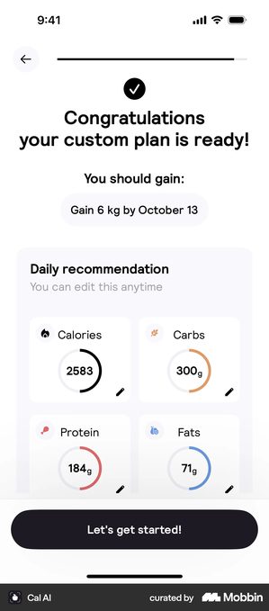
MyFitnessPal · a result computed from their own answers
The projected curve is drawn from the numbers just entered, 70.0 kg to 75.0 kg, and the slider above it redraws the line.
Works when the projection is checkable arithmetic and the user can change the inputs. Letting them drag the slider is what turns a chart into a decision.
Backfires when the curve never reappears on the home screen. A projection shown once was a persuasion trick, and the next number you show is worth less.
Speak does the same job in one sentence and no chart at all:
“Thank you! In two months, you’ll be able to communicate while traveling in France.”
It uses the language chosen and the goal given, and it puts a date on it. That is far more memorable than a curve, which cuts both ways: a user who is not conversational in France in two months remembers exactly what they were told.
Life Reset is the third computed one, and it states the deal before the questions start. Going in:
“Answer all questions honestly. We will use the answers to design a tailor-made life reset program for you.”
Coming out: “You’re carrying more mental weight than you let on — and you’ve been managing it mostly on your own. Based on your answers…” No chart at all. The reveal names something the user disclosed rather than a number they cannot check.
Wanderlog opens with the same kind of promise, “we’ll use your answers to personalize your trips”, and a sentence like that is a debt: everything after the questions gets checked against it.
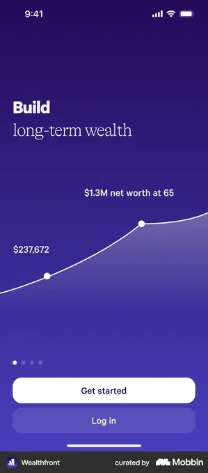
Wealthfront · the same result for everybody
A $1.3M net worth at 65, shown before any information has been collected. It sits exactly where a personalised reveal would go.
Works when it is honestly placed, as here, ahead of the questions, where no personalisation could exist yet and the number can only read as an illustration of what the product does.
Backfires when the same chart sits after ten screens of questions. A user who works out the number was never theirs has been handed evidence the questions were not for them.
Three of eleven is a floor, not a verdict. Liven, which I filed as stock on the strength of that happiness curve, also ships a genuinely computed reveal headed “Based on your answers, your primary irrational pattern is…” so one app sits on both sides of the line at once.
That is the useful version of the finding: computed and stock are properties of a screen, not of a company, and the one you ship in the aha position is the one the user judges you on.
Pattern B · the first real action
The user does the thing. What varies is whether the thing is real work or a checklist about work.
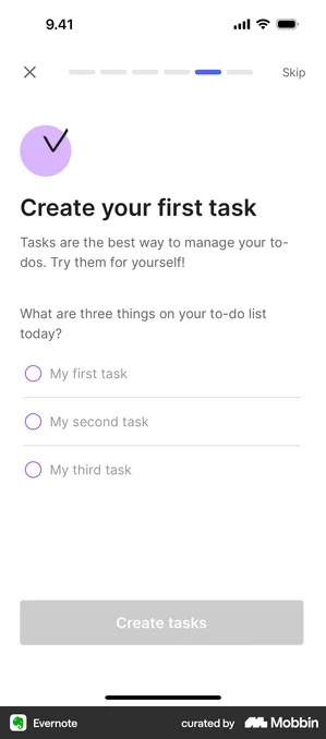
Evernote · the first real action instead of a result
Three task rows and a direct instruction: “What are three things on your to-do list today?” Not a demo, not a checklist about work, the work itself.
Works when the task is something they would have done in the first week anyway. You have pulled a real action forward rather than inventing a chore.
Backfires when the app cannot do anything useful with three lines. If the payoff needs ten items or a connected calendar, a thin first result makes the product look thin.
Between real work and a checklist about it sit the apps that ask for one small real thing and then get out of the way.
Chase UK gives the user a single button with a single job:
“Great, get ready. Tap the button below to activate your card. It only takes a few seconds, so don’t go anywhere.”
The card either works or it does not. There is nothing to interpret.
The app pushr is unusually honest about where its moment is not: “setup complete, let’s get into action by starting your first workout”, with later offered alongside start workout.
Finishing setup is explicitly not the payoff, and the app says so on the screen where most apps would be congratulating you.
pliability puts the celebration after the work rather than before it, “Way to go, Alex! You just completed your first session” which only works because the first session is short enough to finish in the install sitting. The whole pattern rests on that one constraint.
Superlist · the onboarding shipped as the product itself
The first screen is not a setup wizard. It is a Superlist document titled “Onboarding”, with a cover image, two checkbox rows, “Complete employee profile” and “Device setup”, a linked row for the documentation guide, a hand-drawn divider, and the app’s own composer along the bottom: + New task beside the heading and paragraph controls.
Building the checklist out of the product means finishing it teaches the tool rather than taxing the route to it, and what you made is still there afterwards. It needs somewhere for a checklist to live inside the product. Do this to a camera app and you have produced a document nobody wanted, while delaying the one thing they came to do.
Revolut Business · a checklist standing in for the moment
“You’re almost there. Complete the remaining 6 tasks to activate your account.” Deel and Peanut do the same with a completion percentage.
Works when the tasks really are required by regulation or setup, and a list beats discovering the blockers one at a time.
Backfires when a checklist is used where an action would fit. Completing admin is not an aha moment, it is relief, and it converts the product into homework.
Peanut · the checklist that does not hide the product
A sheet over the live feed: “Finish setting up your experience · You have completed 1 of 3 steps”, three rows with the first ticked, and a close cross in the corner. The feed is visible below it, carrying a real post that asks “When can kids drink plain water?”
Against Revolut Business this is the same move doing the opposite job: the product is already running, the list is an overlay on it, and the user can dismiss the list and stay. The content behind the sheet has to be real. Showing a feed the user cannot act on yet is worse than showing the checklist alone, because you have promised twice and delivered neither.
The honest test: if you removed the reveal screen tomorrow, would the user still have felt the product work? If the answer is no, the reveal is carrying weight the product has not earned yet.
Got questions? I’ve got answers
What is the difference between the aha moment and the activation metric?
The aha moment is the experience where the user first understands why your app is worth keeping. The activation metric is the countable event you use as a proxy for it. One is qualitative and one is quantitative, and the metric is only as good as the moment it stands for.
How do I find my app's aha moment?
Look at what retained users did in their first session that churned users did not. The difference is usually a single completed action rather than a feature they discovered.
Should the aha moment be a results screen?
Only if the result is computed from what the user actually entered. Of eleven personalised results screens I pulled, only three are. Liven and Me+ print the identical 86% figure against different user bases, which is template artwork standing where a measurement should be.