App Paywall Examples: The 6 Types and When to Use Each One
Not all paywalls are the same, and picking the wrong type can kill your conversion rate, which is the share of people who see it and buy. The paywall that works for a news app doesn’t work for a meditation app, and the one that works for a game doesn’t work for a productivity tool.
Here are the six types used in mobile apps. Each one on real screens, from apps with the scale to have tested it, with the conversion data behind them and when to use them.
In short
- There are six paywall types: hard, metered, freemium, feature-gated, time-limited trial, and usage-based limits. Soft is not a seventh type: it describes any paywall the user can dismiss.
- Hard paywalls convert at 10.7% download-to-paid by day 35 against 2.1% for freemium, across 115,000+ apps, but that gap is the model, not the screen.
- The type matters less than what leads to it. On AI Decorator, 80% of paying users convert during onboarding, not at the pricing screen.
- Every type below is shown on real screens: Duolingo and QUITTR gating onboarding, Telegram and Spotify on freemium, Kit firing the upgrade at the moment it is needed, Strava and Bloom on trial honesty.
1. Hard paywall
The app is locked behind a subscription or purchase. Nothing meaningful happens without paying first, though there may be a free trial.
Three different things get called “hard”, and keeping them apart is not splitting hairs: it is how the wrong screen stops ending up filed under the wrong type. The business model is the sense RevenueCat measures, an app with no free tier at all set against a freemium one, and it is where the conversion figures below come from.
The screen is a separate question. Vahe Bagdasaryan, whose agency Tangent Growth runs paywall tests across more than 150 apps, draws that line at whether the user can get past it.
Hard means you must subscribe. Soft means you can dismiss it.
The placement is a third question again, and an onboarding gate, meaning a paywall sitting at the last step of onboarding, is where most apps people call hard actually sit.
An app can be freemium, put its paywall at the end of onboarding, and print a close button on it. That is three answers, and not one of them is “hard”.
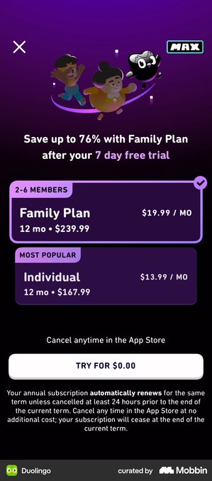
One app being miscategorised would not be worth a section. Going back through the ten screens my own teardown files under “onboarding-gated”, six print a visible close control: Duolingo, Headspace, Strava, BitePal, Tolan and TIDE. Me+ gives a back arrow instead. Two, QUITTR and Moonly, were captured mid-scroll, so the top of the screen is not in frame and the capture cannot answer the question either way.
One, Tripsy, is not a gate at all: the screen recorded there is a purchase confirmation. Not one of the ten is a verifiable locked app, which is a fair indication of how rare the real thing is next to how often the word is used.
When it works
When the app solves an urgent, specific problem and users arrive already knowing they need it: professional tools, B2B apps, niche utilities. According to RevenueCat’s 2026 benchmark data across more than 115,000 apps, hard paywalls convert at 10.7% download-to-paid by day 35, compared to 2.1% for freemium. That is a 5x difference.
The nuance that 10.7% hides: it converts better, but across far fewer users. A hard paywall filters out almost everyone in the first thirty seconds. Comparing 10.7% with 2.1% without looking at absolute install volume leads to bad decisions.
What earns the gate
A gate is only as good as the screens in front of it. Two apps show the two things those screens can do.
QUITTR · the user describes the problem before the app names a price
The order is personalisation first, then a long testimonial, then the plan. By the time the ask arrives, the user has already told the app what they are trying to fix.
The screen also carries a 4.8 rating from 140,000 ratings and an 80% saving. The community line does the same job:
“Join over 1,000,000 users! Become porn free and regain control over your life.”
By the time the price appears, the user has described their own problem in their own words. The screen is not introducing anything. It is answering something they already said.
Headspace · the charge date arrives before the wall does
Headspace puts its dated trial timeline in front of the gate rather than behind it, so the hard stop lands on someone who already knows what day they will be charged. Disclosing first is the cheapest thing you can do to a gate.
Careful though. If you show the timeline and the paywall still blocks everything, the honesty is decorating the wall, not lowering it.
When it doesn’t
When users need to experience value before they believe in it. If your app requires a behaviour change (meditation, fitness, learning), a hard paywall blocks them before they are convinced.

From our work
Travel Diaries
Travel Diaries lets people record trips as online journals and order them as printed books. It started as a free app earning money from book sales, and in 2022 it added a paid membership. Only about 10% of users converted, and book orders dropped.
The problem was not the paywall type. It was the order. Users had to subscribe before seeing any value at all, even to print a book.
In the redesign (August to September 2025) we kept the hard paywall and changed what happens before it. Two things:
- A few opening questions about the user’s travel situation and goals, so the app can show the right plan, online journalling or printing.
- Most importantly, a preview of the journal covers before the paywall.
That second one gets the user to the aha moment, the point where they first see why the app is worth keeping, without paying for it.
Sign-up moved to the end, and the trial now starts by asking for payment details, which raises commitment.
The lesson: a hard paywall does not fail because it is hard. It fails when it arrives before there is a reason to pay.
2. Metered paywall
Users get limited free access, a number of articles, sessions or exports, before hitting the paywall. Once the quota is gone, they pay.
This type is often called a soft paywall, meaning one the user can dismiss. This article does not use the word that way, and the distinction is worth holding onto. Soft describes whether a paywall can be dismissed, not what limits access to it.
A metered paywall can be hard, if the wall that appears at zero has no way past it. And a hard-model app can put a dismissible screen at the end of onboarding.
Using one word for both questions is what lets an app be described as something it is not, which is the confusion section 1 is about.
What it looks like
A counter that ticks down (“2 articles left this month”) and a payment screen that appears when it reaches zero. The apps that do this well warn before the limit rather than at the moment of the block.
The Atlantic · the paywall a reader lands on, written for readers
The metered model came from publishers, and the publisher paywall still does not look like an app one.
The Atlantic offers two plans and no social proof at all: no ratings, no testimonials, nothing saying other people bought it. Below the button it renders its renewal, cancellation and refund terms in full. Five paragraphs of them, set smaller than the body copy but a long way from a footnote.
A publisher’s readers expect to read a contract before they buy one. An app audience reads that much legal text as a warning sign. Same screen, opposite result.
When it works
Content apps, learning platforms, news. Users get a taste, build a habit, and convert because they want more. The whole design problem is the limit: enough to create the habit, not so much that paying never becomes necessary.
When it doesn’t
When your app’s value isn’t tied to consumption volume. If users only need your app once a week, a usage limit might not trigger often enough to convert.
3. Freemium paywall
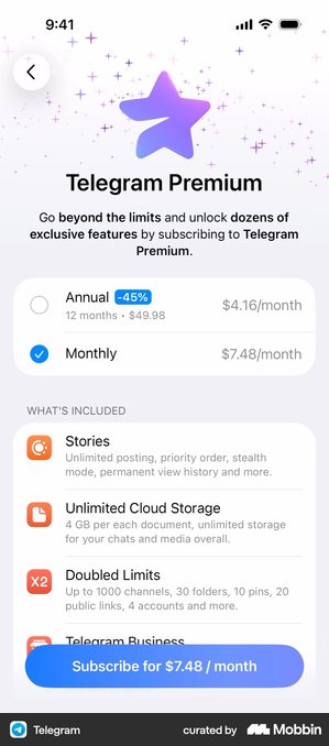
The app is permanently free with a useful but limited feature set. Premium features are locked behind a subscription or one-time purchase.
What it looks like
The whole app works. The paywall shows up as a “Go Premium” screen reachable from settings, and reappears wherever the user touches a paid feature. Two things separate the freemium paywalls that work from the ones that get ignored.
Spotify · plans that differ on something other than billing period
Individual, Duo and Family are stacked cards, each carrying a bulleted spec rather than a price alone. The promotional offer lives on its own screen above, rather than mixed into the list.
Duo is the interesting one. It makes Family look generous and Individual look modest, while still being a real product two people buy.
The plans differ on something real: how many people, not just how often you pay. And the limited-time promotion lives on a screen of its own rather than in the plan list, so an offer is never mistaken for a plan. Both of those are deliberate.
Letterboxd · the renewal date lives inside the plan card
“Subscribed as Pro — Renews in 364 days” sits in the card itself. So the state is visible wherever plans are shown, and the user never has to hunt for when they will next be charged.
Across a whole teardown of paywall and post-purchase screens, it is the cheapest trust win I found. I cannot see a case where it backfires.
When it works
When you can clearly split features into “good enough for free” and “worth paying for.” This model works for productivity tools, creative apps, and social platforms.
When it doesn’t
When you can’t draw a clear line between free and paid. If the free tier is too generous, nobody upgrades. If it’s too restrictive, nobody sticks around.
4. Feature-gated paywall
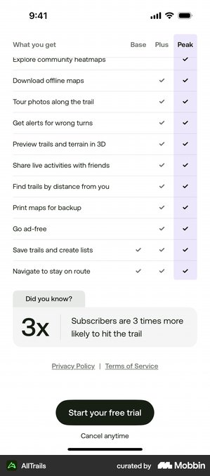
Similar to freemium but more granular. Specific features are locked while the core app is fully functional. Users discover locked features as they explore.
What it looks like
A padlock or premium badge on a single feature. Tapping it opens a sheet about that feature, not the whole catalogue of benefits. The trigger is the whole point: it fires at the exact moment the user wants that one thing.
Kit · the upgrade appears at the moment it becomes necessary
Kit’s tier change is Single child versus Multi child, drawn as a before-and-after pair with an arrow, and it is triggered by the act of adding a second child. The paywall is not a screen the user went looking for; it is the answer to what they just tried to do. The plan names say it plainly: “Single child plan / Multi-child plan (2–5 kids).”
The upgrade appears because the user tried to do the thing that needs it, which is the one arrival time a gate never has to argue for. The same screen, read as an offer.
Orbit · the unlock opens off the screen that proves the number
Orbit fires its unlock straight after the spend summary. It leads with the user’s expected result rather than a feature list: customers “save $300 a year”. So the price reads as arithmetic, not as a fee.
Apple’s Favourites laurel and a 4.8 rating sit above the headline. And what it all leads to is a one-off Lifetime purchase, not a subscription.
The order is what does it. By the time the price appears, the reader has already read a bigger number, so S$24.98 arrives as a subtraction rather than a charge.
When it works
When premium features naturally emerge during the user journey. A photo editor where basic editing is free but advanced filters or AI tools require payment. The user sees the locked feature at the moment they want it most.
When it doesn’t
When your core value is the premium feature. If the only reason someone downloads your app is for the locked feature, gating it creates frustration, not desire.
5. Time-limited trial
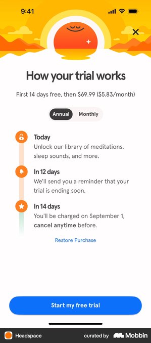
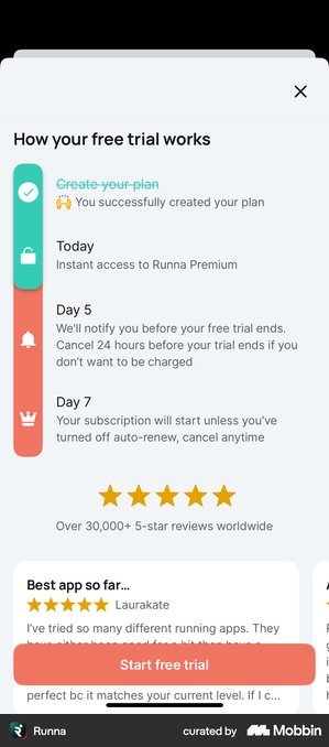
Full access for a limited period (7, 14, or 30 days), then the paywall activates. Users experience everything before deciding.
What it looks like
A screen laying out the trial timeline: “today full access, day 5 we remind you, day 7 billing starts”. Usually the cancellation reminder is used as a selling point rather than buried as small print.
It is the pattern the large apps have settled on. Headspace, Strava, Brilliant, Runna, Buddy and Spark Mail all run a version of it.
And it is rare in a useful way: it lifts trial starts by being more honest, not less.
Strava · the deadline, not just the charge date
Strava runs 30 days on a dated timeline: today you unlock everything, at 28 days you get the reminder, at 30 the subscription begins. Then it states the part most apps leave out, “You won’t be charged until Jul 1. Cancel any time up to 24hrs before your trial ends.” The user gets the real window, not only the billing date.
Naming the deadline and not just the charge date is the rarer half of this, and it is the half that stops a dispute before anybody opens one.
Bloom · a fourth step after the charge
Most trial timelines stop at “trial ends.” Bloom adds one more row underneath, in plain type: “Forget to cancel? No problem. Get a full refund, no questions asked.” It answers what people actually fear about a trial, which is not being charged but forgetting.
All of that depends on the refund being real and quick to claim.
Picture the other version. Someone wants their money back, and they need an email chain and a reason. A promise made in 13px and honoured slowly produces support tickets and one-star reviews, and those cost more than the subscribers the promise saved you.
Deepstash attacks the same fear from the other end. It quantifies the exit instead of asserting it: “Cancel anytime in 15 seconds.”
foodpanda · ninety days, and exactly the same three steps
“Free for 90 days — Today: Free trial starts · Day 89: Billing reminder – cancel anytime · Day 91: Plan starts and billing begins”. Ninety days is the long end of everything in the teardown, and the structure does not change at all from a three-day version: start, reminder, charge.
The clever part is that the reminder is fixed against the charge, not against the start. So even a three-month gap still ends with the warning the user was promised. All of which collapses if that reminder is the only thing standing between someone and a charge they stopped thinking about in week two, and it never arrives.
Hypelist · three days, with the auto-upgrade written into the timeline
The short end of the same pattern: “Today — Unlock access to all premium features instantly · Day Two — We’ll remind you before your trial ends. No surprises! · Day Three — Love it? You’ll be upgraded automatically. Cancel anytime before in just 2 taps.” A “No thanks” exit sits on the same screen.
Fine, as long as the two-tap claim survives contact with the real cancellation flow and the exit stays visible next to it. What is not fine is “upgraded automatically” being the only place the screen admits billing starts. That is a cheerful sentence doing a disclosure’s job.
When it works
When your app needs time to demonstrate its full value. Fitness programs, habit trackers, project management tools.
Trial-to-paid conversion, the share of people who start a free trial and then actually pay, varies sharply by category. Travel 43.5%. Health & Fitness 37.7%. Photo & Video 22.2%.
These are medians, so half the apps in each category sit below them.
The critical detail: when people cancel a trial, they overwhelmingly do it on the first day. 55.4% of all 3-day trial cancellations happen on Day 0, and 39.8% of 7-day trial cancellations. Read that carefully: it is a share of cancellations, not a share of users.
What it tells you is when the decision gets made, not how many people make it. Users don’t cancel because the trial didn’t work. They cancel because the paywall moment didn’t convince them. The trial is almost irrelevant: the onboarding leading up to the paywall is everything.

From our work
Breath training app
We have measured this. On a breath training app we redesigned the onboarding only, leaving the pricing screen and the trial length untouched. An A/B test showed a 16.5% increase in free-to-trial conversion (October 2024 to January 2025).
Four changes did it:
- A goal question up front, to personalise the journey.
- Testimonials and ratings before asking for anything.
- Information revealed progressively instead of all at once.
- The benefit framed in terms of performance and achievement.
Same paywall, same price, same trial. The only thing that changed was how the user felt by the time they arrived.
6. Usage-based limits
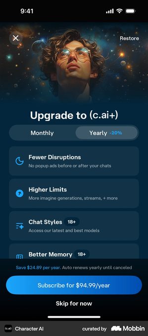
Free users are limited by a resource: storage space, API calls, exports per month, number of projects. Upgrading removes or raises the limit.
What it looks like
A progress bar or credit counter in the interface, and a payment screen when it runs out. It is the default model in AI apps, where every action has a real cost to the developer.
Character AI · sell the constraint, not the feature tour
“Higher Limits” is one of the two rows the upgrade screen opens with, so what is being sold is the exact thing the user just ran into rather than a catalogue. There is no trial anywhere on it, and “Skip for now” stays in view under the price instead of hiding in a corner.
This lands when the user has already hit the limit and knows exactly what they are buying back. Hit them with it in the first session and it reads as a toll, not an upgrade.
Deel · state the ceiling in the user’s own units
Deel is not a usage cap, but it does the thing usage caps most often fail to do. Its unlock is triggered from a contract screen and framed entirely as risk cover, with a specific coverage amount printed on each benefit instead of an adjective.
Put the benefit in the units your user already thinks in. Dollars covered, exports, gigabytes, generations. Generic numbers read as marketing, not as a limit somebody actually measured.
Weverse · when the limit is a currency, and the terms say so
The subscription runs alongside a consumable, and the tick at the end of the screen names it:
“I have reviewed all the precautions and agree to the terms and a monthly subscription with recurring Jelly purchases.”
The entire notice is rendered on the paywall itself, scrollable, ending in that one checkbox and a Start Subscription button.
A model where the user keeps spending a currency is exactly the one that has to be said out loud, and a link would have buried it. The risk is the opposite one: a wall nobody reads buys you the paperwork and none of the trust.
When it works
Cloud services, data tools, creative platforms where power users naturally hit limits. The limit should feel fair: users understand they are getting more than the average person.
When it doesn’t
When the limit feels arbitrary or too low. If someone hits the limit during their first session, it feels punitive rather than fair.

From our work
AI Decorator
In AI apps the usage limit is not a business lever, it is a real constraint: every generation costs the developer money. That changes how you design it.
On AI Decorator, an app that transforms interior and garden photos, we ran QA with real users through TestFlight. We found people did not understand how to start a new generation after seeing their result. The obvious fix was to make that step as easy as possible.
We did the opposite: we made it clearer, but deliberately kept some friction, to avoid accidental generations that drive up cost without giving the user anything.
The app launched with 32% trial-to-paid conversion from release, and 80% of paying users convert during onboarding (June to September 2025).
The same decision at four points in the lifecycle
The six types above are about when you first ask. But the ask does not happen once. Here is the same product, four different moments, from apps with enough scale to have tested them properly, and the screen changes shape at each one.
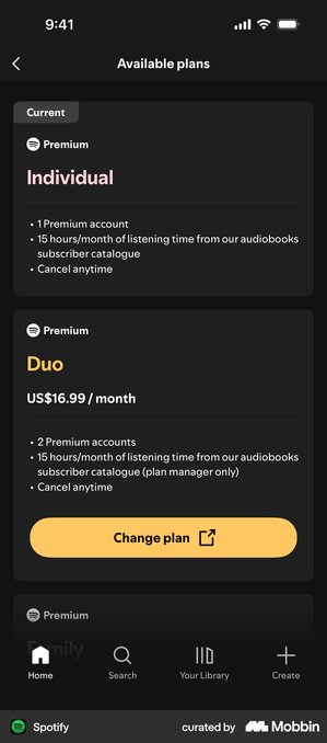
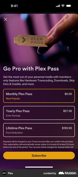
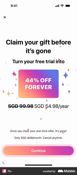
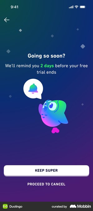
What the four share is that each one names the commitment plainly on the screen it appears on. Spotify shows what you are on now, Plex what each plan is for, Flo what closing the page costs you, Duolingo what happens in two days. None of them makes you go looking.
That is not a style preference. It is the part of a paywall that survives a policy change, because it is the part a reviewer, a regulator or an angry user checks first.
How to choose the right one
Five questions, in this order. The first four are about your user. The last one is about you.
How fast does your app deliver value?
Instant, a hard paywall or trial can work. Slow and habit-based, a metered paywall or freemium with a clear upgrade moment.
Is your value continuous or one-time?
Continuous, a subscription with any paywall type. One-time, feature-gated or a one-time purchase, Plex and Orbit both sell that way.
How large is your potential audience?
Large audience, freemium, because you monetize the small percentage who pay. Small and high-intent, hard paywall or trial.
What’s your category convention?
Look at the top 10 apps in your category. Don’t copy them blindly, but know what your user already expects.
How fast do you need to know if this works?
Daphne Tideman, who advises subscription apps on pricing and positioning, puts this one alongside audience size and value frequency. It is the only question of the five that is about you rather than your user.
A paywall with no free tier answers “will anyone pay for this?” almost immediately, because every install either converts or does not. You can read the result from the first hundred.
Freemium cannot answer it until you have volume. At a 2.1% median, Tideman’s rule of thumb is that you need upwards of a thousand free users before the paying group is big enough to learn anything from.
Her sharper point is that freemium can actively delay the answer. Free users have different needs and different tolerances, so their feedback pulls you toward features that people who would never pay want, while engagement rises and revenue does not.
If you are early and the open question is whether anyone will pay at all, the model that answers fastest is worth more than the model that would eventually earn most.
Choosing your paywall type
- Name the type you are actually running before you change it, several apps described as hard paywalls are onboarding gates with a visible dismiss
- Match the type to how fast your app delivers value, not to what converts best in a benchmark
- If value is one-time rather than continuous, look at feature-gating or a lifetime tier before a subscription
- Fix what leads to the paywall first: on AI Decorator, 80% of paying users converted during onboarding rather than at the pricing screen
- Check the top ten apps in your category so you know what your user already expects, then decide whether to meet it or break it deliberately
- Keep the exit visible. Every screen in this article that works has one
Got questions? I’ve got answers
What is a paywall in an app?
A paywall is the screen where an app asks the user to pay, or to start a free trial, in order to keep using it or to unlock a specific feature. In mobile apps a paywall is a product screen rather than a content wall like a newspaper’s: its job is to explain the value and close the conversion within a few seconds.
What is the difference between a hard paywall and a soft paywall?
Soft means the user can dismiss the screen and carry on; hard means they cannot get past it without paying. That is the distinction this article uses, and it is about the screen itself. Two other senses get called the same thing and cause most of the confusion. As a business model, the sense RevenueCat measures, a hard paywall app has no free tier and a freemium app does: hard paywalls convert at 10.7% download-to-paid by day 35 against 2.1% for freemium, across more than 115,000 apps. A metered paywall is a type rather than a property: it allows limited use first, for example a number of articles, sessions or exports, and only then asks for payment. Most screens people call hard are dismissible paywalls placed at the end of onboarding, which is a question of placement.
Which type of paywall converts best?
Hard paywalls have the highest download-to-paid conversion rate, 10.7% by day 35 versus 2.1% for freemium, but they convert across far fewer users because most people leave first. No single type always wins: the right choice depends on how quickly the app delivers value, whether that value is recurring or one-off, and the size of the potential audience.
How many people cancel a free trial on the first day?
55.4% of all 3-day trial cancellations happen on Day 0, and 39.8% of 7-day trial cancellations. This is a share of cancellations rather than a share of users, so it describes when the decision is made rather than how many people cancel. It suggests the decision is not made during the trial but at the paywall moment, and that the onboarding leading to that screen matters more than the length of the trial.
What is the difference between RevenueCat and Superwall?
Both are subscription infrastructure tools, not paywall types. RevenueCat focuses on managing subscriptions, receipts and revenue analytics across platforms, and includes remotely configurable paywalls. Superwall focuses on the paywall itself: it lets you design, target and A/B test payment screens without shipping a new App Store build. Choosing between them does not replace deciding which paywall type your app needs.